Intuit has a recognition problem many successful companies would envy: people know TurboTax, Credit Karma, QuickBooks and Mailchimp, but may not connect all four to one platform. Its new identity, developed with JKR and highlighted by Brand New on September 28, makes that relationship visible. The logo is the entry point, yet the bigger move is turning a portfolio into one story.
JKR’s Intuit case study describes a new wordmark that can become a standalone symbol and activate as Intuit Intelligence. Intuit’s editorial logo library now offers ecosystem lockups alongside the individual product marks. That is a practical sign of the strategy: the parent brand can appear without erasing familiar products.
The lowercase i has to carry the whole family
A symbol that begins inside a wordmark has an advantage over an unrelated icon: the connection is learned while the name is read. Here the lowercase i can scale from a complete Intuit signature to a compact cue. The risk is equally clear. It needs consistent placement and color rules or it becomes just another generic letter on a crowded finance screen.
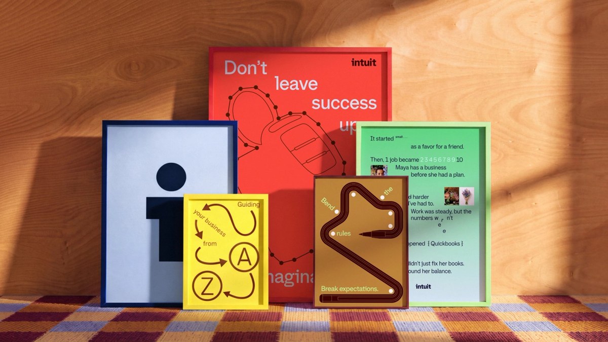
Image: JKR / Intuit system and product expressions.
Brand architecture is a user experience decision
The products have different jobs. Tax filing, bookkeeping, credit choices and marketing are not interchangeable. A useful masterbrand must clarify their shared promise while keeping each product easy to find. Intuit’s compact, horizontal and stacked ecosystem logos show how much work happens between a strategy slide and an actual app header, ad or press image.
The outdoor application shown by JKR makes the same point at another scale: the identity must explain the parent company quickly, while a specific product or benefit still gets attention. If everything becomes “Intuit,” the customer loses the familiar route in. If everything remains separate, the parent investment stays invisible.

Image: JKR / Intuit brand on a city billboard.
A comparison from another product portfolio
Google’s evolving identity also uses a simple parent mark while products keep distinct utility and context. Intuit faces a more commercial cross-sell question, but the design principle is similar: repeat a small set of recognizable assets and let product names continue to do useful work.
What a smaller software company can borrow
Map the moments where customers meet the company name and where they meet a product name. Test the mark as a favicon, a product badge and a sales deck signature before declaring the architecture solved. A polished wordmark is valuable only if it reduces that naming confusion.
If your company has several tools, explore a clear parent wordmark first. Then use the brand kit generator to set type and color rules, and compare the marks on real screens with AI mockups. The goal is recognition across the family, not a forced sameness.