Formula E’s latest identity, created with MOX, arrives as the championship prepares for its GEN4 era. Its core challenge is familiar to every sports property: how can a mark feel credible on a race car, legible in a phone notification and alive in broadcast motion without becoming three unrelated designs?
The mark is designed for momentum
The update uses a sharpened, forward-leaning visual language rather than relying on a literal car illustration. That restraint matters. A championship identity has to survive changing circuits, teams and technology; motion, contrast and a compact geometry give it a way to express speed across many formats.
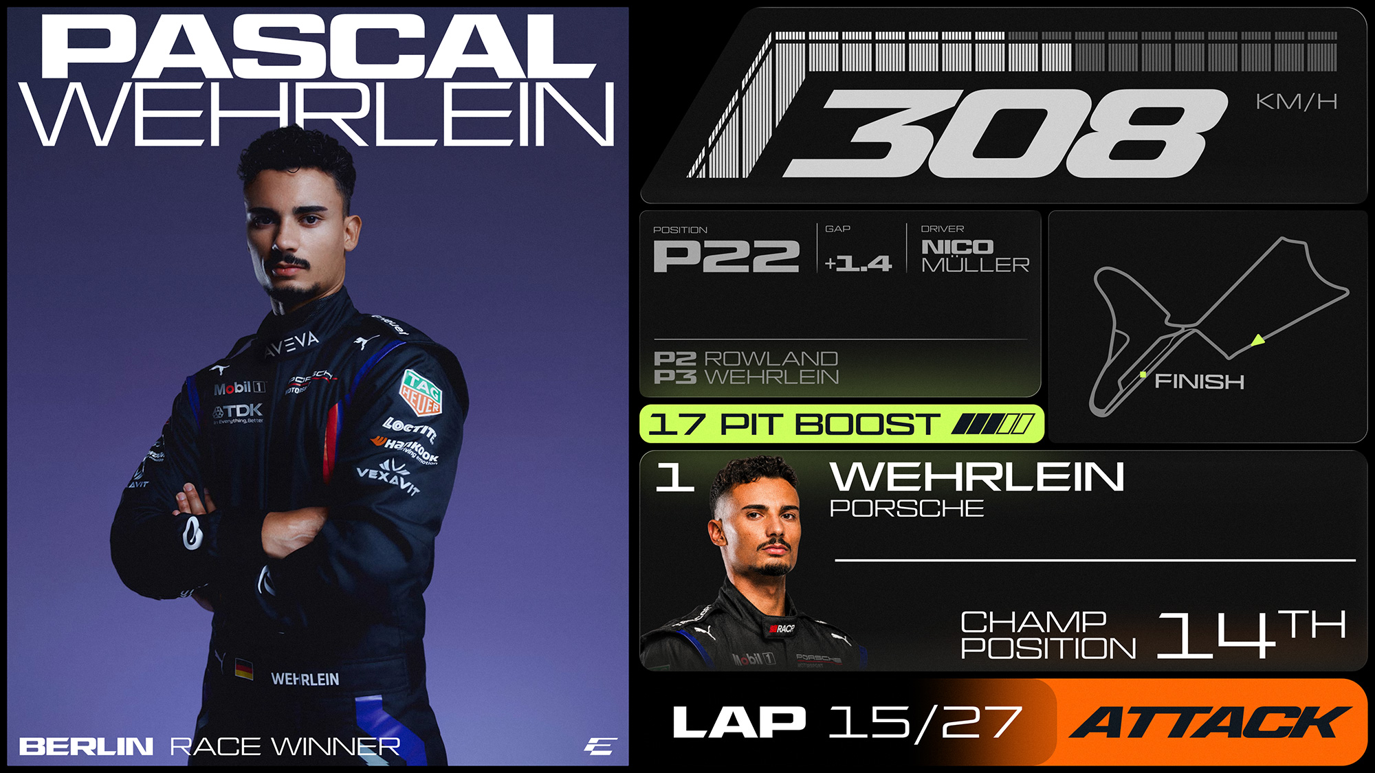
Formula E identity-elements image published in Brand New’s September 2026 coverage Source
Broadcast is now a first-class logo environment
A modern sports logo is watched as often as it is printed. It has to enter score graphics, social clips, app interfaces and animated transitions in seconds. Formula E’s system is a reminder that a logo should be tested in motion early: if the silhouette cannot hold during a fast cut, the brand loses one of its busiest touchpoints.
Run the three-screen test before launch
Test a proposed mark on a grandstand sign, a 16:9 broadcast graphic and a vertical social clip. The weakest result—not the polished presentation board—shows where the identity needs more contrast or a simpler silhouette.

Abstract blue light-trail study AI-generated editorial illustration; it is not an official brand asset.
A useful contrast with other event identities
The right system balances a stable core with host- and season-specific energy. Sologo’s look at the Archery World Cup identity shows the other side of that equation: a tournament needs room for place. Formula E needs room for speed. Both benefit from a mark that is simple enough to carry a larger visual language.
What smaller teams and events can borrow
Prototype your logo on a jersey, a livestream lower third and a vertical social post before approving it. Pick a distinctive shape or typographic move, then give it a repeatable motion rule. Consistency is not sameness; it is the ability to be recognised while the format changes.
Building an identity for a club, race team or competition? Create a sports-ready logo with Sologo and test your strongest concept across the places supporters will actually see it.