Monk’d is a healthier ice-cream brand built around monk fruit, and Rare Ideas has given it an identity that has to do several jobs at once: look indulgent, communicate a differentiated ingredient story and remain easy to spot in a cold cabinet. The strongest part is the hierarchy, not a single decorative flourish.
Packaging has to answer the shelf question fast
Food packs are read at a glance. A product name, a category cue and the reason to believe must cooperate before the shopper reaches for the tub. Monk’d uses a friendly, distinctive visual voice while allowing the product proposition to stay visible. That is a better model than letting a mascot or a claim dominate every surface.
Monk’d packaging system from Rare Ideas’ case study Source
Why the logo needs a supporting cast
A food logo rarely works alone. Color blocks, illustration, flavor signals, type weight and ingredient language decide whether the identity feels coherent from lid to freezer shelf. Monk’d shows how a logo can be expressive while leaving enough room for the package to organise information.
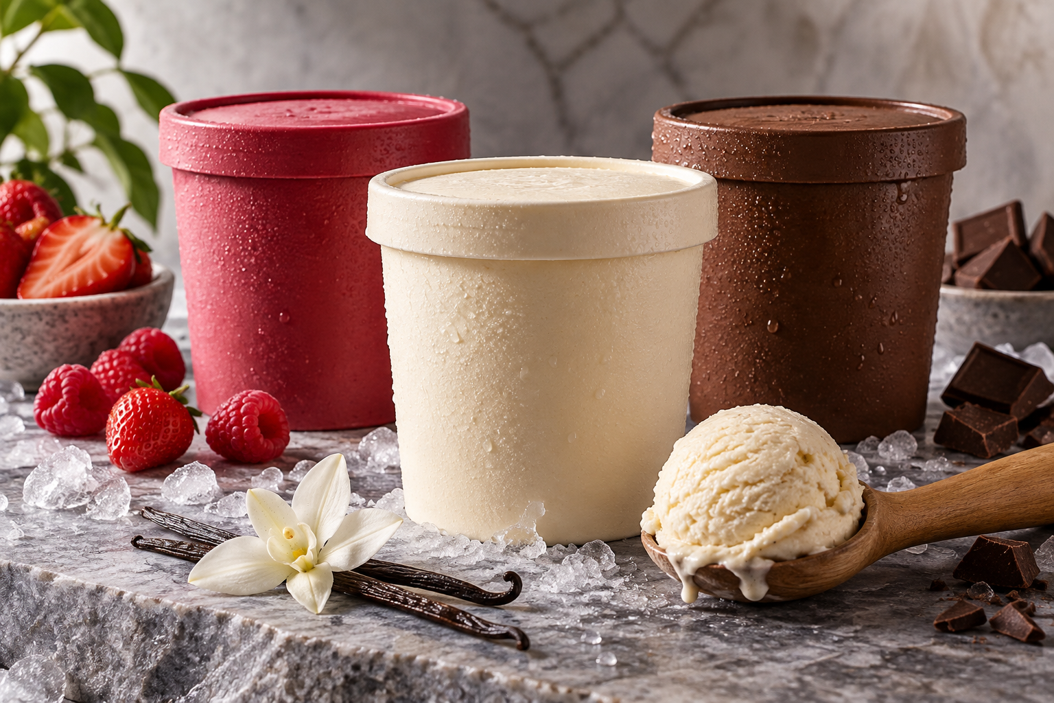
Unbranded ice-cream packaging still life AI-generated editorial illustration; it is not an official brand asset.
The broader lesson for food founders
In crowded food categories, “healthy” is not a visual style. It is a trust problem. The best packaging systems make the offer understandable before they make it fashionable. See also Sologo’s analysis of the Jif packaging refresh, where familiar equity is updated without losing the quick recognition that retail depends on.
The thumbnail test is a packaging test
Shrink the front panel to the size of an e-commerce product tile. If the brand, flavour and key benefit still have a clear reading order, the system has a much better chance of working both online and in store.
Write the three messages a shopper must understand in two seconds, then let each part of the pack do one job. Keep the logo readable at thumbnail size; choose color with category context in mind; and make a single, specific benefit more prominent than a cloud of vague wellness claims.
If your logo needs to grow into packaging, menus and social assets, build a cohesive Brand Kit with Sologo—then apply the same hierarchy everywhere your customer makes a choice.