7UP is making a product reformulation visible through identity, not only advertising. The refreshed lime-forward drink turns the familiar logo vertically, strengthens the palette, and borrows typographic energy from the brand's 1964–74 era.
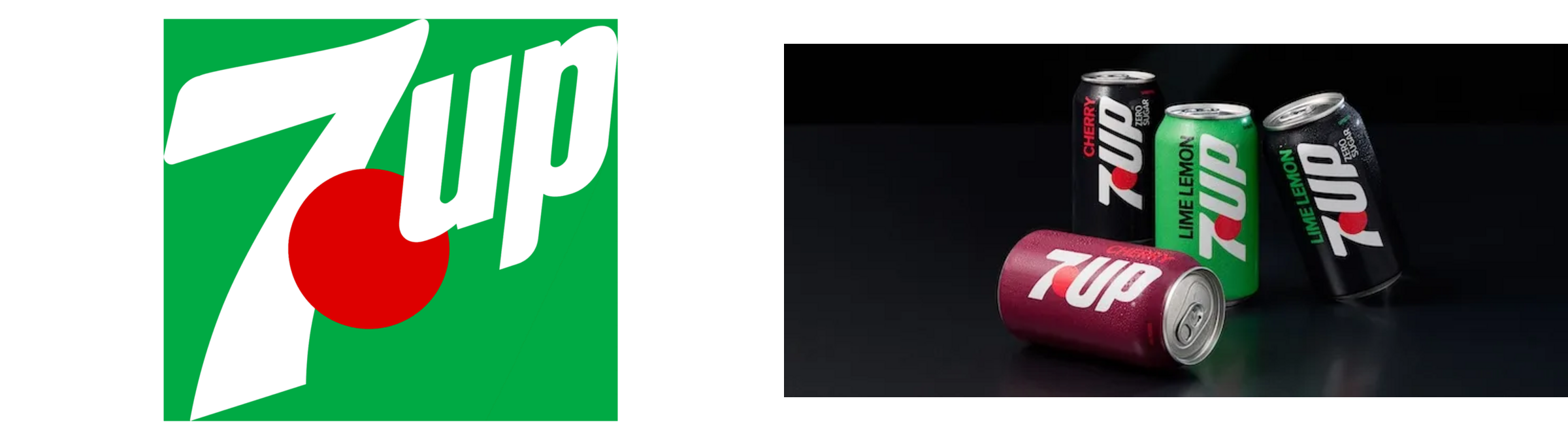
A source-based comparison of the previous horizontal identity and the new vertical 7UP presentation. Images: LogoLounge.
What Changed in the Identity?
The most obvious change is orientation: the mark now stacks upward instead of running horizontally. That move supports the 'flip the sip' idea and gives cans a taller visual spine. Bolder green and red, plus retro letter cues, make the reformulation feel like a deliberate chapter rather than a minor recipe note.
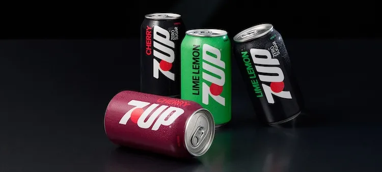
The new vertical logo makes the lime-first reformulation visible before shoppers read the copy. Image: LogoLounge.
Why This Change Matters
A package redesign works hardest when it explains a real product change. Here, the vertical wordmark creates a physical metaphor for flipping expectations from lemon-lime to lime-lemon. The identity does not ask nostalgia to do all the work; it uses history to make a current proposition feel credible.
The Broader Branding Trend
Beverage shelves are dense with circles, bubbles and diagonal energy. Changing a logo's orientation can create distinction without abandoning recognition. It also shows that heritage brands can revisit archives selectively—recovering useful attitude while keeping modern production and digital needs in view.
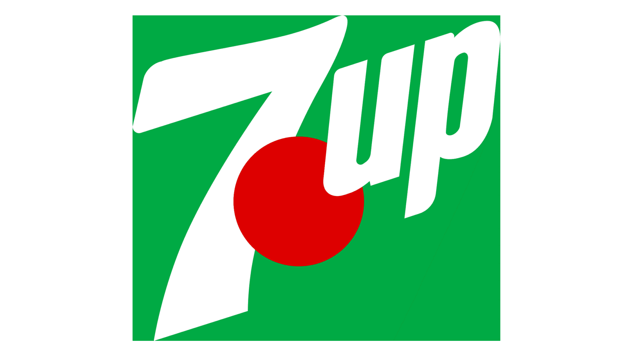
The previous horizontal treatment shows how strongly orientation changes shelf rhythm. Image: LogoLounge.
Related Logo Lessons
Recent food and drink refreshes often restore expressive type, strong color blocking and memorable pack architecture after years of simplification. The best examples connect those choices to taste, ingredients or ritual instead of treating retro style as decoration.
What Smaller Brands Can Learn
- Tie the visual change to a product or positioning change customers can understand.
- Test logo orientation as part of packaging architecture, not in isolation.
- Use archive references selectively instead of recreating an old label wholesale.
- Protect the most recognizable color and shape cues while changing composition.
Source evidence: LogoLounge's report with 7UP launch imagery. Explore related tools including Sologo Brand Kit, AI Mockup, and the most relevant generator for this idea.
Turn the lesson into your own identity. Use Sologo's design tool to explore an original direction for your brand—without copying the identity discussed here.