Big Rock Brewery's rebrand is a useful counterpoint to quiet craft-beer minimalism. Helms Workshop returns the Calgary brewery to a louder mix of expressive illustration, assertive typography and packaging that treats the brand's namesake geological anomaly as attitude, not scenery.
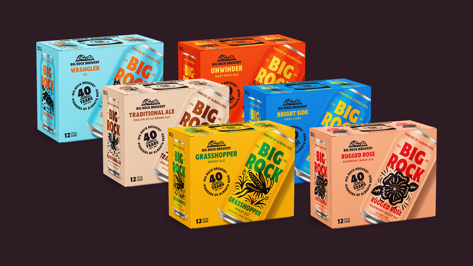
Big Rock's rebuilt packaging family uses bold color, illustration and assertive typography. Image: Helms Workshop official case study.
What Changed in the Identity?
The system replaces familiar craft clichés with bold color fields, rugged characters and clearer pack architecture. The logo and typography carry more weight, while each beer receives a distinct illustration and personality. Variety comes from storytelling; recognition comes from the repeated framework.
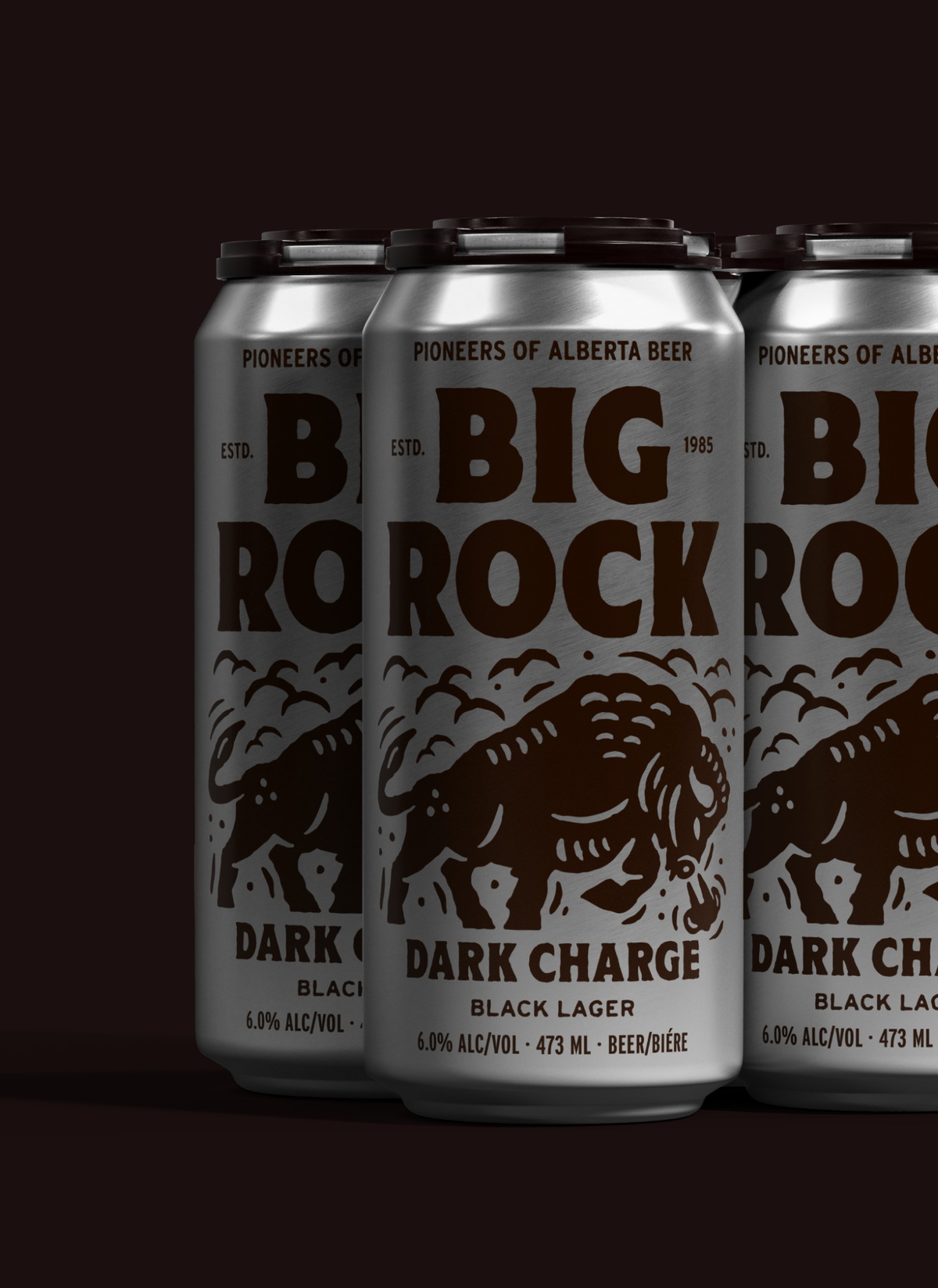
Individual beers gain distinctive personalities inside one recognizable architecture. Image: Helms Workshop official case study.
Why This Change Matters
Big Rock needed to feel established without becoming polite. The rebrand uses the brewery's history and regional confidence as permission to be unusual. Helms reports a 47 percent sales rise in the quarters after relaunch, a reminder that shelf distinction can be a commercial tool when it clarifies what the brand stands for.
The Broader Branding Trend
Craft beer created visual abundance, then converged around similar hand-drawn badges, muted palettes and insider language. Brands now need a stronger architecture: enough consistency to be found quickly, enough variation to make each product worth exploring, and a voice that remains legible from across the aisle.
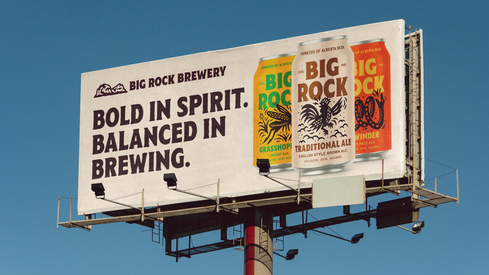
The identity extends into outdoor communication with the same unapologetic tone. Image: Helms Workshop official case study.
Related Logo Lessons
The most effective beverage portfolios separate masterbrand recognition from flavor storytelling. A stable logo zone, typographic hierarchy or package silhouette can hold the range together while illustration and color do the work of navigation and discovery.
What Smaller Brands Can Learn
- Define one repeatable package architecture before designing individual flavors.
- Use illustration to express product personality, not to fill empty space.
- Make regional heritage a point of view rather than a collage of landmarks.
- Measure the redesign through recognition, trial and portfolio sales—not awards alone.
Source evidence: Helms Workshop's official Big Rock Brewery case study. Explore related tools including Sologo Brand Kit, AI Mockup, and the most relevant generator for this idea.
Turn the lesson into your own identity. Use Sologo's design tool to explore an original direction for your brand—without copying the identity discussed here.