A heritage mark carries a different burden from a startup logo. Royal Copenhagen has used its crown and waves as symbols of origin and craft for generations. Kontrapunkt’s new identity, highlighted by Brand New on October 8, keeps those anchors and redraws them with more deliberation. The decision is less about making the mark look young than making it speak clearly in today’s packaging and digital spaces.
Kontrapunkt’s Royal Copenhagen case describes a refined crown and wave, a bespoke typeface and a communications idea, “made with life.” The agency ties the system to brushwork, gatherings and pieces passed between generations. That is a more concrete foundation than a generic claim of luxury.
A wax seal makes the heritage argument tangible
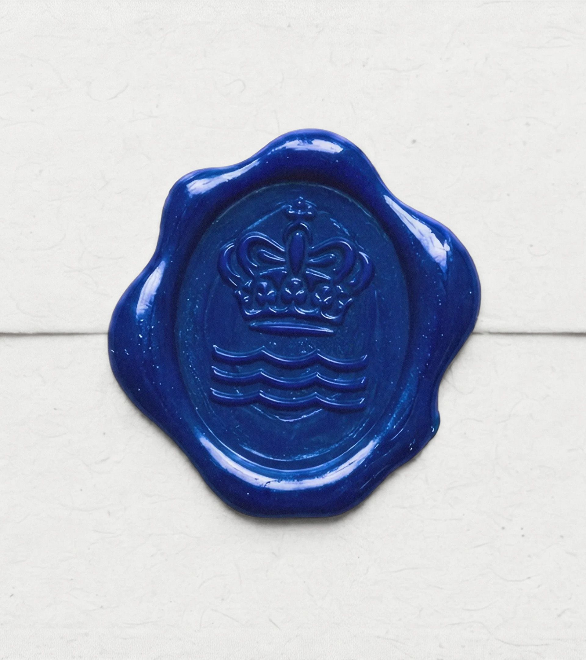
In the agency imagery, the mark appears impressed into a vivid blue wax seal. The crown and waves become a physical signature, not just a flat icon beside a headline. It is a useful test of the drawing: details must survive texture and uneven light. A heritage logo earns its refinement when it can still be read on the material that defines the brand.
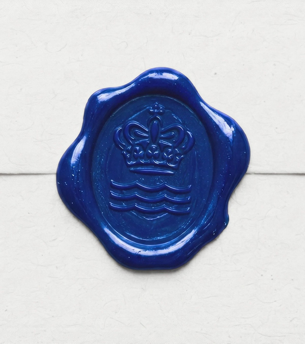
Image: Kontrapunkt Royal Copenhagen crown and wave in blue wax seal.
The same logic applies to an embossed box or a small ceramic stamp. Fine lines can suggest care, but too much detail disappears. Stripping every irregularity away would weaken the connection to hand-painted porcelain. The mark needs a controlled middle ground.
The custom typeface carries the voice further
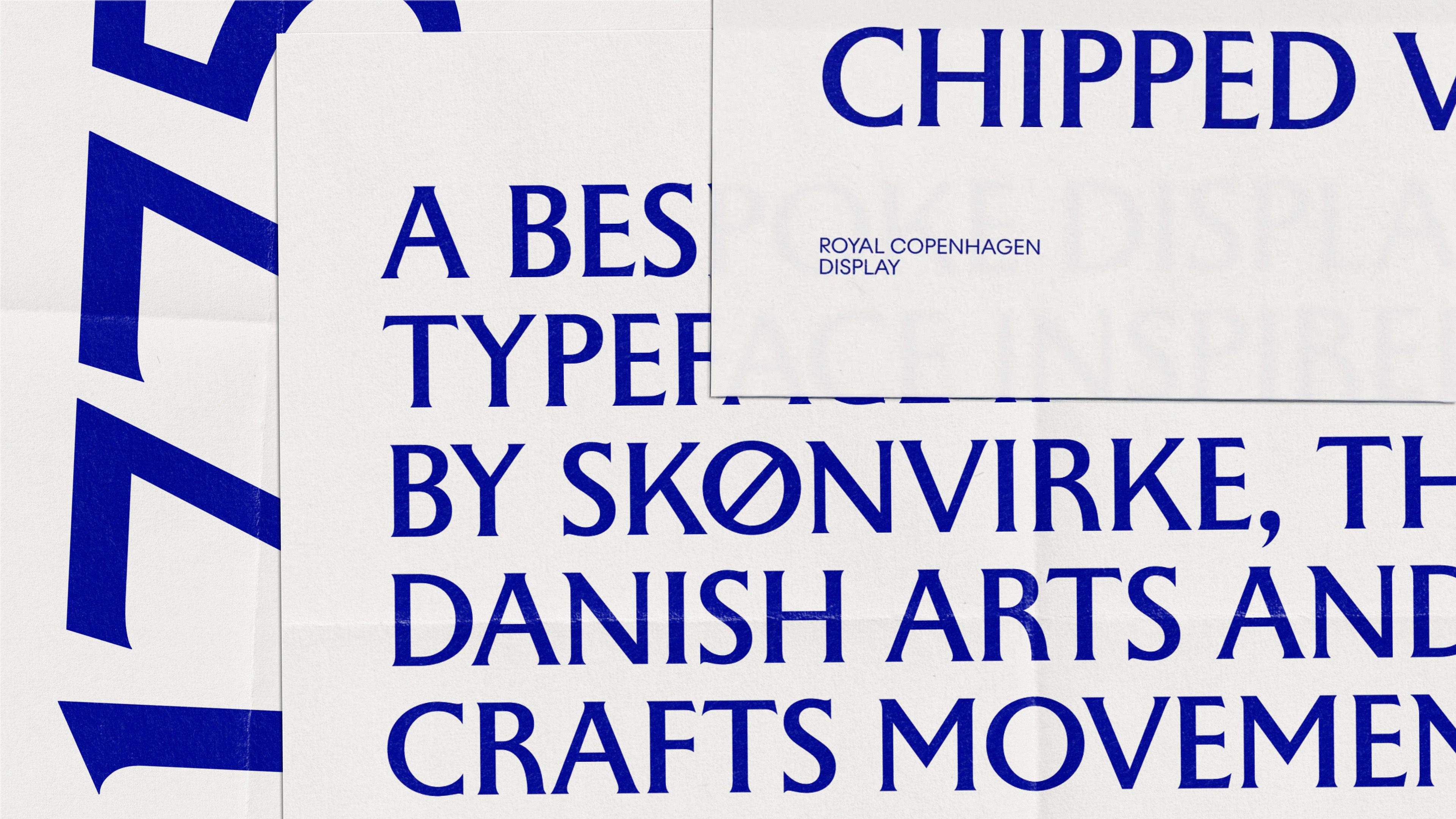
Kontrapunkt did not stop at a cleaner symbol. The project includes a bespoke typeface that gives campaigns and product stories a consistent texture. The specimen shown by the studio is expressive and visibly different from an anonymous luxury serif. Large typography can carry an editorial moment; small product details still need restraint and legibility.
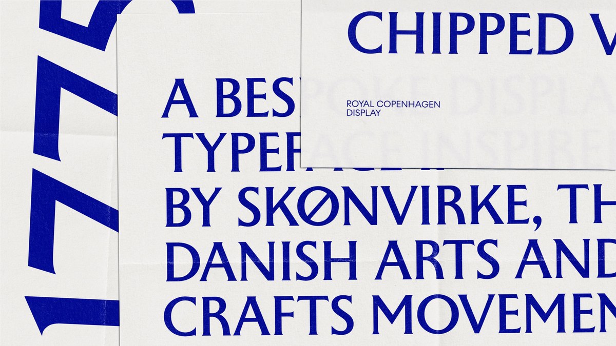
Image: Kontrapunkt Royal Copenhagen bespoke typeface specimen.
This is where many heritage refreshes become generic: an old emblem survives, but everything around it is replaced by interchangeable premium styling. Here the typography, blue palette, objects and photography are all asked to support the same craft story. The system can feel contemporary without erasing the reason the brand is known.
The useful lesson is selective change
A company with a long history should list which assets customers already recognize and which ones actually fail in current use. Preserve the former; redesign the latter. Royal Copenhagen’s crown and waves remain a shortcut to its heritage, while the type and messaging help them travel across campaigns, commerce and packaging.
If a family business has an old crest, explore a simpler logo variation from a legitimate image you own, then build consistent type and color rules with the brand kit generator. Check the result on packaging mockups before deciding which details to keep.