The Information Technology and digital services landscape is arguably the most fiercely competitive branding environment on the planet. Here, the product is often intangible—cloud infrastructure, complex algorithms, or raw data processing—and the market is defined by speed, agility, and relentless innovation. For designers and marketers, this high-stakes environment demands that the corporate mark transcend aesthetics; the tech logo must become an active, communicating asset.
Today’s most successful tech logo trends are driven not by fleeting visual styles, but by strategic necessities: communicating trustworthiness in a complex digital world, signaling advanced technological capabilities (especially AI), and adapting seamlessly across countless digital touch-points.
If you are navigating a brand overhaul or need to create a cutting-edge visual identity, here are the five strategic mandates shaping modern tech branding. If you need a rapid, modern solution, consider using an free AI logo generator to visualize these complex trends instantly.
1. Minimalism 2.0: The Mandate of Functional Geometry
In the tech industry, clarity often equals sophistication. Because many modern digital platforms—from SaaS products to AI tools—offer complex and abstract functions, overly intricate logos can create a sense of friction or inaccessibility for users. Simplicity, on the other hand, conveys transparency and ease of use.
Recent design approaches favor what could be described as “minimalism with character”—a style that combines geometric precision with distinctive, essential forms. This aesthetic helps communicate qualities such as efficiency, trustworthiness, and intuitive performance, even when the underlying technology is advanced.
A key method supporting this approach is the intentional use of negative space—the blank area around or within the mark. When handled skillfully, it allows designers to suggest hidden meanings or subtle visual interplay, creating a logo that feels both simple and conceptually rich. This mirrors the technological pursuit of optimization: achieving more with less.
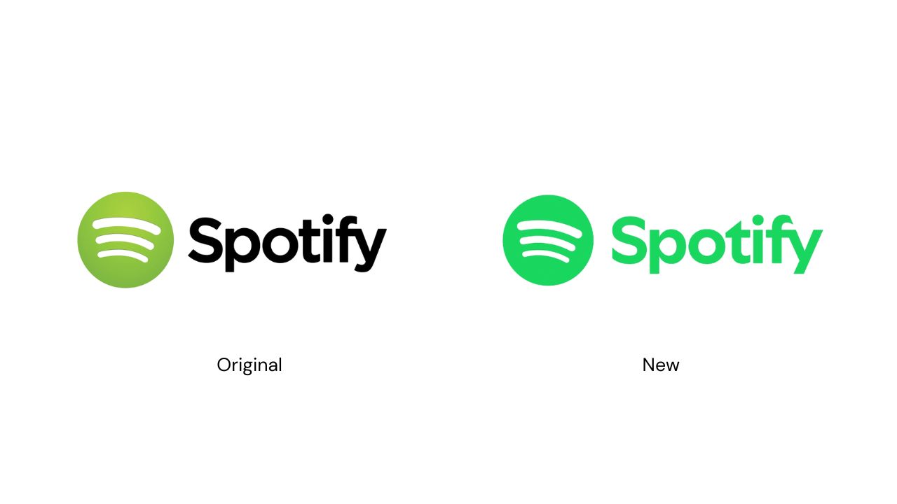
For example, Spotify’s redesign replaced its older, more detailed iconography with a geometric green circle and three white arcs, paired with a modern sans-serif wordmark. The reduction to basic geometric shapes plus ample whitespace enables the mark to scale effortlessly across devices and screens, while still retaining distinctive character. In doing so, Spotify signals that its brand is digital-first, streamlined and credible.
2. The Color of Motion: Gradients and Dynamic Signaling
The era of flat, single-color logos is fading. In today’s design landscape, color must do more than signify identity—it must communicate movement, intelligence, and adaptability.
While blue continues to anchor trust and technological reliability, leading brands are layering that stability with vibrant gradients and blended hues to express multidimensionality and constant evolution. The shift isn’t just aesthetic; it’s behavioral. These color transitions act as visual metaphors for fluidity, responsiveness, and algorithmic sophistication.
A particularly advanced approach is the use of “Gradient Tails” or “BlurTails,” where motion blur and seamless color transitions imply ongoing activity and convergence. Even in static form, this technique suggests perpetual advancement—ideal for AI-powered and forward-looking companies.
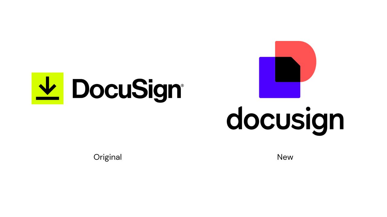
DocuSign’s 2024 rebrand illustrates this principle perfectly. By introducing futuristic gradients into its visual identity, the company signaled its transformation from an eSignature platform to an intelligent agreement ecosystem powered by AI. The result is a logo system that feels alive—evoking precision, dynamism, and the fluid logic of continuous computation.
3. Iconic Language: Visualizing Networks and Data Flow
As brand value increasingly resides in connectivity, decentralized systems, and advanced machine learning, the logo must visualize these intangible concepts. The interconnected-nodes motif has emerged as a near-universal visual shorthand for networks, data, innovation, AI, blockchain, and cloud-computing platforms. This geometric lattice of dots and connecting lines efficiently communicates complexity and technological depth across cultural barriers. By representing the entire system—not just a single product—the mark asserts the brand’s technological depth and systemic integrity.
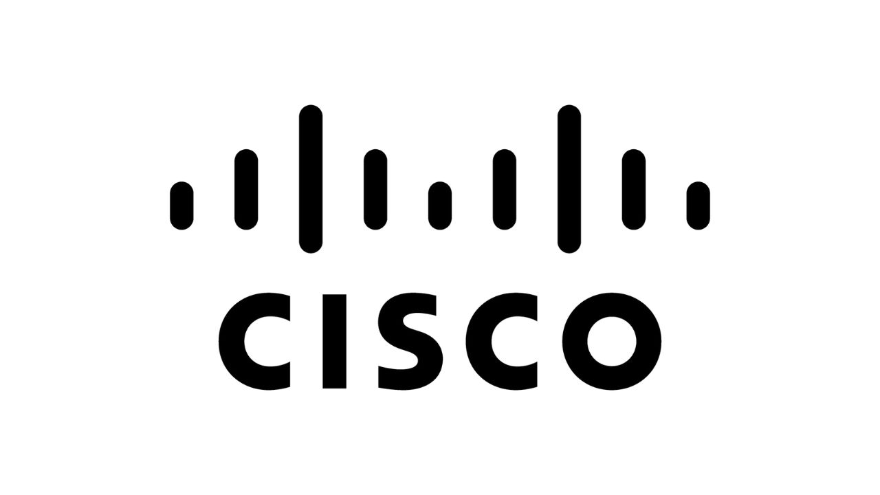
A strong real-world example is Cisco Systems. Its hallmark logo—first introduced in the 2000s and still in use—features vertical bars evocative of a stylized bridge or waveform, subtly referencing networking infrastructure, data transmission, and connectivity grids. Although the design isn’t literal dots and lines, it functions in the same way: a visual shorthand for systems and networks, rather than for a discrete product.
- Data flow, decentralization, connectivity and AI/ML infrastructure, by representing multiple points (nodes) and the links between them.
- It works as a visual metaphor for platforms, ecosystems, and distributed systems, which are harder to depict concretely.
- In practice, the motif works in minimal prints, apps and iconography, preserving meaning when scaled down or abstracted.
4. Typography: Balancing Authority with Approachability
Typography remains one of the most immediate expressions of a brand’s confidence and function. In the digital space, sans-serif typefaces continue to dominate due to their clarity, scalability, and strong performance across different screen sizes. Their clean geometry communicates precision and reliability—qualities expected of technology brands that deal with complex systems or data.
Yet, there has been a noticeable shift in tone among leading IT and tech companies. Many are moving away from the rigid, corporate aesthetic that once defined digital branding, opting instead for typography that feels warmer and more human. This “friendly minimalism” trend often appears through subtle design choices such as rounded letterforms, wider spacing, and the adoption of all-lowercase wordmarks. The result is a softer, more conversational brand voice that reduces perceived hierarchy and fosters approachability.
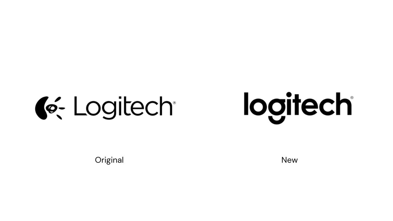
A clear example of this is Logitech’s rebrand in 2015. The company replaced its traditional, uppercase logo with a lowercase wordmark in a custom sans-serif typeface. This redesign coincided with a strategic repositioning—from a hardware-focused company known primarily for computer peripherals to a broader lifestyle-oriented tech brand. The lowercase lettering communicates accessibility and innovation, while the precise, balanced letterforms retain a sense of authority and technical credibility. In essence, Logitech’s typography bridges professionalism with personality: confident enough to be trusted, but casual enough to invite engagement.
Through such design choices, tech brands are redefining how authority appears visually. Rather than relying on rigidity or corporate gravitas, they now use typographic warmth to humanize their digital presence—turning technology from something users adapt to into something that adapts to them.
5. Logo Animation as a Core Brand Asset: Driving Engagement and Memorability
For any brand operating in the digital ecosystem, the logo can no longer be a static file.
Logo animations are fundamentally more engaging and memorable than their static counterparts, adding dynamism and enhancing brand storytelling to establish emotional connections with the audience. Motion design techniques—such as sliding, rotating, morphing, element reveals, and color transitions—allow the logo to perform rather than just appear. In today’s high-velocity digital environment (especially across social feeds), the deployment of a polished, looping logo animation signals that the brand is agile, technically fluent, and tuned to its screen-first ecosystem. A brand without a dynamic identity risks appearing static or behind the curve.
Conclusion: Designing for the Future of Tech
Modern logo design in technology is about efficiency and emotional connection. Your brand mark must look simple, feel friendly, and silently scream "I am complex and connected." By prioritizing functional geometry, leveraging motion through gradients, speaking the language of data via connected nodes, and adopting a humanizing typographic strategy, you can create an identity that builds instant trust and positions your platform for future growth.
Don't let your brand identity stagnate. Start creating modern, adaptive logos with an AI logo maker today.