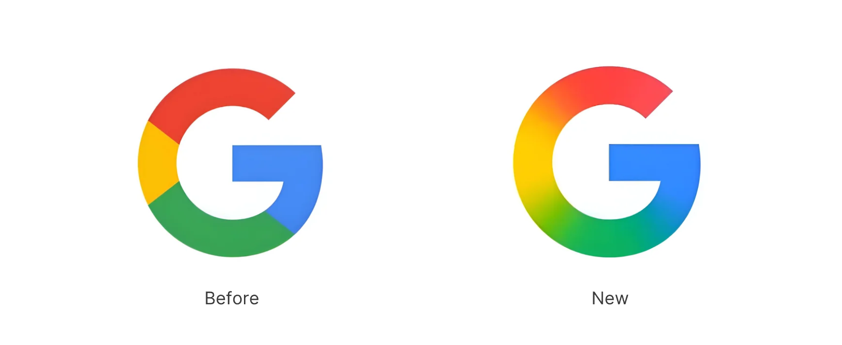
On May 12, Google quietly rolled out a refresh for the Google App icon on iOS. The familiar four-color “G” logo gained a subtle gradient blur that softly blends the red, yellow, green, and blue sections. This change – the first tweak to Google’s G icon in a decade – adds vibrancy and a more modern look to the Google logo, aligning it with Google’s latest AI-inspired design language.
The Revolution of the Google App Icon
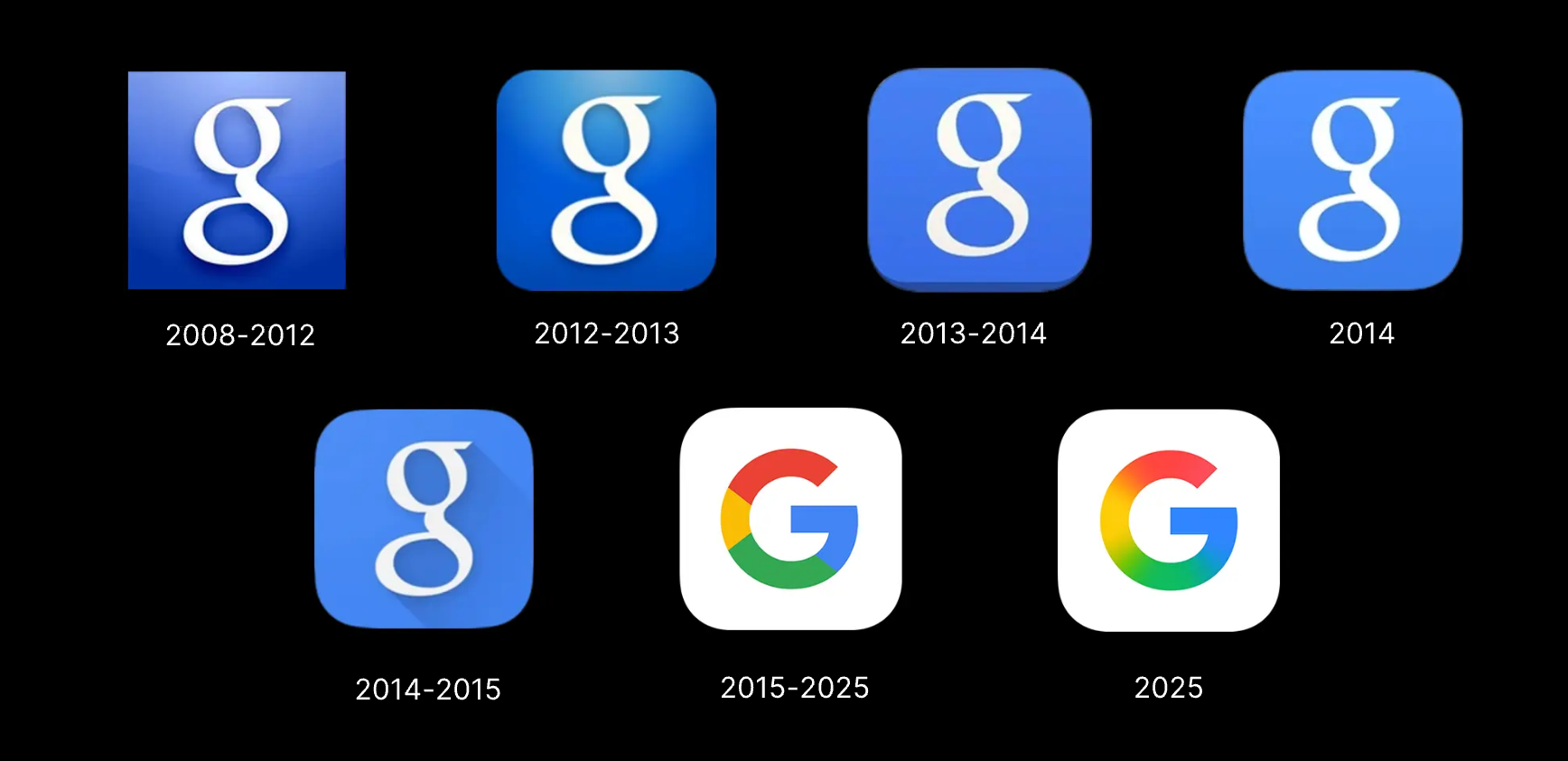
The updated Google app icon keeps the same bold sans-serif “G” shape introduced in 2015, but the hard color boundaries have been replaced by a gentle gradient fade, creating a softer and more fluid appearance. So far, this new icon is live on the Google Search app for iOS (and even on Pixel phones via a beta update)
The update is very subtle, but it has caught attention. Designers and younger users have generally praised the new icon’s modernity and softer look, while a few longtime users worry that the more blended colors make the “G” slightly less immediately distinctive. In any case, the change is purely cosmetic – Google’s wordmark logo (“Google” in full) remains unchanged – but it signals Google’s willingness to evolve its logo design for a cohesive visual system.
Other Google Product Icons
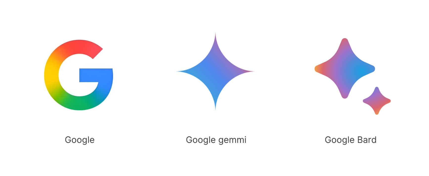
Observers note that the new gradient style matches the look of Google’s Gemini AI logo and “AI Mode” shortcuts in Google Search. That suggests Google is moving toward a unified, futuristic aesthetic tied to its AI efforts. Over time, Google may roll out the new look across its ecosystem for consistency.
Other Brand Examples Using Gradient Logos
Google isn’t alone in embracing gradients. Many tech and creative brands have moved from flat colors to multi‑hue logos in recent years. For example:
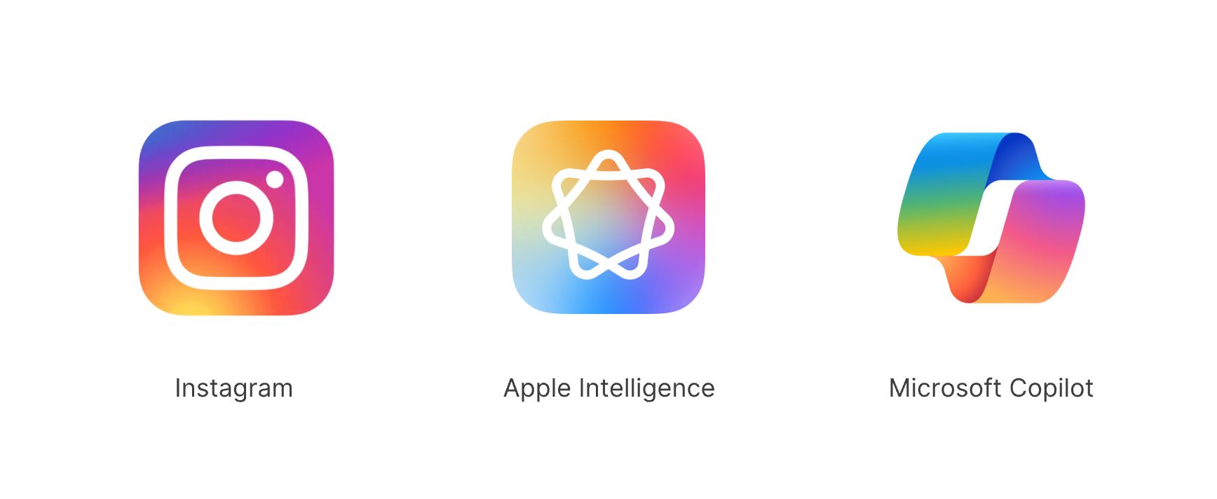
- Instagram: Since 2016, Instagram’s camera icon has used a vibrant orange-purple-blue gradient background, a stark change from its old flat logo. The gradient is now one of Instagram’s most recognizable design elements.
- Apple Intelligence: Revealed in 2024, the Apple Intelligence logo features a distinctive abstract symbol composed of overlapping shapes in soft gradient shades of blue, purple, pink, and orange. The design suggests neural networks and fluid thinking. The gradient not only adds dimensionality but also reflects Apple’s positioning of AI as seamless and intuitive.
- Microsoft Copilot: It features an abstract 3D emblem designed with a gradient multicolor palette. While it includes all the core Microsoft colors, it also introduces a broader spectrum of hues — ranging from orange to purple.
These examples show that smooth gradients are a wider logo design trend, helping brands look more dynamic and modern. Google’s shift is a logical part of this movement.
Conclusion
In short, Google’s quiet iOS icon refresh on May 12 is a small but telling step in the evolution of the Google logo and branding. It makes the Google “G” more vibrant and in tune with current design trends, while hinting at a future where all Google app icons might share a unified gradient style. For brand designers, the takeaway is clear: even iconic logos evolve. Successful brands will continue to refine their icons to stay fresh – often using gradients and color blends as a tool.
Try to Generate Your Own Logo
Ready to experiment with logo design yourself? Try generating your own vibrant, modern logo at AI Logo Generator like Sologo AI and see how easy it is to apply these trends to your brand!