The Brisbane 2032 emblem asks one bird to represent a place, a sporting event and a future memory. Officially unveiled on October 5, the Olympic version draws on a pink cockatoo; its Paralympic partner uses a sulphur-crested cockatoo. The warm crest also evokes a flame and Queensland’s outline. It is a dense brief compressed into a mark that must work from a city-scale launch to a small souvenir.
The Australian Olympic Committee’s announcement describes six pieces revealed across Queensland before the complete design appeared in Brisbane. The International Paralympic Committee’s account confirms the paired species, flame and feather references. These are official emblems, separate from mascots that will be introduced later.
The paired emblems are siblings, not copies
The Olympic crest is predominantly pink; the Paralympic version moves toward yellow and orange. Both share the cockatoo’s upward sweep and the Brisbane 2032 signature, then meet different Games symbols below. That family resemblance matters. A Paralympic identity should be clearly connected to the host city without being treated as a recolored afterthought.
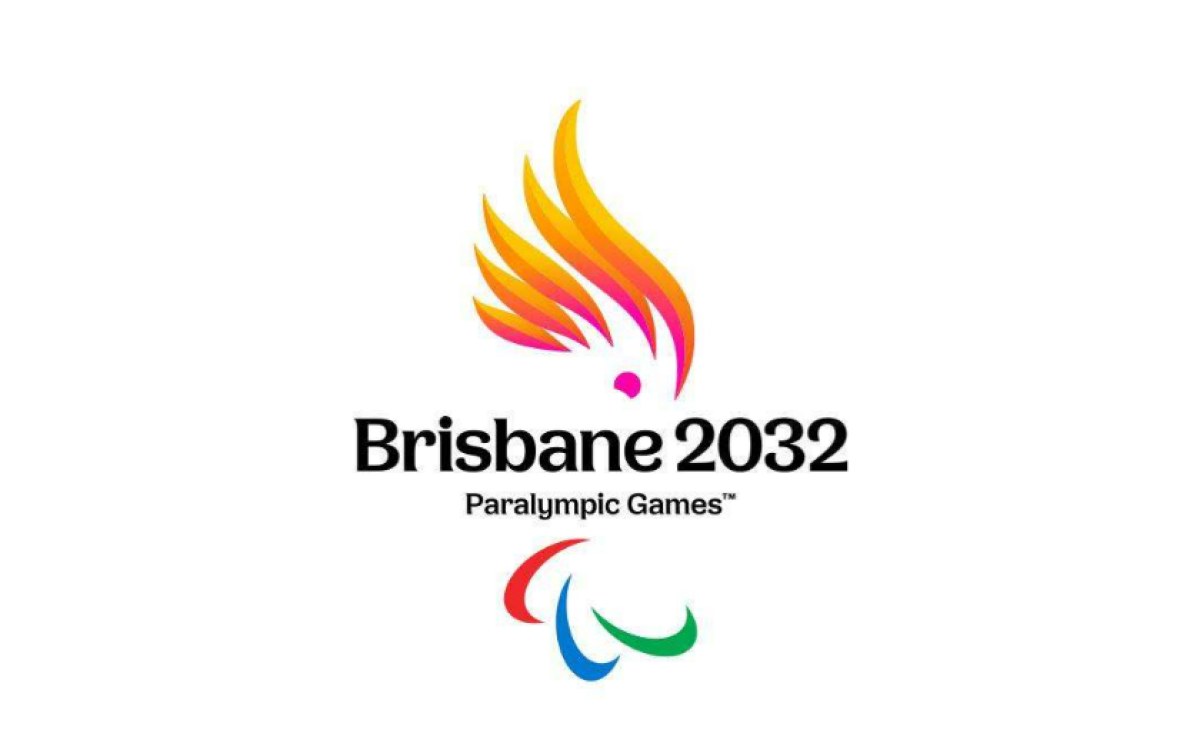
Image: International Paralympic Committee Brisbane 2032 Paralympic emblem.
The official explanation also points to three and two feathers as a nod to 2032 and recognizes the cockatoo’s First Nations cultural significance. Those meanings can enrich the identity, but a viewer should still be able to remember the shape before reading an explainer. The crest’s motion and bright color do that first job.
Local character has to survive commercial use
An Olympic emblem does not live only on a launch screen. It will appear on merchandise, signs, broadcasts, mobile layouts and sponsor communications. The official Olympic Shop already shows the mark on a mug: the crest and wordmark are compact, with the rings still visibly separate. This mundane use is an early reality check for a complex concept.
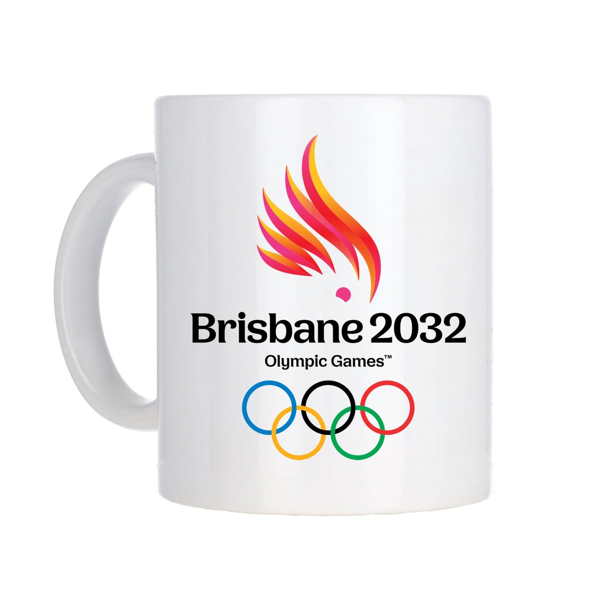
Image: Official Olympic Shop Brisbane 2032 branded mug.
At small sizes, viewers may not see a map outline or count feathers. They can still recognize the energetic bird-flame silhouette. That is the hierarchy the system needs: an immediate cue, a legible host name and deeper symbolism for those who spend longer with it.
What a local event brand can borrow
Brisbane 2032 had to connect a distinctive place to a globally regulated symbol set. A neighborhood festival or sports club has fewer constraints, but the same ordering helps: identify one local trait, create a simple primary silhouette, then test it on tickets, banners and merchandise. Do not ask every tiny detail to explain the whole story.
To explore an event mark, start with the AI logo generator or turn your own licensed sketch into options with Sketch to Logo. Use AI mockups to test legibility on real objects. Keep official Olympic and Paralympic symbols out of unlicensed designs.