A pair of socks made Bombas famous. Its next identity has to make sense on much more than socks. In the refresh shown by &Walsh and covered by Brand New on October 7, the company moves toward a broader promise of comfort while keeping its donation mission visible. The interesting question is whether one unmistakable brand can also leave room for Sport, Kids and Dress.
&Walsh’s official Bombas case study describes comfort as both physical and emotional. The gallery shows a heavier, rounded BOMBAS wordmark, soft color fields and organic shapes across storefronts, packaging and digital shopping. None of these devices depends on drawing a literal sock. That matters as the range grows.
The wordmark does the recognition work
The blocky letters feel approachable because their weight and corners are controlled, not because the mark is cute. At a storefront scale, the name can carry a window. In a color system, the same wordmark can cross a warm red, cool blue or muted green without losing its basic silhouette. Color creates mood; letter shape maintains continuity.
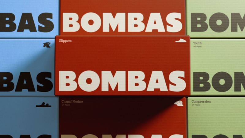
Image: &Walsh Bombas wordmark and color system.
That distinction is useful for any retail brand with growing categories. If every new product needs a new symbol, recognition gets fragmented. If every product receives exactly the same treatment, shoppers lose helpful cues. A stable master wordmark lets the surrounding palette, photography and descriptors carry the variation.
Sport needs a different tempo
The Sport extension is a sharper test than another everyday sock. &Walsh gives it a dedicated mark, high-contrast palette and performance-oriented art direction. The BOMBAS name still leads, while SPORT signals the use case. The bright accent and tighter presentation feel more energetic than the parent’s relaxed scenes without pretending it is a separate company.
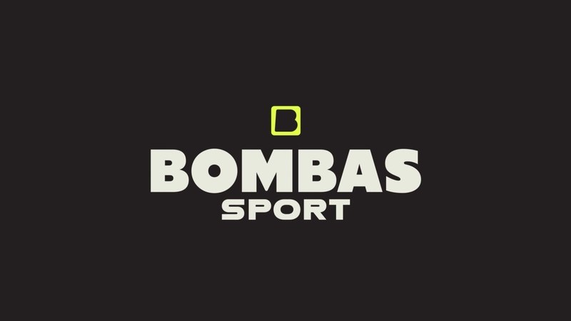
Image: &Walsh Bombas Sport signature.
Kids and Dress present different needs again. The agency says each receives its own look within the family. That is brand architecture in ordinary shopping terms: a parent promise customers recognize, followed by a quick cue that helps them choose. The system is doing more work than the logo in isolation.
A promise must survive the checkout
Bombas ties purchases to giving. &Walsh’s applications continue to show the one-purchased, one-donated idea on shopping bags and other customer touchpoints. A brand can put comfort in its colors, but its purpose only feels credible when the shopper encounters it during the actual journey. A logo refresh cannot replace that repeated proof.
For a smaller apparel company, start with a wordmark that works on a label and a shopfront. Then use a brand kit to define where subbrand names, colors and promises appear. Test the system on product mockups before adding another standalone icon.