Imagine receiving a tournament logo and nothing else. Where does the sponsor go? How large is the city name? Which colours may a local organiser change? A strong mark cannot answer those questions on its own.
The Archery World Cup identity by Arecibo, revisited by LogoLounge on September 22, 2026, is useful precisely because it addresses the applications around the mark. This is fresh coverage of the 2026 season system: Arecibo’s case study is dated August 3, so it should not be mistaken for a new September launch.
The trophy supplies a point of focus
Arecibo identifies the World Cup trophy as the source for the icon. Its bow-like diagonal and stepped arm make a compact silhouette with a clear direction. That matters because a tournament emblem should identify this competition, rather than simply illustrate the sport in general.
The distinction is familiar from the FIFA World Cup trophy: a prize can carry the meaning of a particular tournament as well as a game. The comparison is conceptual; the two identities solve the drawing problem differently. For a local competition without a recognised trophy, a place, ritual or shared club symbol may offer a more specific starting point than another generic ball or arrow.
A city name should join the identity without becoming a new logo
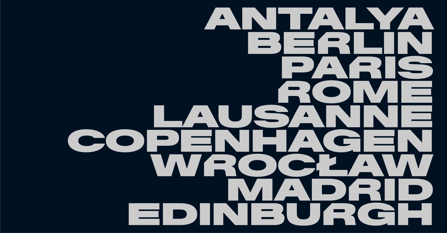
AWC Baikal typography specimen from Arecibo’s case study, showing host-city names as a consistent family. This is a design specimen, not a schedule. Source
The AWC Baikal specimen places very different city names in a common visual voice. The practical challenge is their unequal length. A system must accommodate that variation while keeping the event legible; shrinking every long name until it fits can leave one host looking less important than another.
Arecibo’s venue approach allows local colour and pattern within a shared structure. Our reading is that this separates two valuable things: recognition of the series and expression of the host. Organisers do not have to choose between an anonymous template and a new identity for every stop.
The sponsor is part of the layout problem
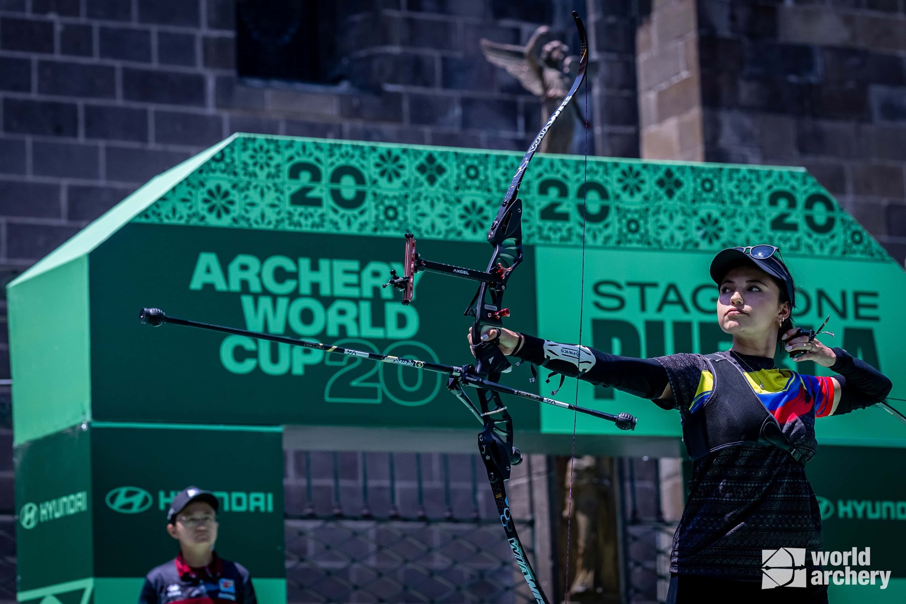
The 2026 identity in a competition setting. Source: Arecibo; stadium photography credited to ALBERGA / WORLD ARCHERY. Source
A sports photograph rarely shows a perfect, isolated logo. It contains an athlete, equipment, signage and several commercial messages. In the image above, the event graphics need to remain understandable through that clutter. The brand system should anticipate the scene, rather than assume the camera will find the ideal view.
That is why reserved sponsor areas and a repeatable hierarchy are substantive design decisions. If every organiser improvises those relationships, the same competition can look unrelated from one venue to the next. A reusable brand kit is most valuable when it explains what may change and what must stay fixed.
Team identities provide a useful counterpoint. A club badge can carry local affiliation year after year; a touring event has to accommodate many local affiliations at once. Sologo’s analysis of AS Roma’s identity offers a related way to think about the connection between an emblem and its community.
Give volunteers a kit they can actually use
A small league can borrow the operational idea without commissioning custom type. Supply one approved mark, a clear-name version, two or three sample sign layouts and a reserved sponsor area. Include a long team name and a crowded sponsor row in the examples, because those are where a comfortable-looking template often breaks.
Then test a phone-sized score graphic and a wide photograph of a banner. If the event name disappears, fix its size or placement before adding more decorative energy. A logo system earns its value when someone other than its designer can use it reliably.
Building a club or tournament identity? Start a direction with the Sologo Sports Logo Maker, and develop the winning mark into a few repeatable layouts for the people running the event.
Sources: Arecibo’s original case study and LogoLounge’s September 22 coverage. Images come from the agency case study; application advice is our own analysis.