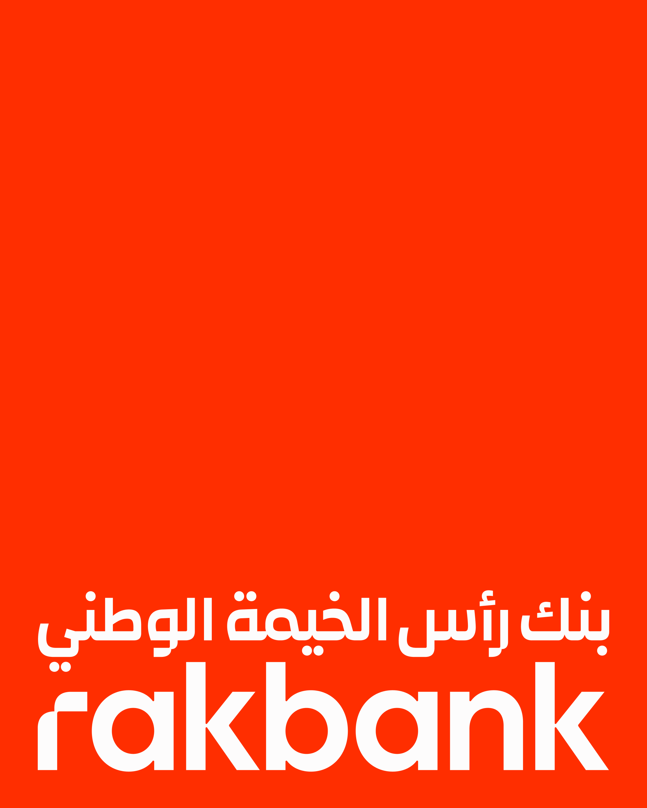
Rakbank has refreshed its logo and identity as it approaches 50 years in the UAE. Koto refined the sail-inspired symbol, aligned the Arabic and Latin wordmarks, and pushed the bank's familiar red into a brighter system. The interesting design question is whether a bank can look more digital without looking less human.
The answer here is a coordinated identity rather than an isolated app icon. Koto's project case shows the mark on signage, cards, and digital products, while Rakbank's own introduction frames the change around service as well as speed.
A sail with a job to do
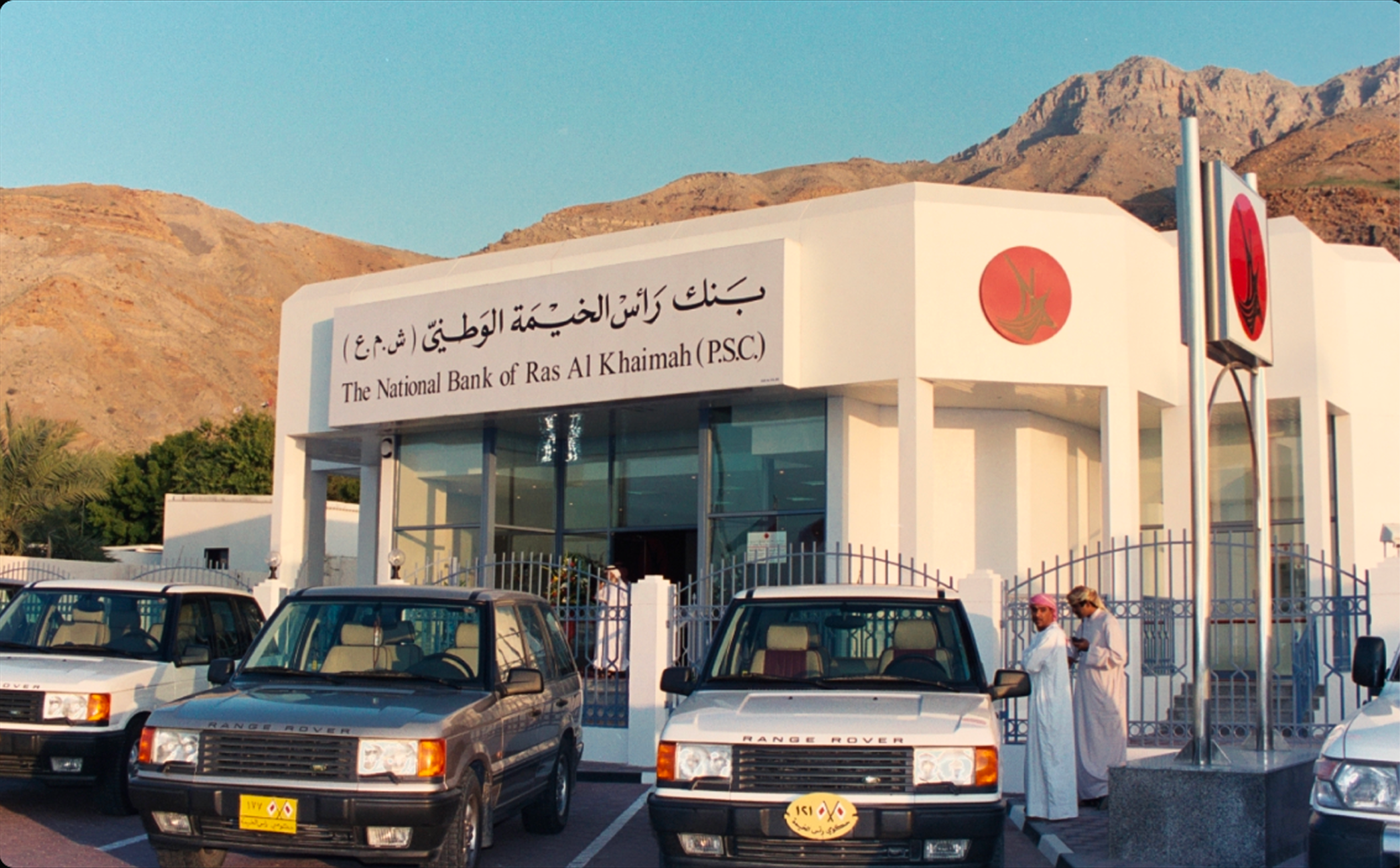
The old dhow sail already connected Rakbank to place. Koto kept that idea but tightened the shape and its relationship with the name. That is a more disciplined move than swapping heritage for a generic finance symbol. A recognizable cue can survive a redesign when its proportions and applications become clearer.
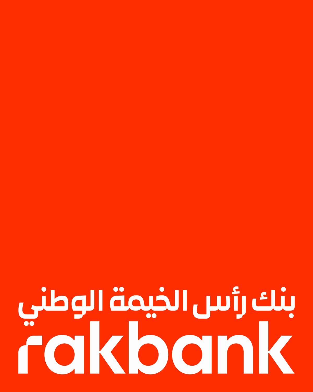
Image: Koto / Rakbank Arabic and Latin wordmark.
The system has to cross languages and channels
A bilingual bank does not have one logo problem; it has a family of lockups, card names, branch signs, and tiny screens to manage. Koto describes a masterbrand system spanning Personal, Business, Wholesale, and Islamic banking, plus 11 card designs. The strongest evidence of a refresh is whether those many pieces start to feel related.
The lettering carries that relationship. Koto paired a handwritten style with a digital counterpart and designed ligatures across Latin and Arabic. The two modes are a visual version of the bank's service promise: fluid enough for a person, precise enough for a screen.
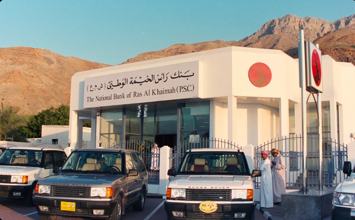
Image: Koto / archival Rakbank branch exterior used to discuss heritage.
Two useful comparisons from finance branding
Mastercard's brand history shows how its overlapping circles became a simpler, more flexible digital symbol. Rakbank faces a related scaling challenge, but its sail retains a specific geographic meaning. The lesson is to simplify the recognizable cue rather than discard it.
In Pentagram's Tala identity, forms inspired by local architecture also shape the wordmark. Tala and Rakbank use different visual languages, yet both show that regional references work best when they become rules for a whole system, including type, rather than a single decorative icon.
What smaller finance brands can borrow
First, identify the local symbol customers already know before drawing a new one. Next, test the same mark on a debit card, branch sign, and mobile header. Finally, specify how the wordmark works in every language the brand actually uses. A polished logo alone cannot solve those operational questions.
If you are building a finance identity, start with a focused mark in the Sologo logo maker, then check its type and naming in the wordmark maker. Put the promising option into real touchpoints with the AI mockup tool before you call the system finished.