Kuwait's &Cookies needed to feel new in a crowded dessert market. Fishfinger answered with a bouncy logo, an ampersand that behaves like a character, and just three main colors: buttercream, pink, and red. The brand was featured by Brand New on September 25, and its agency case shows the identity working beyond a single neat logo slide.
The striking part is restraint. Fishfinger did not need a large palette or dozens of decorative motifs to make the shop look energetic. The identity concentrates its personality in type, oversized product photography, and a few deliberately imperfect cookie doodles.
The logo is a voice before it is a badge
A food brand has to speak in short bursts: a box, a cup, a menu, a social caption. &Cookies uses direct copy and a lively wordmark so those bursts sound like one place. The ampersand helps the name feel open-ended, a useful fit for an ever-changing menu of flavors and drinks.
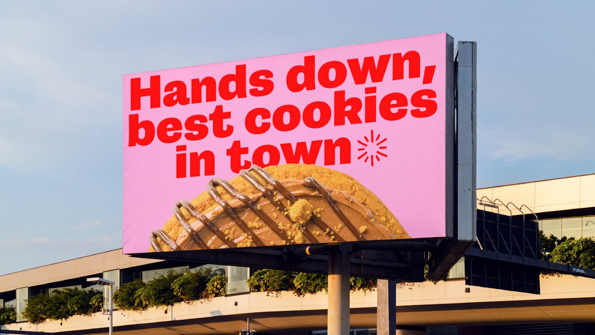
Image: Fishfinger / &Cookies billboard showing the brand typography.
Three colors, many combinations
Buttercream gives packaging warmth, pink creates a playful field, and red supplies impact. The compact palette makes an outdoor billboard and a small takeaway box recognizably related. The system can vary its layout without making every touchpoint look unrelated.
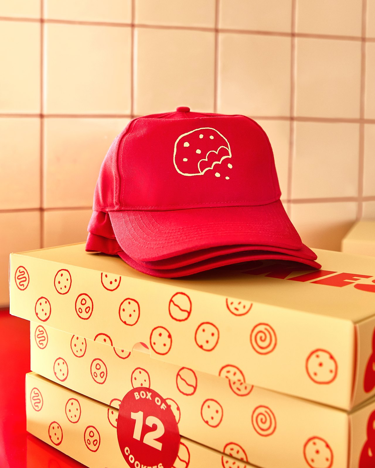
Image: Fishfinger / &Cookies cap and box packaging.
Why the box matters more than the mockup
Customers carry packaging through the street and photograph it at home. Fishfinger extended the system to uniforms, store design, and motion as well as boxes. That is the practical difference between a logo that looks good in a portfolio and an identity that advertises itself during everyday service.
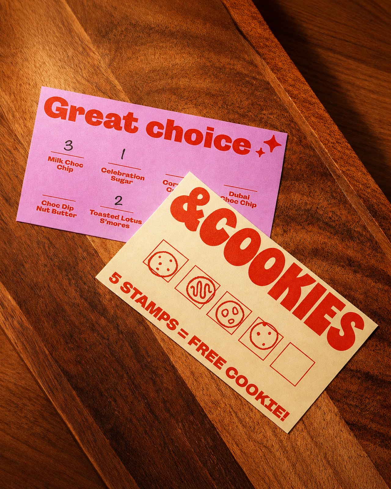
Image: Fishfinger / &Cookies printed menu and takeaway design.
What other food identities make visible
Pentagram's Parla identity gives pizza boxes and stickers an energetic typographic and color system. Its playfulness travels with the food, just as &Cookies' wordmark and palette do. Van Leeuwen's identity takes a quieter route: a restrained logo anchors colorful ice cream pints. Together, the cases suggest a useful choice for a dessert brand: decide where the personality lives, then repeat that logic on every package.
If you are designing for a bakery or cafe, begin with a wordmark concept that still reads on a small label. Then test a tight palette in the brand kit generator and place it on a box or storefront with the AI mockup tool. The package is where customers will judge it.