Carter's has replaced its straightforward blue wordmark with a flowing script and a shooting star where the apostrophe used to sit. The company announced the refresh on September 15; Brand New highlighted the logo on September 25. The mark is a compact expression of Carter's new promise to let every child's light shine.
Look at the before-and-after comparison: the old mark was efficient, but it could have belonged to many retailers. The new stroke rhythm is more personal. The star turns punctuation into a memorable device without hiding the brand name.
A tiny symbol needs a clear role
The star is not decoration pasted beside the logo. It replaces a character already in the name, so it is encountered whenever the wordmark is read. That gives the brand a small piece it can potentially use on labels or campaign materials. It also creates a practical test: at tiny size, the word must still read as Carter's.
Heritage is a design resource, not a costume
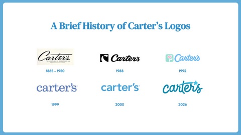
Carter's says the script draws on earlier marks in its 161-year history. The company's timeline of logos makes that connection visible. A script can suggest care and familiarity in childrenswear, but it needs enough clarity for an ecommerce header, clothing tag, and store sign.
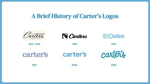
Image: Carter’s / Business Wire history of the brand wordmark.
The campaign has to make the promise believable
The new identity arrives with the Watch Them Glow campaign and commitments to children and families. Those actions matter because a star alone cannot carry a claim about individuality. The logo sets the tone; products, imagery, and experiences have to give that tone substance. Carter's says the identity will roll out in 2026, with more retail and packaging applications in 2027.
When an established script keeps evolving
Coca-Cola's current visual system keeps its familiar Spencerian script while making the surrounding system work across packaging and digital surfaces. Campbell's updated soup label similarly refines a signature-based logo while simplifying other label details. Carter's is newer to this script direction, so its test is whether the star and lettering remain clear as that wider system rolls out.
For a kidswear or family brand, try drawing one meaningful cue from the name or history before adding a mascot. Build several directions in the name-to-logo maker, refine legibility with the wordmark maker, and test the favorite across packaging and social assets in the brand kit generator.