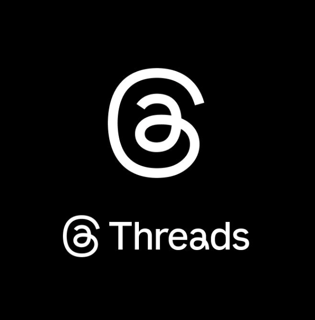
Threads did not radically rebrand in May 2026. It made a more interesting move: a small typographic refresh that signals a big positioning change. The updated logo is heavier, slightly italic, and more confident as an app icon.
If you design logos for digital products, this is the kind of update worth studying. Most people will not describe the details. But they will feel the result: the icon holds its own in a crowded grid, and the brand feels less like a side project.
Threads refreshed its logo and wordmark to read better as an app icon and feel more standalone.
What Changed in the Threads Logo?
At a glance, it looks like two simple decisions:
- More weight so the mark does not collapse at small sizes.
- A forward italic slant that gives the wordmark posture and motion.
LogoLounge also highlights a continuous-line idea in the mark, which helps support the product story: on Threads, the conversation keeps going.
The previous Threads logo carried more inherited Instagram typographic cues.
Why This Matters: The App Icon Grid Is the Real Battlefield
In the app store, on a home screen, and inside a share sheet, logos are not judged like posters. They are judged like UI components. They compete for recognition at 48–64px, often on mixed backgrounds, often next to sibling brands.
Threads had a specific branding problem: the original look carried visible DNA from Instagram Sans. That can be useful early on, but it also makes the product feel inherited rather than distinct. When a product matures, that inheritance starts to limit it.
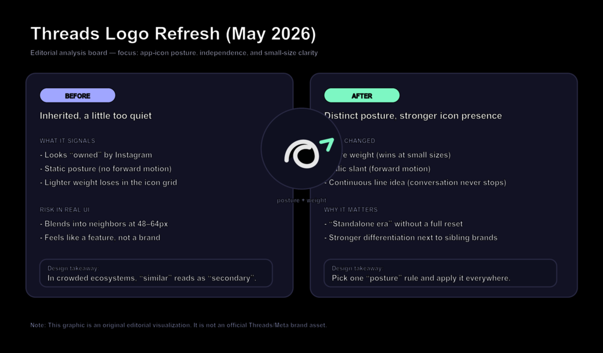
Editorial analysis graphic: a practical way to think about weight, posture, and differentiation.
Broader Trend: Child Brands Need a Visual Exit Strategy
More products launch as extensions: inside a platform, inside a suite, inside a parent company ecosystem. That is convenient for adoption, but it creates a design debt: at some point the brand needs to prove it can stand alone.
The Threads update is a clean example of an exit strategy that preserves recognition:
- Keep the recognizable skeleton.
- Change one or two system-level rules (weight and posture).
- Apply them consistently across icon, wordmark, and typography.
What Smaller Brands Can Learn
If you are designing a logo for an app, SaaS tool, creator product, or online store, borrow the principle, not the style:
- Start from legibility. If it does not read at 48px, it is not ready.
- Pick one posture rule. For example: heavier weight, slight slant, wider spacing, or sharper terminals.
- Reduce inherited cues. If you look like someone else's feature, you will be treated like it.
- Test in context. Put the icon next to competitors in a grid and see what disappears.
- Turn your rule into a system. Extend it into typography, buttons, and templates, not just a logo file.
Design a Screen-Ready Wordmark Logo
If you want a wordmark logo that stays readable as a small icon, start by exploring weight and posture variations. Try Sologo Wordmark Maker for clean, digital-first wordmarks. Then build consistency with the Brand Kit Generator and test real-world usage with the AI Mockup Generator.