Tupperware has unveiled a fresh new identity with its recent logo redesign, marking a significant shift in its branding strategy. The update, developed by Landor, aims to resonate with modern audiences while maintaining the brand’s legacy.
Tupperware's New Logo Design
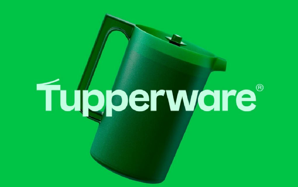
Landor’s solution is guided by the strapline “Utility is beautiful.” The new logo takes inspiration directly from the brand’s products: the peel-off container lid is reimagined as a capital letter T with its top peeled back, while the color palette draws from the hues of Tupperware containers. In addition, the scalloped shape found on container lids has been repurposed as a call-out device, prominently carrying the message “The Original Since 1946.”
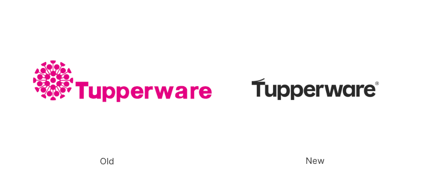
This visual system emphasizes simplicity, functionality, and recognition. Compared with earlier logos that leaned on intricate detailing, the 2025 redesign opts for a cleaner, more product-inspired identity.
The Evolution of Tupperware’s Logo
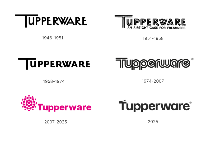
Over the decades, Tupperware has continuously evolved its logo to align with changing consumer tastes. The 2007 update introduced a splash of color, while the new 2025 version fully embraces minimalism and product-driven storytelling. This marks a natural progression from decorative detail toward functional clarity.
Conclusion
Tupperware’s new identity demonstrates how design can translate product characteristics into brand meaning. By turning everyday details—like a peel-off lid or a scalloped edge—into distinctive visual elements, the redesign reinforces the connection between form and function. It is a strategic shift that highlights utility as beauty, positioning the brand visually for modern relevance while honoring its heritage.