In 2025, bakery logos are rising beyond cute whisk icons and pink frosting motifs. As artisanal baking meets premium aesthetics, brands are rethinking how warmth, craft, and identity come together visually. Whether you’re opening a boutique patisserie or rebranding your local bakery, understanding the latest logo design directions will help you bake personality into every pixel. This guide explores four major bakery logo trends in 2025—each with real examples and design takeaways you can apply using an AI logo generator.
Vibrant Simplicity: Expressing Energy Through Color
Many modern bakeries are stepping away from pastel sweetness toward bold, saturated tones that feel both fresh and confident. This approach communicates energy, creativity, and a sense of handmade imperfection—perfect for bakeries that want to stand out in a crowded market.
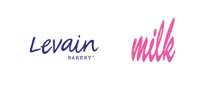
- Example – Levain Bakery: Levain’s royal blue logo is instantly recognizable. Its handwritten typography paired with the deep blue background conveys both warmth and strength—inviting yet assertive. The blue also contrasts beautifully with golden-brown baked goods, creating a visually appetizing balance.
- Example – Milk Bar: The vivid pink cursive logo mirrors the playful, experimental tone of Christina Tosi’s desserts. It’s casual, confident, and youthfully modern—a great reminder that bakery branding can be both fun and iconic.
Design tip: Choose a vibrant brand color that reflects your bakery’s mood—blue for trust, pink for creativity, orange for warmth. Keep the rest of your logo simple so the color takes center stage.
Elegant Typography: The Rise of Serif Wordmarks
Minimal wordmarks are trending across luxury bakeries in 2025, reflecting precision and sophistication. Serif fonts, in particular, suggest heritage, artistry, and care—values deeply aligned with slow-baked craftsmanship.
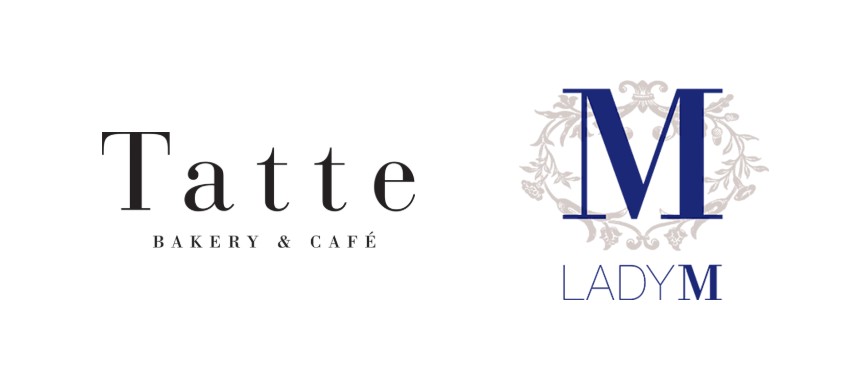
- Example – Lady M: The uppercase serif “M” framed in a floral emblem represents refinement and delicacy. The monochrome palette highlights the elegance of the brand without unnecessary flair, positioning Lady M closer to a luxury fashion house than a casual bakery.
- Example – Tatte Bakery & Café: Though minimalist, Tatte’s black serif logotype feels timeless and artisanal. Its typography-first design builds trust and aesthetic harmony, appealing to urban audiences seeking authenticity.
Design tip: Serif fonts evoke tradition and artistry, while sans-serifs communicate modern minimalism. Consider combining both for contrast—a serif wordmark with a sans-serif tagline often works beautifully.
Heritage Revival: Craft Meets Nostalgia
2025 also sees a nostalgic turn in bakery branding—reviving vintage motifs like shields, ribbons, or circular seals that recall old-world craftsmanship. This aesthetic works particularly well for bakeries emphasizing handmade quality and history.
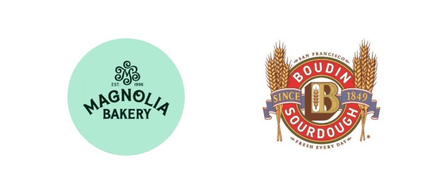
- Example – Magnolia Bakery: Its soft mint green and cursive logo nod to 1950s Americana, invoking nostalgia and comfort. Magnolia’s branding transports customers to simpler times while staying fresh and relevant through clean composition.
- Example – Boudin Bakery: Established in 1849, Boudin’s rope-bordered emblem and serif typography exude authenticity. The logo’s red-and-gold palette honors its San Francisco roots while maintaining visual clarity.
Design tip: Pair vintage typography with balanced spacing and modern icons—this ensures your logo feels classic but not outdated.
Minimal Marks & Icons: Modern Artisanal Identity
For newer boutique bakeries, simplicity speaks volumes. Minimal iconography—like line-drawn croissants, wheat stalks, or abstract shapes—keeps branding flexible across digital and packaging uses. The goal: modern, scalable, and instantly readable.
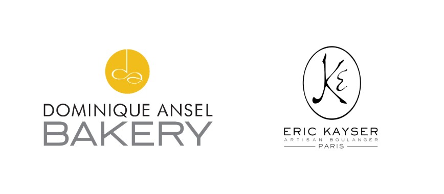
- Example – Dominique Ansel Bakery: The circular monogram “DAB” mark is clean yet distinctive, ideal for both storefronts and packaging. It reflects modern craftsmanship—polished, precise, and globally recognizable.
- Example – Eric Kayser (Maison Kayser): The stylized wheat emblem paired with slender typography embodies French artisanal excellence. The design’s restraint mirrors the brand’s focus on technique and balance.
Design tip: Think in symbols. Even if you start with a wordmark, test how your initials or a small emblem might work as a compact logo variation for packaging or digital avatars.
Final Thoughts
The best bakery logos in 2025 blend artistry with clarity. From Levain’s bold blue to Lady M’s elegant serif, these examples show how color, typography, and simplicity can tell powerful brand stories. If you’re ready to bring your bakery’s vision to life, logo maker tools like Sologo AI make it effortless. As an AI logo creator, Sologo AI lets you:
- Generate unlimited design variations until you’re satisfied
- Experiment with multiple color palettes and font pairings
- Visualize your logo in real-life brand kits—on packages, products, and menus
With its smart generation modes, Sologo helps bridge your creative idea and professional design execution, even if you’re not a designer.