The automotive industry is abuzz with the introduction of BMW’s new logo, making its debut on production cars — 2026 iX3. This change marks a significant shift in the brand's visual identity, offering a fresh perspective for both enthusiasts and designers alike.
BMW’s New Logo Design
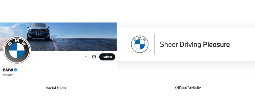
BMW’s latest logo redesign was first introduced in 2020 (for brand communication only.) The new design showcases a sleek and modern aesthetic, emphasizing simplicity and clarity. It features a flat design, removing the 3D elements that characterized its 1997 predecessor. The color palette remains true to its roots with the iconic blue and white, but with a more refined and contemporary look. Typography has been streamlined, providing a cleaner and more sophisticated appearance.

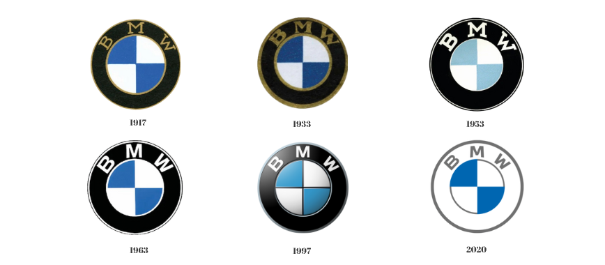
The Evolution of BMW’s Logo
BMW’s logo has undergone several transformations since its inception. Originally launched in 1917, the logo has seen changes in style and design, reflecting the brand’s growth and adaptation over the years. Key milestones include the transition to a more polished design in 1963 and the introduction of 3D elements in 1997, which have now been removed in the latest version.
Design Advantages of the New Logo
The decision to redesign BMW’s logo stems from the desire to align with modern design trends and enhance brand recognition. The flat design is more versatile, adapting seamlessly to digital platforms and print media. This change reflects BMW’s commitment to innovation and staying ahead in the competitive automotive market.
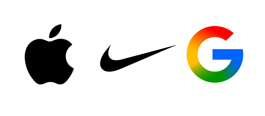
Brands with Similar Visual Strategies
- Apple Apple’s logo is a prime example of a minimalist design that has stood the test of time. The sleek, flat design mirrors BMW’s approach, emphasizing simplicity and brand recognition.
- Nike Nike’s logo, the iconic swoosh, is another example of effective minimalism. Its clean lines and adaptability have made it instantly recognizable worldwide, paralleling BMW’s strategy.
- Google Google’s logo evolution towards a flat design mirrors the trend BMW follows. The use of primary colors and straightforward typography enhances clarity and brand identity.
Conclusion
BMW’s new logo debut on production cars highlights the importance of adapting to modern design trends while maintaining brand heritage. Designers can learn valuable lessons in simplicity and adaptability, understanding that a logo is not just an emblem but a storytelling tool that evolves with the brand.