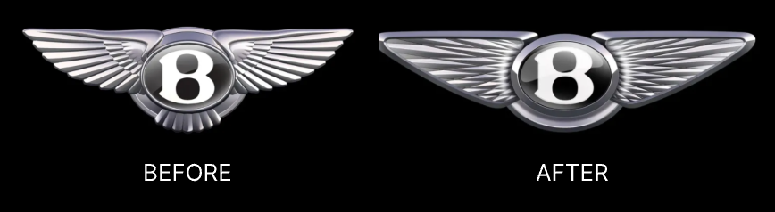
On July 1, 2025, Bentley unveiled a simplified version of its iconic Winged B emblem, marking the fifth redesign in the brand’s hundred-year history. Created by Bentley’s in-house design team, led by Robin Page, the new car logo signals a new era for the marque’s brand identity. It will debut on a concept car launching later this month.
What’s New in Bentley’s Logo?
· Jewel-Like “B”
The central "B" has been reimagined with inspiration from high-end watchmaking. No longer a flat engraving, it now features a jewel-like, 3D glass structure — giving it a premium, modern presence. This standalone "B" can be flexibly used across digital platforms like websites, social icons, and app interfaces.

· Refined Wing Structure
The core Winged B elements remain, but the wings have been simplified and stylized with a more geometric diamond pattern. The number of feathers has been balanced — now 10 on the left, 11 on the right — while the feathers beneath the central "B" have been completely removed for the first time.
With cleaner lines and better proportions, the new logo feels more agile and futuristic, while staying rooted in Bentley’s legacy.
Alongside the physical badge, Bentley also introduced a flat version of the new logo, designed for marketing and digital communications. This line-drawn variant appears in launch videos and will likely become a standard for web, print, and other modern media applications.

A Brief History of the Bentley Logo
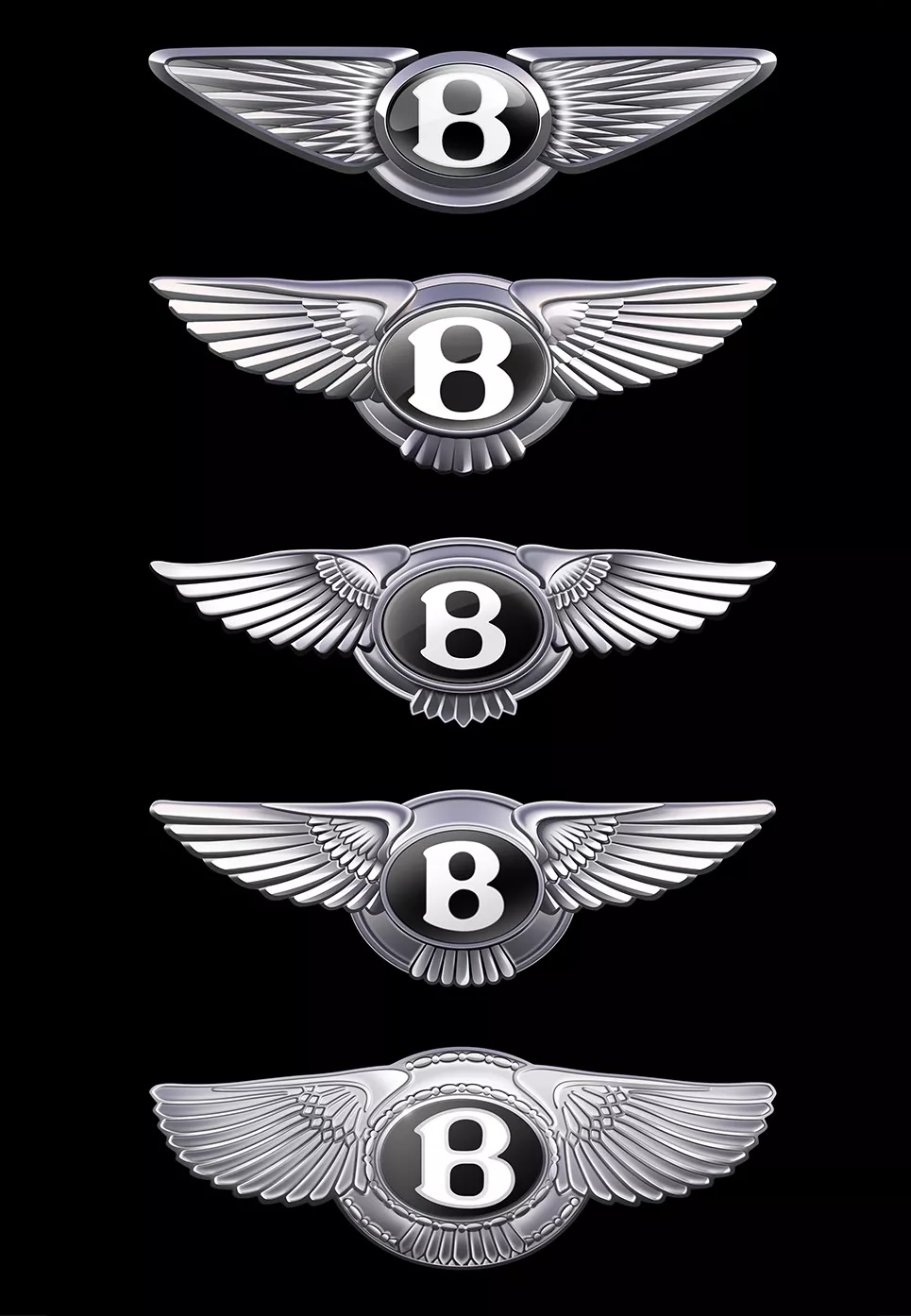
Since 1919, Bentley’s logo has undergone five major updates while always keeping its core design: the bold “B” with wings.
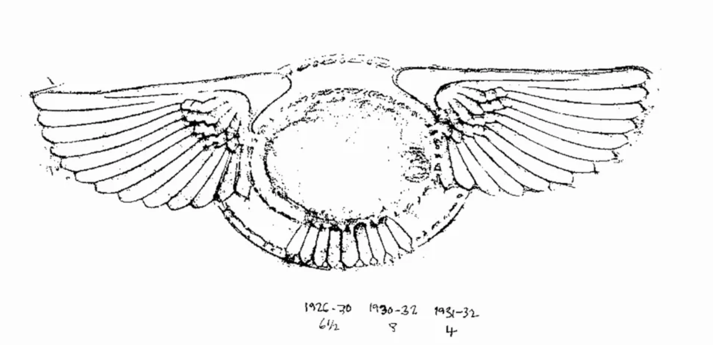
This emblem draws inspiration from the founder, W.O. Bentley’s aviation background—he was an engineer who designed aircraft engines during World War I. The wings in the logo symbolize speed, freedom, and precision, echoing both the spirit of flight and the high-performance engineering that Bentley cars embody.
A Wave of Logo Simplification Across Car Brands
Bentley’s new logo is part of a broader trend in the automotive industry, where heritage carmakers are streamlining their brand identities for the digital age.
Audi rolled out a flat, black‑and‑white version of its four-ring emblem in 2022, removing chrome and gradients to improve digital clarity and versatility.

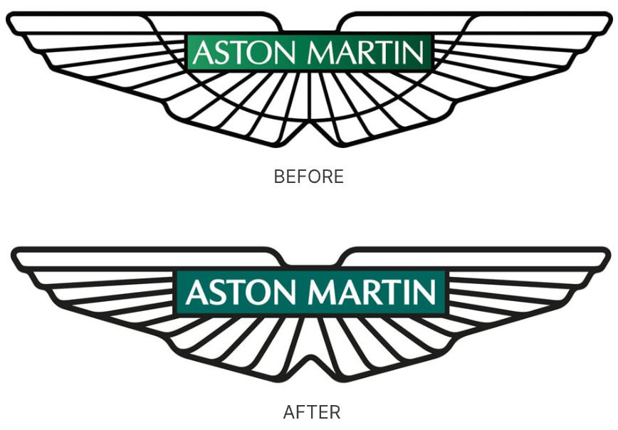
Aston Martin collaborated with designer Peter Saville for a “subtle but necessary” update to sharpen its iconic winged logo while retaining its classic elegance.
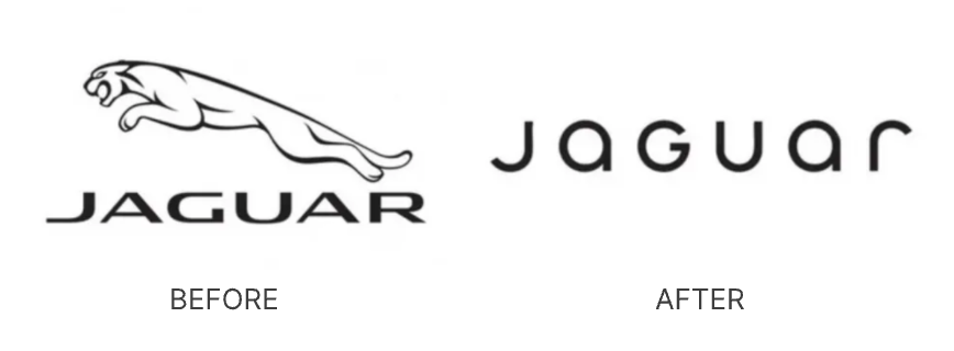
Jaguar launched a bold rebrand in 2024, dropping its leaping cat for a stylized “JaGUar” wordmark. The futuristic, car-free ads sparked backlash online—Elon Musk even joked, “Do you sell cars?”
Conclusion
Bentley’s new car logo strikes a delicate balance—refining a century-old emblem for today’s digital-first world. With cleaner lines, a simplified wing design, and a more sculptural “B,” the update honors the brand’s heritage while embracing modern luxury.
As more car brands rethink their visual identity, Bentley shows that evolution can still feel timeless.
✨ Design Your Own Iconic Logo with Sologo.ai
Bentley’s refined logo shows how powerful a subtle, thoughtful redesign can be — especially when rooted in heritage and made for modern platforms. Whether you’re building a brand from scratch or refreshing an old symbol, you can do the same.
With Sologo.ai, turn sketches, photos, or ideas into sleek, professional logos — no design skills needed. Just upload an image and let AI help you create something timeless, just like Bentley did.