In the world of branding, a smart logo isn’t just a beautiful image—it's a gateway into the brand’s soul. A well-crafted logo goes beyond aesthetics, embedding subtle messages that enhance brand storytelling.
While AI Logo Generator tools like Sologo AI make it easy to generate endless logo variations, the real challenge lies in choosing or crafting one that speaks. The world’s most iconic logos often carry hidden details that make them unforgettable. Let’s explore how these subtle elements elevate brand storytelling — and what you can learn from them.
Negative Space & Visual Illusions
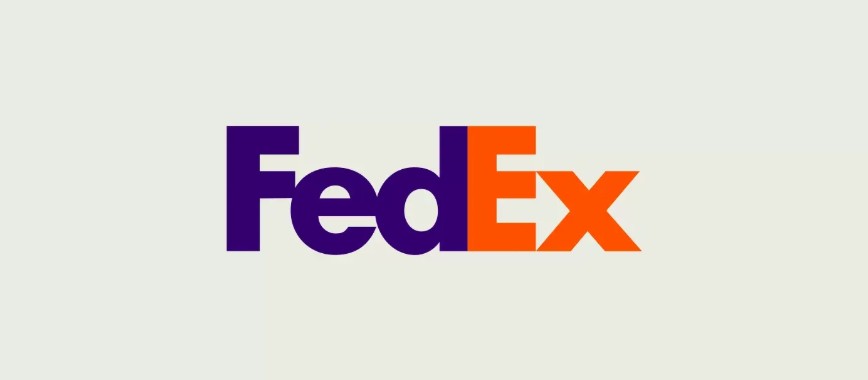
FedEx: The Arrow of Precision
The FedEx logo is another celebrated example of hidden design opportunities. The logo features a negative space arrow between the “E” and “X”, which discreetly signals speed, precision, and forward movement. This hidden arrow reinforces FedEx’s reputation for reliable and efficient delivery, making an immediate and memorable visual impact.
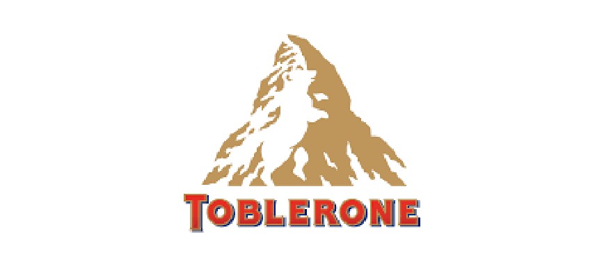
Toblerone: A Bear with a Story
Toblerone’s logo hides an intriguing secret within the image of the mountain. A subtle outline of a bear, drawn from the heraldic symbol of Bern (the brand’s hometown), is nestled into the design. This clever integration connects the brand to its Swiss origins and embeds a piece of local lore into the product’s identity.
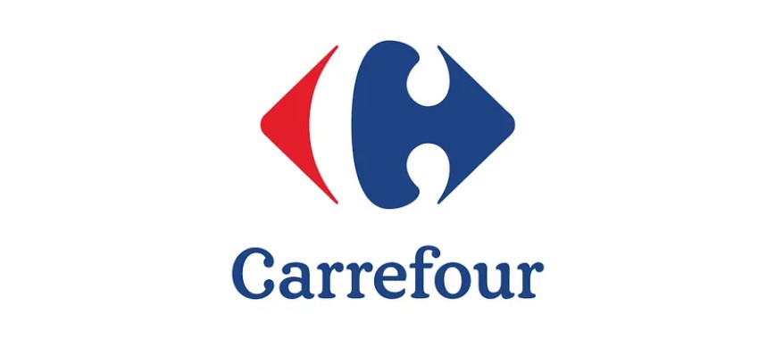
Carrefour: The Intersection of Choice
Carrefour’s logo draws from linguistic and visual interplay. In French, “Carrefour” means “crossroads”, and the logo components subtly mimic an intersection or a fork in the road. This design hints at the endless product choices available at the store, reinforcing the concept of a marketplace where numerous options converge.
Takeaway: Negative space is never truly empty. When used wisely, it becomes a powerful storytelling tool that adds layers of meaning without visual clutter.
Numbers, Letters & Symbolic Hints
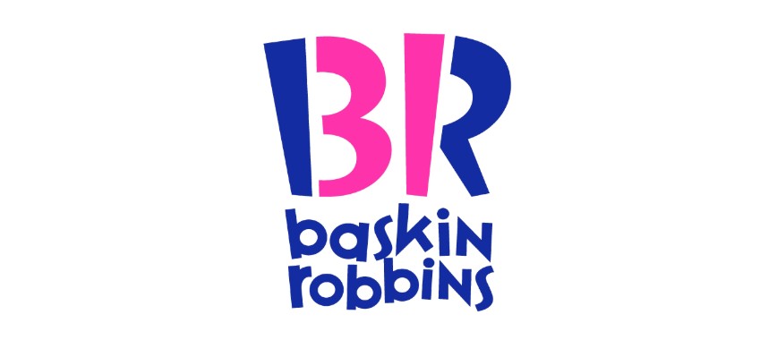
Baskin-Robbins: A Scoop of Subtlety
Baskin-Robbins has ingeniously incorporated its signature number “31” into the logo, representing its promise of delivering 31 unique ice cream flavors. This hidden element not only underscores its extensive range but also sparks curiosity among observers, inviting them to explore the brand’s diverse offerings.
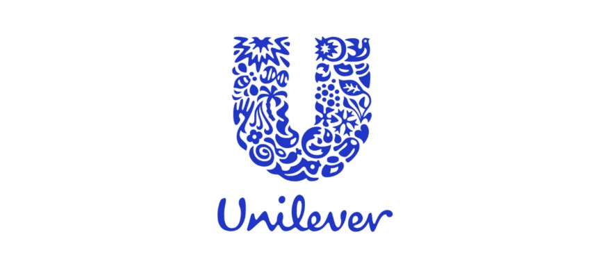
Unilever: A Mosaic of Possibilities
Unilever’s logo is a masterclass in multipurpose design. Comprising hundreds of miniature icons, the “U” encapsulates the diverse range of products from food to cleaning supplies. Each small element is a nod to the wide array of goods that Unilever markets, transforming the logo into a narrative mosaic of the brand’s extensive portfolio.
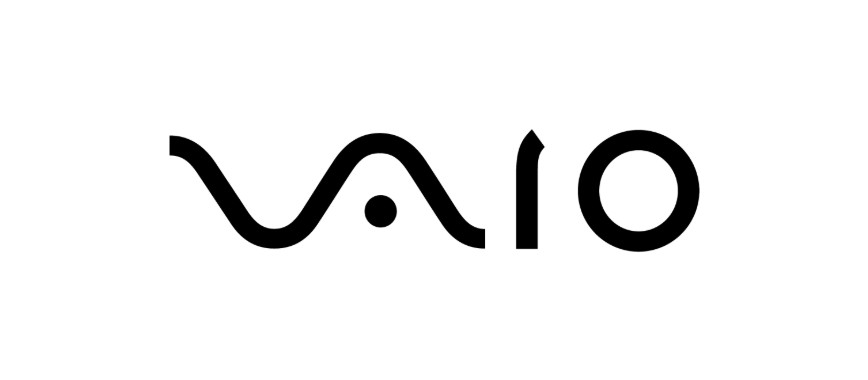
Sony VAIO: Bridging Analog and Digital
Sony VAIO’s logo transcends the conventional by encapsulating the evolution of technology. The design splits into two distinct parts:
- V and A: These letters resemble analog waveforms.
- I and O: These characters echo the binary code of the digital world.
This fusion not only reflects the technological shift from analog to digital but also positions the brand as a bridge between eras.
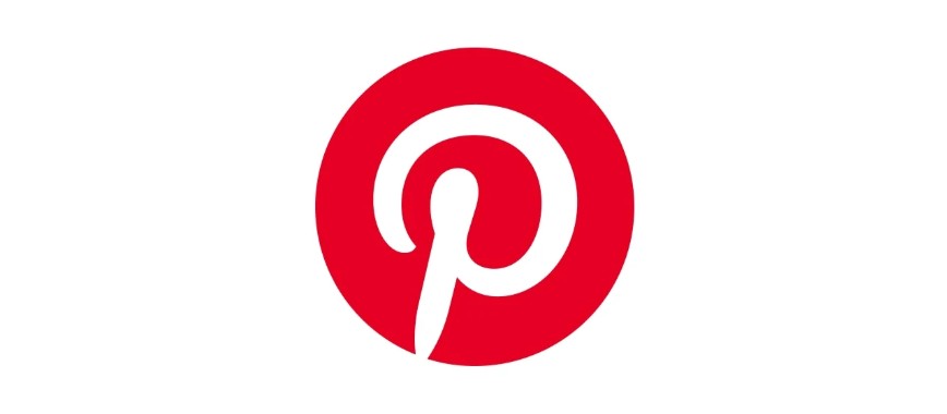
Pinterest: Pinning Down Inspiration
Pinterest leverages its initial into a symbol that doubles as a pushpin—an instantly recognizable tool for pinning ideas and saving inspiration. This dual-purpose design reflects the platform’s core functionality in a visually simple yet highly effective manner, instantly communicating its purpose to users.
Takeaway: Typography isn’t just text—it’s an opportunity. Smart integration of numbers, letters, or shapes turns your logo into a puzzle that rewards discovery.
Emotion & Personification
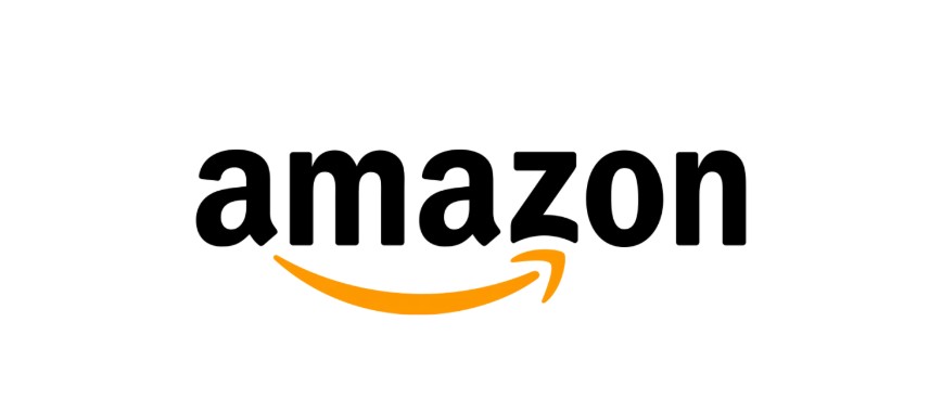
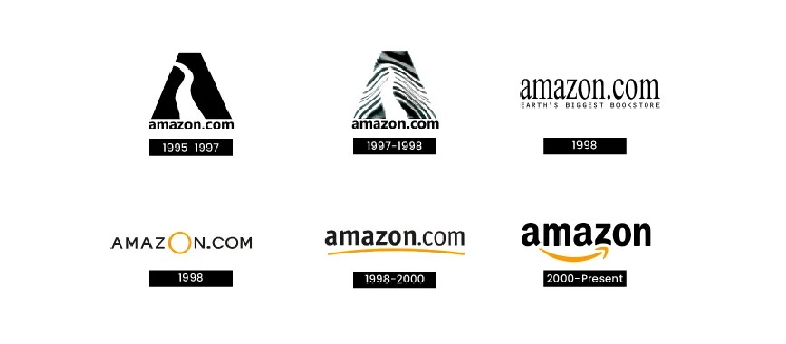
Amazon: A Smile That Defines the Brand
Amazon’s logo is a masterclass in how visual design can capture a brand’s personality. From 1995 to 2000, the company experimented with several logo variations before settling on the now-iconic version featuring a curved arrow beneath the wordmark. Stretching from “A” to “Z,” the arrow symbolizes that Amazon offers everything “from A to Z.” At the same time, its gentle curve forms a smile—an intentional gesture of friendliness and satisfaction. Since its debut in 2000, this smiling arrow has remained unchanged, perfectly encapsulating Amazon’s promise of convenience, happiness, and customer care.
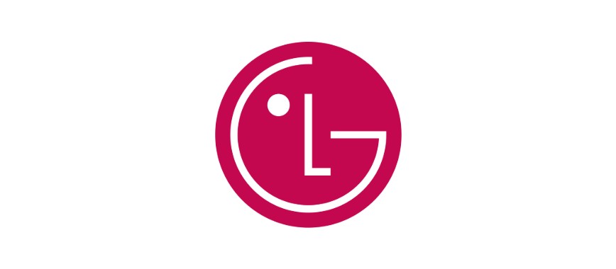
LG: Smiling Through Simplicity
LG’s logo is emblematic of friendly, approachable branding. What might appear as a simple arrangement of letters is, upon closer inspection, a stylized visage with a prominent smiling feature. This hidden smile bolsters the brand's image as optimistic and customer-centric, ensuring it remains approachable and memorable.
Takeaway: When a logo feels alive, the brand becomes more relatable. A touch of humanity transforms symbols into emotional connections.
Conclusion: The Subtle Art of Design Opportunities
The most memorable logos don’t just look good—they carry layered meanings. From Amazon’s “A-to-Z” promise to FedEx’s arrow of precision, these examples illustrate how the best designs arise from the thoughtful integration of a brand’s intrinsic characteristics.
In a competitive marketplace, a logo that communicates on multiple levels can be the spark that ignites brand loyalty and memorability. For designers and brands alike, the lesson is clear: beyond aesthetics, seek the story. Whether through clever manipulation of negative space, hidden icons, or visual metaphors, each of these cases demonstrates that the art of concealed design is a fertile ground for innovation, ultimately forging a lasting connection between the brand and its audience.
If you’re ready to experiment, AI Logo Maker tools like Sologo AI can help you generate countless variations and uncover hidden opportunities within your own brand identity.