A beer can often has only a few seconds to make itself recognizable. Carling’s refreshed identity places a detailed badge on the pack and the pint glass, borrowing the language of football clubs rather than treating football as a temporary promotion. Reported by Design Week on November 5, the BrandOpus work asks whether a lager can look like something people belong to.
BrandOpus says the badge combines the historic brewery, Burton upon Trent and British barley with the established Carling Black Label asset. The agency also describes an updated glass, founder Thomas Carling’s signature, and illustrations for stadiums and club spaces. The new identity is rolling out in shops, pubs and bars.
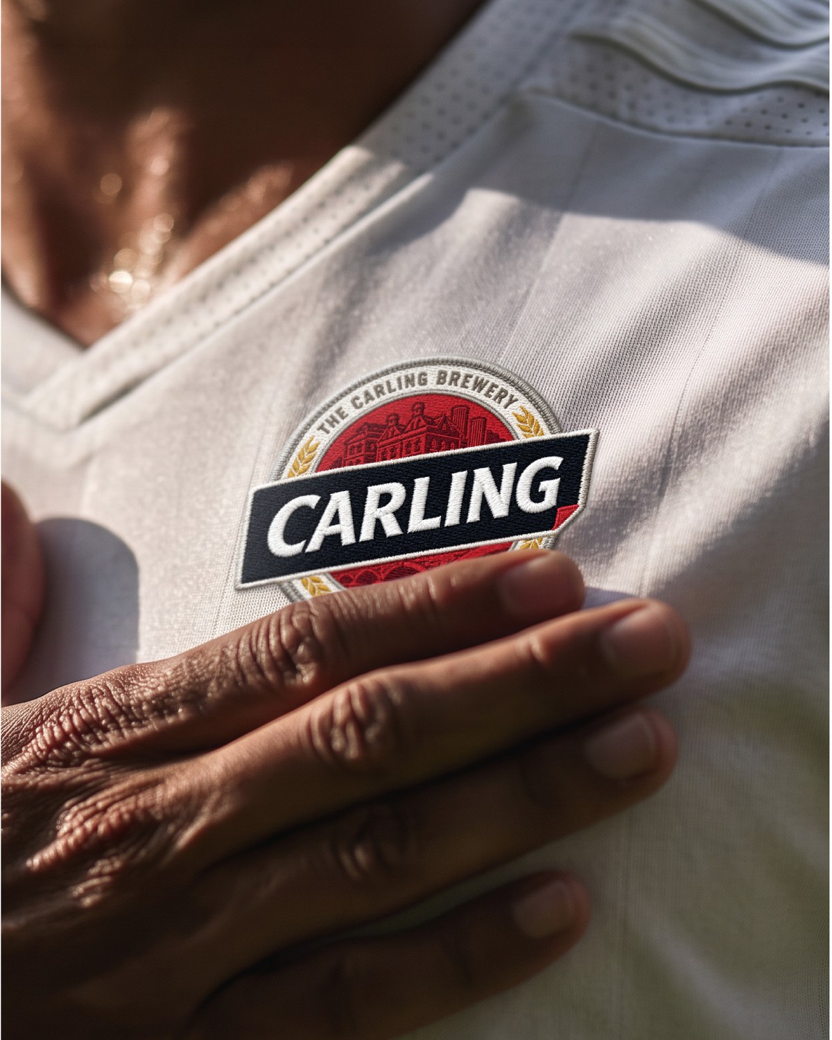
Image: Carling badge on a football jersey, BrandOpus press imagery
The badge makes heritage portable
Football crests are designed to travel: stitched on clothing, printed small on tickets, seen from the far side of a ground. Carling uses that familiar format to connect its brewing details to the shared ritual of a match or a round with friends. The badge is more than decoration when it gives the brand a repeatable shape that works on a sleeve, a can and a tap.
There is a trade-off. A detailed crest can become muddy at very small sizes. Carling’s strong black banner and familiar diagonal wordmark help the name remain readable when the illustration cannot. The packaging succeeds only if the badge’s story and the product name can be understood at different distances.
The glass is part of the identity
BrandOpus kept the glass’s interlocking structure, originally designed so multiple pints can be carried together, while adding the refreshed badge and embossed Burton upon Trent detail. That is a stronger expression of the brand’s “bringing mates together” idea than a slogan alone: the object itself supports the behavior. The can and glass use the same visual cues, making the story visible before and after purchase.
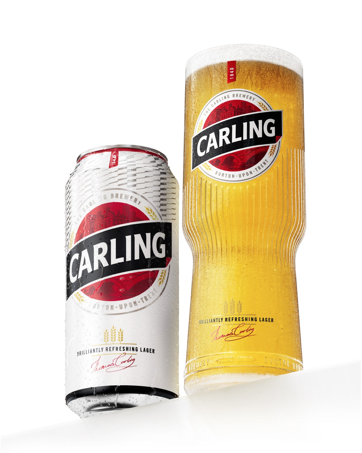
Image: Carling refreshed can and glass, BrandOpus press imagery
An identity for local clubs, not just national shelves
The agency says its mural and outdoor system can adapt to individual club colors and personalities. That flexibility needs discipline: Carling should remain recognizable while local supporters feel represented. JKR’s KFC identity offers a different example of a familiar food-and-drink brand using long-held visual assets across packaging and environments. Carling leans on the crest instead of a portrait, but both cases show why an established brand element should earn its place in daily touchpoints.
What beverage founders can learn
Look for an honest ritual around the product before designing a badge. Heritage details help only when they connect to something customers experience now. Then test the mark on the actual container, at shelf distance, and on the objects people handle. A story that works only in a case-study close-up is not enough.
For a drink or hospitality brand, explore a legible wordmark and a compact badge or monogram. Check both on packaging and venue mockups before building a consistent brand kit.