Look at the final “f” in giffgaff’s new wordmark. Its tip points forward like a small signpost. Koto has taken that quiet detail and repeated it through offer messages, packaging and digital screens. The UK telecom brand’s refresh, covered on November 11, shows how a logo feature can help people decide where to go next rather than simply ask to be noticed.
giffgaff’s own announcement says the new look responds to a business that has grown beyond mobile into broadband and wants to keep its member-led character. Creative Boom’s report describes Koto’s signpost, acid green, custom Giffsans typeface and straightforward language.
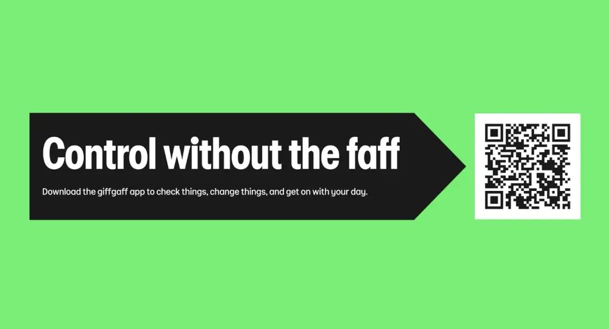
Image: Giffgaff signpost-led campaign, Koto imagery
One letter becomes a direction
The arrow works because it is already part of the name. It does not demand a second icon that must be learned separately. In a price offer, it can point to the next action; on a parcel, it can frame a message; in the logo, it adds a bit of character without breaking the reading of “giffgaff.” This is a practical system, provided the arrow remains useful rather than appearing everywhere by habit.
The condensed Giffsans adds punch to short lines such as “Control without the faff.” The green, black and white palette is high contrast, but a service brand has a harder test than a poster: prices, conditions and choices must stay easy to scan. The logo earns attention; the information architecture must earn trust.
The app is the real stress test
A member may see an advert once, then use the app every month. The mobile example shows the arrow language framing an offer while products and actions remain visible. If the device helps people distinguish mobile from broadband, or spot a better deal, it supports the brand’s stated promise of clarity. If it obscures details, the cleverness works against the service.
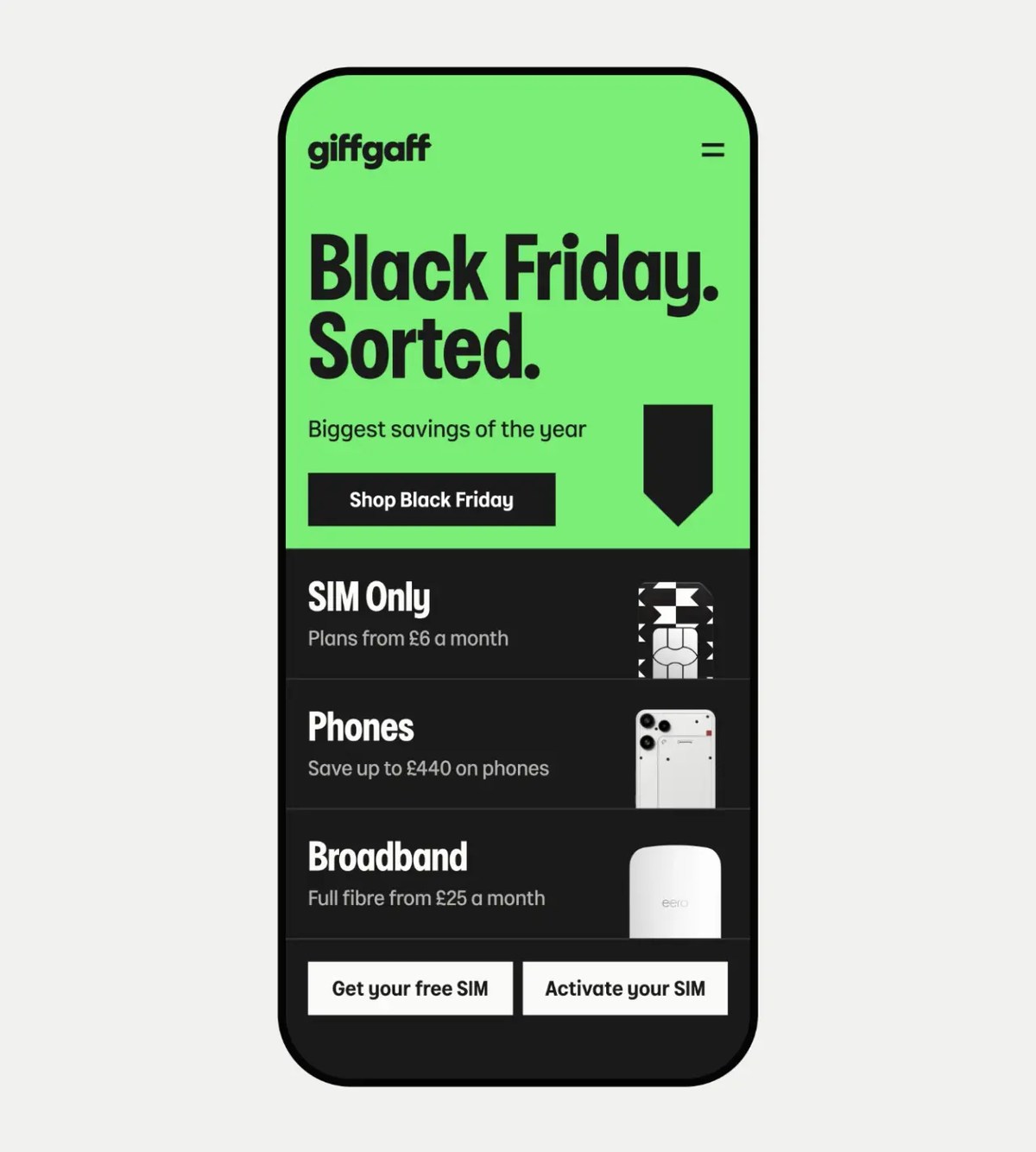
Image: Giffgaff mobile offer design, Koto imagery
A wider lesson in place and service branding
Koto’s Oxford Street identity also uses typographic character and wayfinding to help a varied audience move through a place. giffgaff faces a different task, but both systems show how a distinctive mark can connect communication to navigation. The opportunity is to make brand recognition useful at the moment of choice.
A test for small digital brands
Try identifying one shape already present in your name or product. Can it guide an action without becoming a gimmick? Test it first in a tiny icon, a dense price card and a real mobile flow. If it works only on a large presentation slide, it is still just decoration.
Explore the idea in a wordmark maker, then check it in app and packaging mockups. A brand kit can keep type, color and the directional detail consistent as your service grows.