A lot of telecom “logo refreshes” fail for the same reason: the logo is updated, but the brand still collapses inside the product. Plans, checkout flows, legal copy, and pricing grids do not care about a pretty mark. They care about clarity, hierarchy, and trust.
Lebara's rebrand is worth studying because it looks like a system built to run on screens, not just a logo file.
Lebara's identity is designed to live across high-density digital touchpoints (source: Verve).
What Changed in the Lebara Identity?
The visible change is the refreshed logo and typography posture. The strategic change is how the system handles different contexts:
- Typography as the engine: the brand expression is carried by type rhythm and controlled variation.
- Color as interface hierarchy: clear contrast and role-based color usage help users read faster.
- Consistency across touchpoints: ads, web, and product UI share the same building blocks.
Typography and layout act like the brand's chassis (source: Verve).
The same rules repeat across media so the brand stays recognizable (source: Verve).
Why This Matters: Telecom Branding Is Mostly Information Design
Telecom is a trust category. Users need to understand plans, pricing, and fine print quickly. That means the brand identity has to support two competing modes:
- Low-expression mode for product UI, plan tables, legal, and checkout.
- High-expression mode for social campaigns and attention moments.
If you only have one “loud” style, product clarity suffers. If you only have one “quiet” style, marketing disappears. The answer is a dial: a consistent skeleton with controllable intensity.
A brand system should hold together even when information density increases (source: Verve).
Broader Industry Relevance: Brand Systems Are Becoming Product Systems
More brands are judged inside apps and dashboards, not on posters. That pushes identity in a product-led direction: modular components, contrast rules, and typography systems that behave like UI tokens.
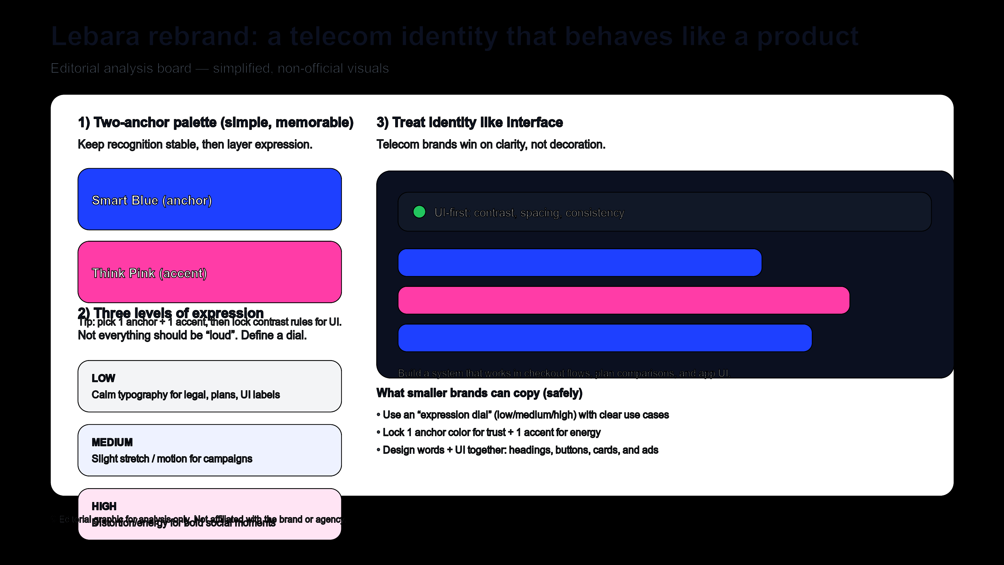
Editorial illustration (not official assets): define an “expression dial” and role-based color rules.
What Smaller Brands Can Learn
- Define 3 expression levels: low (UI), medium (web), high (campaign).
- Choose one anchor color and one accent: then lock contrast and spacing rules.
- Start from readability: if your plan table is unclear, your brand will feel untrustworthy.
- Make typography decisions explicit: weights, spacing, and headline rules matter more than decorative assets.
Design a Screen-Ready Wordmark
If your brand identity is mostly typography, start by exploring wordmark directions that stay readable at small sizes. Try Sologo Wordmark Maker for clean wordmarks, then build a consistent system with the Brand Kit Generator and test real-world usage with AI Mockup.