Kuda was already known in Nigeria as “the bank of the free.” Its new identity, shown by Barkas in October, asks a larger question: what can banking help people do beyond moving money? The answer is a “More Life” platform with a heavier Kuda wordmark, expressive type, bright color and a product experience that feels part of the same idea.
Barkas’s official case study says the team worked with Kuda and local creatives, taking cues from the energy of Lagos and the ambitions of a younger generation. That cultural starting point matters. A banking app can be technically capable yet visually interchangeable with every other finance dashboard.
A wordmark with a different weight
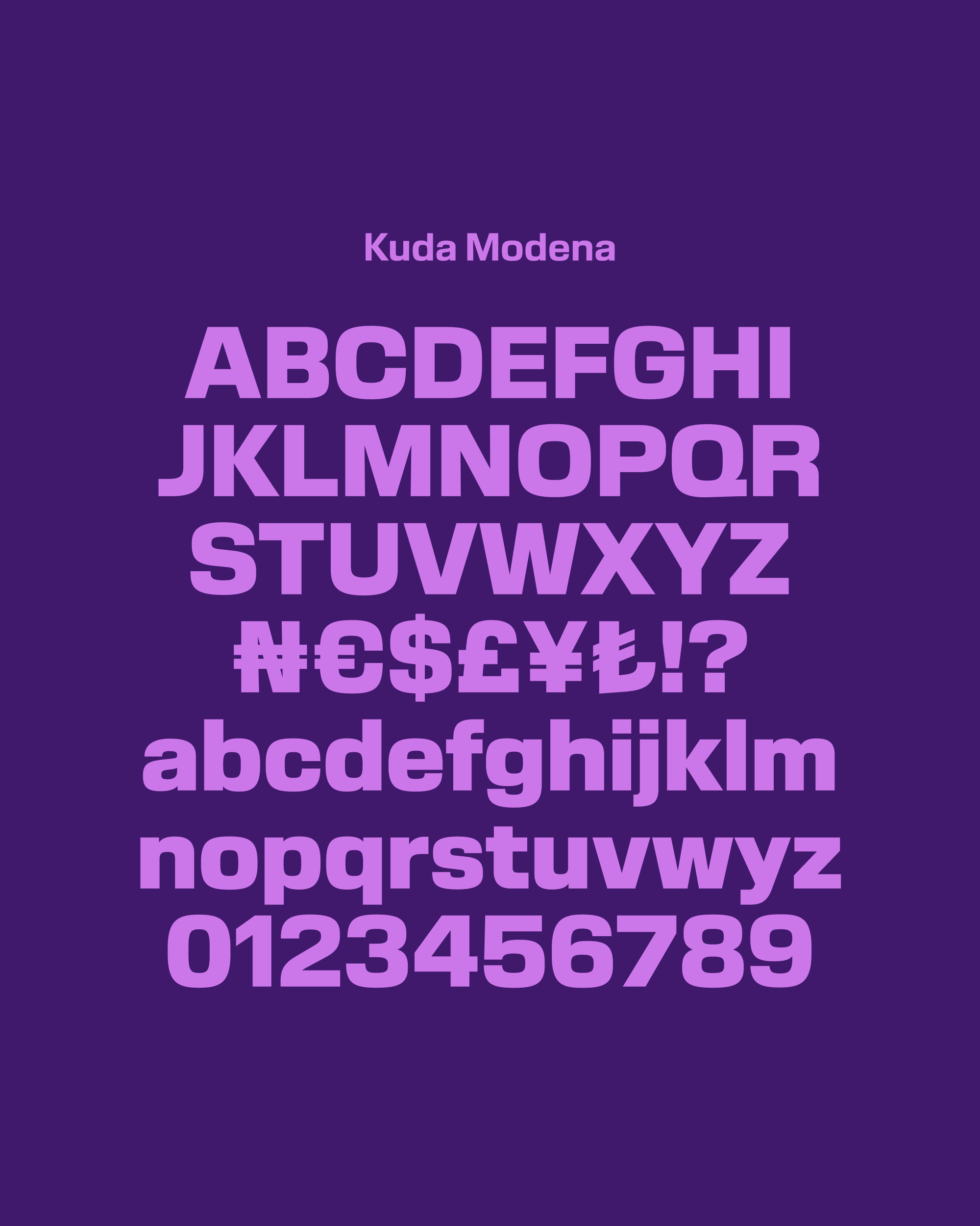
The new uppercase letters are broad and assertive. Barkas lists Kuda Modena as a custom face, with Suisse Int’l supporting it. The type does more than supply a logo: it gives campaign lines and interface moments a shared voice. In the specimen, the chunky forms can carry short messages without a separate decorative device.
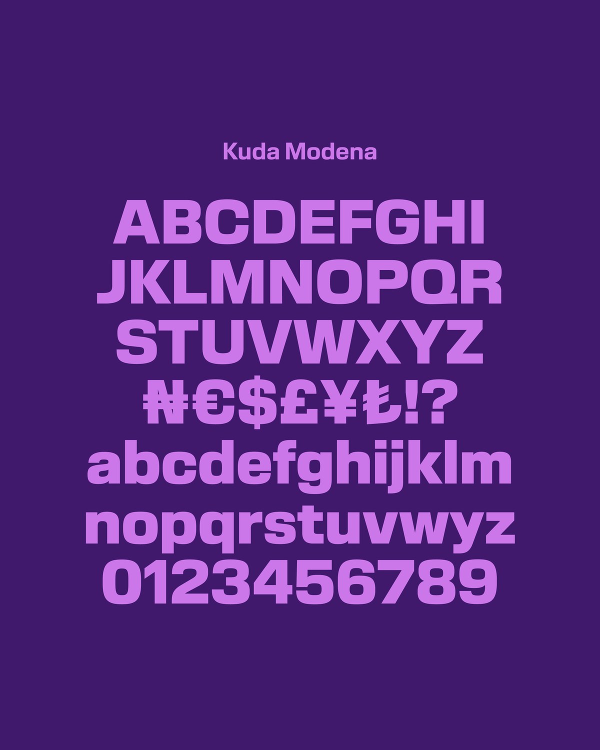
Image: Barkas specimen for the custom Kuda Modena typeface
That choice has a tradeoff. Loud display type works in a billboard or social post, but transaction amounts and controls need a calmer hierarchy. The system succeeds only if its personality remains legible at the moment a customer checks a balance or sends money.
The product must carry the promise
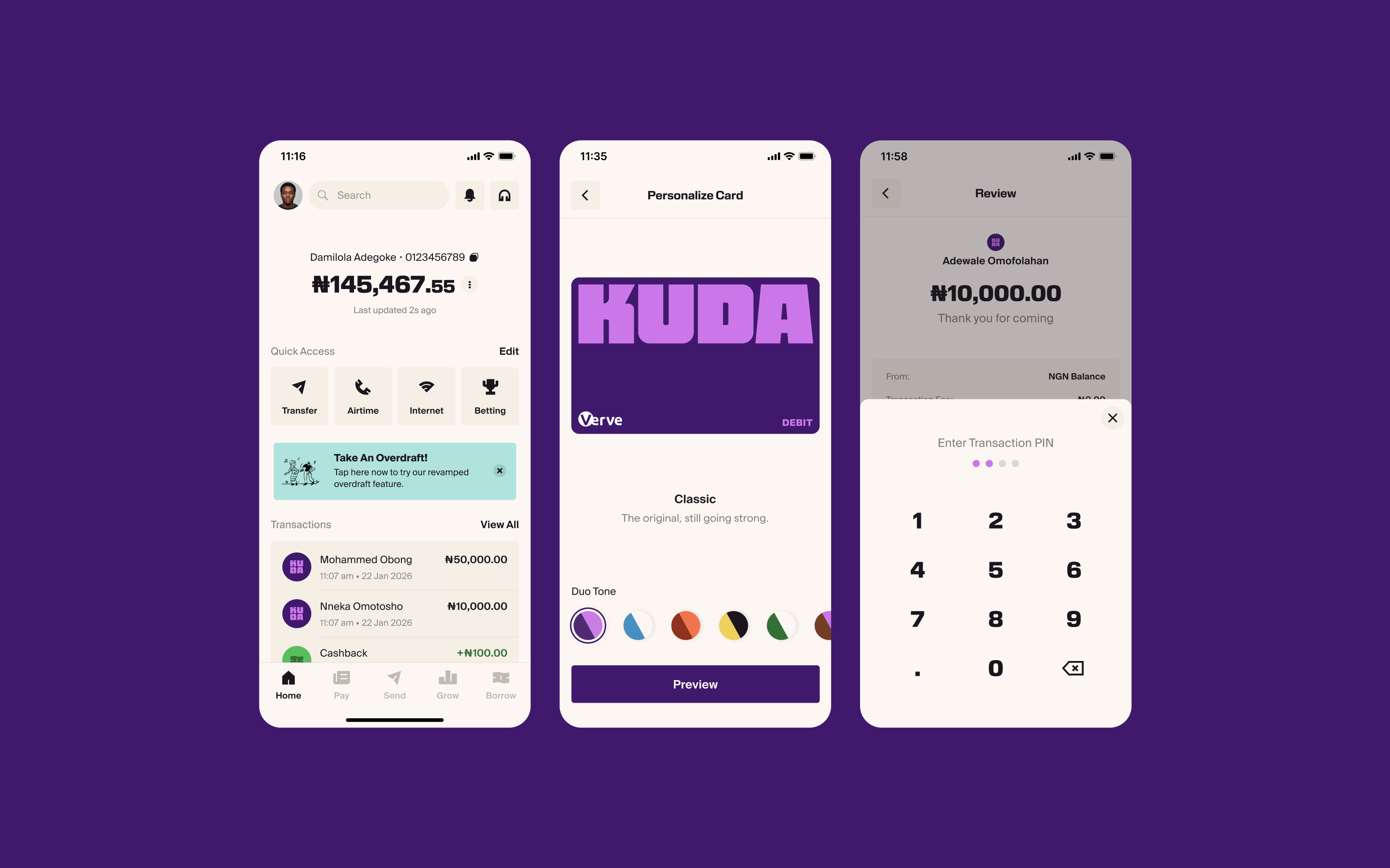
Barkas describes a brand, product and website built around movement, color and everyday moments. Its screen examples show the purple identity inside the service rather than only around advertising. The app view is the strongest test because customers will see it repeatedly, often while making a decision that requires trust.
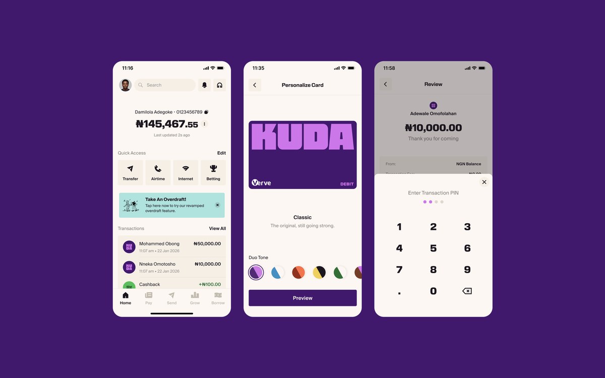
Image: Barkas Kuda product interface examples
“More Life” is an aspiration, not a measured customer outcome. What the design can do is make that position recognizable across a campaign, card and interface. Whether the bank delivers the promise depends on the actual service. The distinction keeps the editorial reading honest.
A lesson for a growing fintech
Name the role your product plays in customers’ lives before drawing a new symbol. Then test the wordmark in a small app header, a payment card and a long headline. Kuda shows how one distinctive type system can link these settings while allowing the functional screens to stay clear.
If you are developing a finance brand, start with a readable wordmark, build color and type rules in a brand kit, and check the result in realistic mockups before launch.