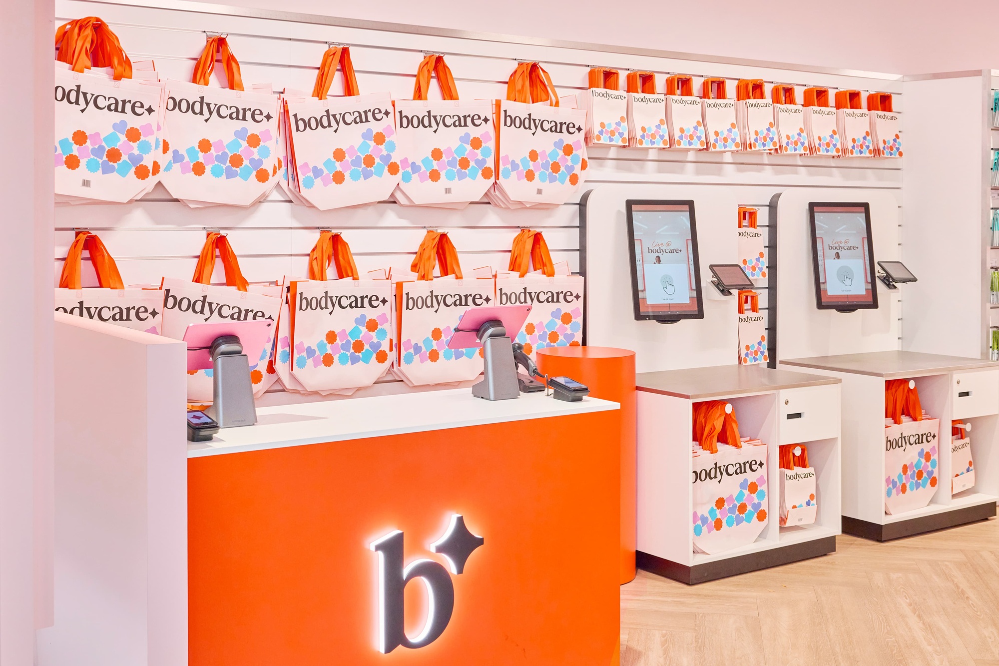
A value beauty retailer can easily look like a pharmacy or a permanent sale. Bodycare’s October relaunch by Fold7Design takes a different route: bright orange and pink, a flexible family of symbols, and a store designed for product discovery. The logo matters because it needs to hold that warmer experience together, not simply mark the entrance.
The launch account says Bodycare began in 1970, entered administration in 2025 and was acquired by an investment group led by Charles Denton. The relaunch therefore has an operational task: give returning shoppers a reason to visit while introducing the brand to people who discover beauty products through social feeds.
Symbols built for conversation
Fold7Design created shapes that can range from abstract marks to recognizable hearts and speech bubbles. The launch image places a compact symbol beside the Bodycare name, then repeats the playful shapes on a shopping bag and staff styling. The name stays readable; the surrounding elements do the expressive work.
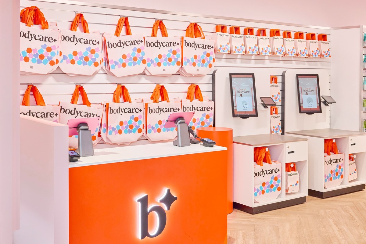
Image: Bodycare new retail store and service counter
The system can support signage, packaging and digital posts without forcing every item into an identical layout. That flexibility is useful, but it needs rules: if every shape, color and message changes at once, shoppers may lose the common thread. The repeated wordmark and palette are the anchors.
A physical store that borrows a feed’s logic
The launch describes live creator spaces and a Bodycare Studio format within stores, with areas for content and social commerce. It also describes technology for reading trends, pricing and stock. These are company plans and claims, not independently measured outcomes. The visual identity gives them a visible setting through approachable signs and bright, open interiors.
The store photograph is more useful than a standalone logo file. It shows whether the signature survives on a counter, shelving and repeated wayfinding. Here the orange provides continuity while products and people remain the focus. The real test will be whether shoppers can find what they need amid the invitation to explore.
What other retailers can borrow
Start with the behavior the shop should encourage. Bodycare chose discovery, so the symbol family and store language have room to be playful. A specialist pharmacy might need a different balance. Test a mark on a receipt, storefront, shelf label and social post before deciding that it represents the whole experience.
For a retail identity, compare a clear wordmark with a flexible brand kit. Then see how the two behave in store and packaging mockups rather than judging a logo in isolation.