If you’re a designer or marketer working with healthcare, medical-tech or wellness brands, this blog walks you through the critical logo design trends that are reshaping the sector. You’ll discover the strategic drivers behind them, how they map onto patient psychology and digital demands, and plenty of real-world examples you can reference in your next brief.
Ready to translate insight into action? Consider using an AI logo maker for rapid iteration—especially when you must explore minimalist, scalable, mobile-first marks.
1. The New Foundation of Healthcare Branding: Trust, Transparency & Digital Fluidity
1. Trust and Professionalism Are Non-Negotiable
In healthcare, you’re not selling a commodity—you’re building confidence. A logo here isn’t just a mark; it’s often the first impression a patient has of your service, implying competence, reliability and emotional safety.
When a design feels amateur or cluttered, the risk isn’t just aesthetic—it can translate into perceptions of inadequate care.
2. Minimalism and Versatility Are Tactical Requirements
Today’s healthcare logo must work across a vast array of contexts: app icons, appointment schedule screens, NFC smart-labels on pharmaceutical packaging and large-scale signage. That means simplicity is mandatory—not optional.
Complex icons and heavy gradients may look interesting in print, but they often fail legibility on mobile or scale awkwardly on small UI elements. The win: minimalist logo, clean lines that convey precision and clarity.
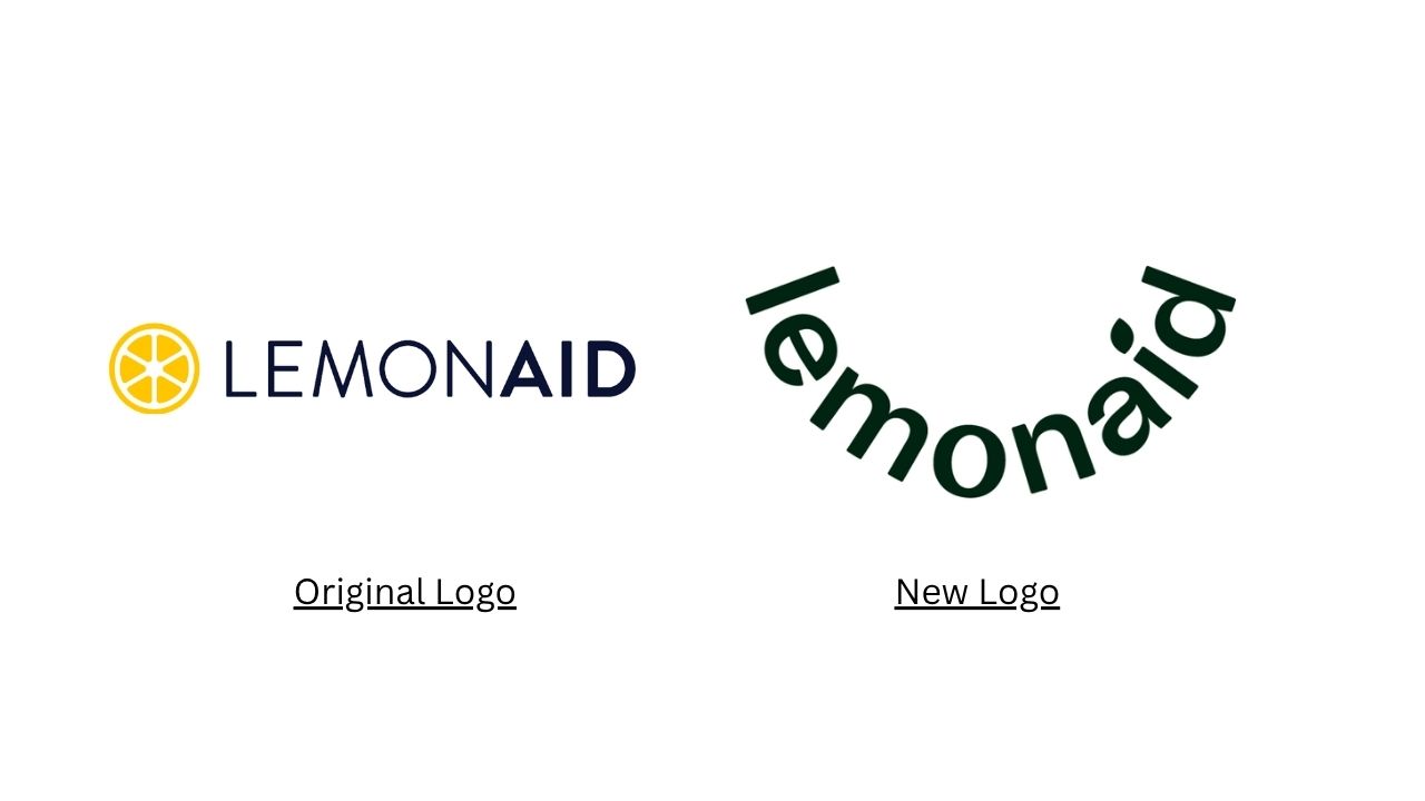
Lemonaid Health: This telehealth platform rebrand dropped a literal lemon icon and reshaped the wordmark into a smiling curve—shifting from “medical commodity” to “friendly digital care.”
3. A “Mobile-First” Lens Drives Design Constraints
With digital health platforms growing and mobile screens leading user journeys, healthcare logos must perform at tiny sizes. Small-screen legibility is now a design baseline.
An icon that looks great at 300px may blur or lose meaning at 24px—so the strategic trend is to distill the symbol to its essence. Too much visual noise = risk of mis-recognition or cognitive friction in a high-stress context.
4. Shift From Institutional Authority → Patient-Centric Comfort
Historically, healthcare branding leaned heavily on institutional gravitas—emblems, clinical symbols (crosses, stethoscopes, white coats). But the emerging paradigm emphasizes human-centered care, empowerment, empathy.
The visual language therefore is evolving: less “We fix you” and more “We support you”. That shift involves dropping cold, medical-tool symbolism in favor of softer, more human design cues.
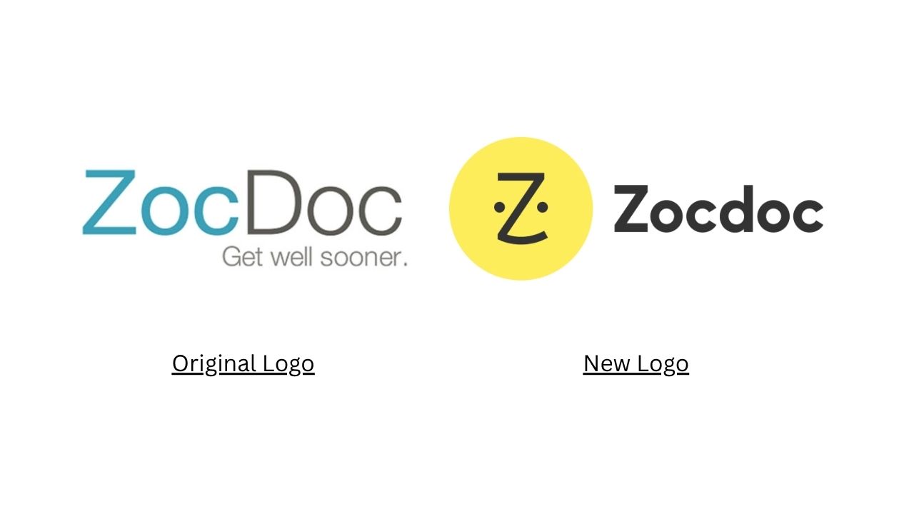
Zocdoc: The digital health scheduler's 2016 identity overhaul replaced a dated “doctor-cartoon” look with a friendlier, simplified “Zee” mark and an optimistic yellow palette—signaling the brand’s shift toward a more human-centered patient experience.
Design takeaway: Start any healthcare logo brief with a “Clinical Barrier Audit”, identifying design elements (symbols, colors, typography) that might inadvertently feel cold, intimidating, or overly institutional. Then ask: how can the identity emphasize support, safety, clarity?
2. Color Psychology: Dominance, Differentiation & The Wellness Shift
1. Blue & Green: The Reliability Standard
Blue is the foundational color of healthcare branding — it suggests trust, stability, calm. One study notes over 80% of major healthcare logos use blue.
Green is the second favorite—linking brands to healing, nature, renewal.
Use of these hues helps to anchor trust, especially in a market where patients feel vulnerable and decisions matter.
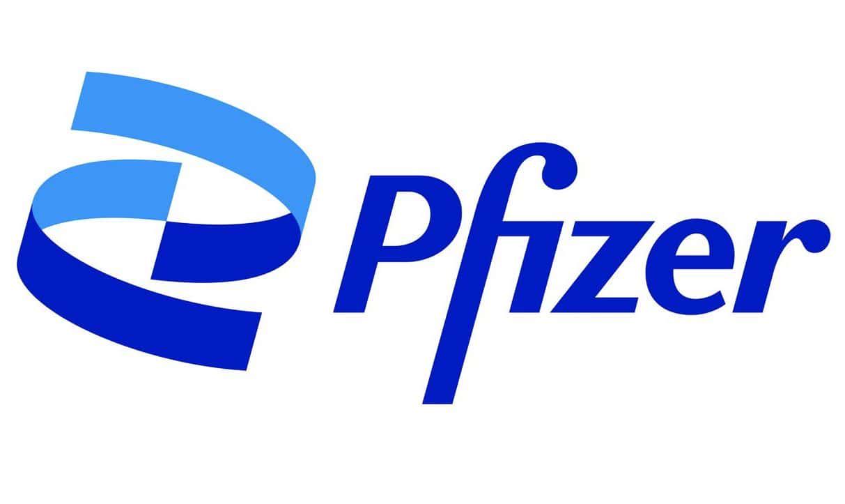
The Pfizer wordmark uses a strong blue anchor to reflect credibility and expert status.
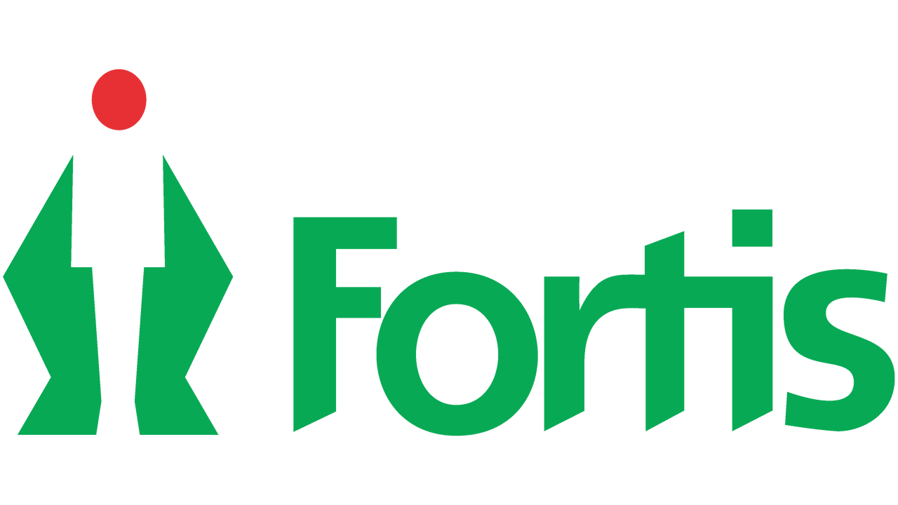
Fortis (Abstract Hand/Arrow Concept): Companies aiming to convey dedication to raising the standard of care utilize abstract hands and upward arrows in their logos to symbolize elevating patient well-being and fostering hope.
2. The “Same-Blue” Problem & Secondary Palette Strategy
Because so many healthcare brands use similar blues, differentiation is a challenge. The strategic move: keep a trustworthy blue anchor, but layer a secondary accent palette (e.g., rich purple for luxury specialist care; earthy tones for holistic wellness).
This allows a brand to belong to the category (healthcare) and stand out.
| Color | Primary Psychological Association | Traditional Usage (Clinical) | Modern Usage (Wellness/Tech) | Strategic Rationale |
|---|---|---|---|---|
| Blue | Trust, Stability, Professionalism, Calmness, Security | Hospitals, Insurance, General Medicine (Dominant) | Technology, Innovation, Mental Clarity, Serenity | Foundation of Competence; indispensable for anxiety reduction. |
| Green | Health, Healing, Renewal, Nature, Balance | Wellness Centers, Pharmacy, Holistic Care | Earthy Palettes, Growth, Holistic/Natural Care | Essential for wellness messaging; symbolizes growth and vitality. |
| Purple | Serenity, Spirituality, Luxury, Quality | Specialized/High-end Clinics, Therapy Spaces | Calming effects, expertise, and market differentiation | Reserved for niche services that convey specialized competence or premium quality. |
| Red | Urgency, Alert, High Energy, Passion | Emergency Services, High-Alert Areas | Actively avoided in therapeutic/wellness branding | Used only where immediate attention or danger mitigation is the primary goal. |
| Earth Tones | Warmth, Dependability, Natural Connection | Minimal use; often historically seen as counter-sterile | Biotech innovation, approachable aesthetics, hospital interiors | Softens institutional appearance; fosters familiarity and psychological comfort. |
Design takeaway: Choose your primary color (often blue for general trust) and then craft a secondary palette that signals your niche: tech-forward (electric teal), holistic (sage + taupe), premium (deep purple/gold). Ensure the palette works in grayscale and at small scale.
3. Typography & Visual Authority: Balancing Tradition with Accessibility
1. Serif vs Sans-Serif: Psychological Framing
- Serif fonts suggest tradition, formality, stability—good for institutions emphasizing heritage or gravitas.
- Sans-serif fonts feel modern, clean, digital-native—ideal for digital health platforms, apps, signage.
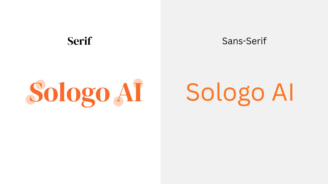
Many healthcare brands now adopt a hybrid approach: a serif for the primary logotype (wordmark) + a sans-serif for navigation or digital UI. This balances institutional trust with accessibility.
2. Legibility and Accessibility Are Critical
In healthcare contexts, typography isn’t just aesthetic—it impacts comprehension and patient safety. Fonts must be easy to read across ages, devices and lighting situations. Overly stylized typefaces (script, fancy, condensed) are generally inappropriate. Research emphasizes readability in signage and digital health apps.
Design takeaway: For a healthcare logo system, define a two-tier typography strategy:
- Primary wordmark: a stable Serif (for print, HQ collateral)
- Supporting text/UI: a highly legible Sans-serif
- Include strict spacing/kern rules, ensure the wordmark works at smartphone app icon size, and check that font weights render cleanly on signage and retina displays.
4. Iconic Evolution: From Clinical Symbols to Abstract Metaphor
1. Departing from Outdated Symbols
Some traditional healthcare symbols (like the Caduceus) carry problematic historical baggage and may feel commerce-oriented rather than care-oriented. Instead, modern healthcare branding often removes medical tools or crosses to avoid cold or clinical associations.
2. Embracing Abstract, Human-Centered Iconography
The trend is toward icons that communicate outcome, emotion, connection—not necessarily what you do, but why you do it.
- Upward arrows + hands = improvement, support.
- Leaf/plant/human-leaf hybrids = growth, healing.
- Rounded shapes, soft geometry = wellness, inclusivity.
These symbols scale, adapt to digital use, and pair well with wordmarks.
3. Structural Choices: Wordmark vs Pictograph vs Lettermark
For large general hospital systems, a strong wordmark (or monogram) may be the best route for clarity and flexibility. In narrower niche brands (telehealth, wellness), a symbol can work well—but must meet mobile-first requirements.
Design takeaway: Ask: does the icon symbolize helping rather than fixing? If you use medical-tool imagery, is it still friendly and modern? Ensure the mark works in monochrome, favicon size and printed signage—abstract yet meaningful wins.
5. Sector-Specific Branding Architectures
1. Clinical & Hospital Systems – Credibility meets Approachability
Large hospital networks must preserve authority while softening their image to attract today’s patients. Key strategies:
- Anchor with trust-colors (blue/white)
- Use mix of Serif + Sans typography
- Incorporate imagery or iconography that feels welcoming
- Ensure brand architecture is modular (multiple service-lines)
2. Biotech & Medtech – Precision, Innovation & Digital Native
These brands emphasize technical credibility and future-orientation. Logo trends here include:
- Abstract molecular/geometric icons
- Cool tech palettes (teal, electric blue, silver)
- Sans-serif typefaces with high readability
Be wary: avoid cliché “DNA strand + blue gradient” combos—originality here counts.
3. Mental Health & Wellness – Empathy, Accessibility & Warmth
Here the bar is different: the logo must reduce anxiety rather than evoke clinical rigor. So skip sharp crosses, red alarms, too-sterile aesthetics.
Focus instead on gentle shapes, softer palettes, and approachable typography. Colors that evoke safety and calm dominate.
4. Digital Health & Telemedicine – Mobile-First Branding
Because the user journey often begins on a smartphone, digital health brands need marks that work at icon-size, reduced friction, and reinforce trust quickly.
High-resolution, multi-layered marks don’t serve here—flat, simple, legible marks win the day.
6. Strategic Recommendations for Future-Proofing Your Medical Identity
Here’s how to turn insight into action:
✅Clinical Barrier Audit
Before redesigning, audit your current logo / brand system for: Remove or refine any elements that subtly communicate "institution > patient".- Intimidating or overly clinical symbols (e.g., stethoscopes, crosses)
- Colors that may evoke stress or urgency rather than calm (e.g., bright red outside emergency context)
- Typography that is hard to read on small screens or at distance
✅Digital Health & Telemedicine – Mobile-First Branding
Define 2 types of typography:
-
Wordmark (Serif or clean humanist Sans)
- Learn how to make a wordmark logo here.
-
Supporting UI/text (legible Sans-serif)
- Ensure spacing, weights and legibility hold across devices, signage, mobile icons.
- See more combination logo ideas for inspiration.
✅Invest in Metaphorical Iconography
Create a symbol / mark rooted in outcome and emotion rather than tools. Ask:
- Does the mark scale to 24px?
- Does it work in monochrome?
- Does it feel friendly rather than clinical?
✅Differentiate with a Secondary Palette
Before redesigning, audit your current logo / brand system for: Remove or refine any elements that subtly communicate "institution > patient".
- Premium services → purple/gold
- Wellness/holistic → sage/earth tones
- Tech/medtech → teal/electric combinations
✅Design for Mobile & Digital First
Start by drawing the logo in its smallest expected size (app icon, favicon).
Ask:
- Does it retain meaning?
- Is it legible?
- Does the typography hold?
Then test scaling up (print, signage) to ensure flexibility.
Final Thoughts
In today’s healthcare environment, a logo is not decorative—it’s strategic. It must build trust, support digital futures, and humanize care.For designers and marketers: use simplicity as your foundation, but differentiate through thoughtful secondary palettes, typography systems tailored for accessibility, and metaphor-based iconography that honors the patient journey.
Before you start designing, check out our Medical Logo Ideas page — a showcase of creative, healthcare-focused designs that can help you visualize the right direction for your own brand identity.
Ready to create a healthcare-ready logo?
Explore our ai logo generator to iterate fast, test legibility at micro-sizes, and capture the right emotional tone from day one.Transform your brand. Build the trust your patients deserve.