Novo Nordisk has shortened the name people will see day to day to “Novo,” while keeping Novo Nordisk A/S as its legal global name. The September 14 announcement also updated the Apis bull, a company symbol dating to the 1920s. It is a rare example of a pharmaceutical rebrand that changes the verbal shortcut and the visual mark together.
The company’s September 14 release calls the platform “Lasting Health Starts Now.” The new identity is designed for more personal, everyday communication, but its strongest design decision may be the one it did not make: abandoning the bull.
A shorter name needs a longer memory
A single word is easier to place on a sign, in an app header or beside a small social avatar. It is also less descriptive. The bull supplies continuity while “Novo” becomes a more usable everyday label. The pair can bridge familiar corporate recognition and a faster, more consumer-facing tone.
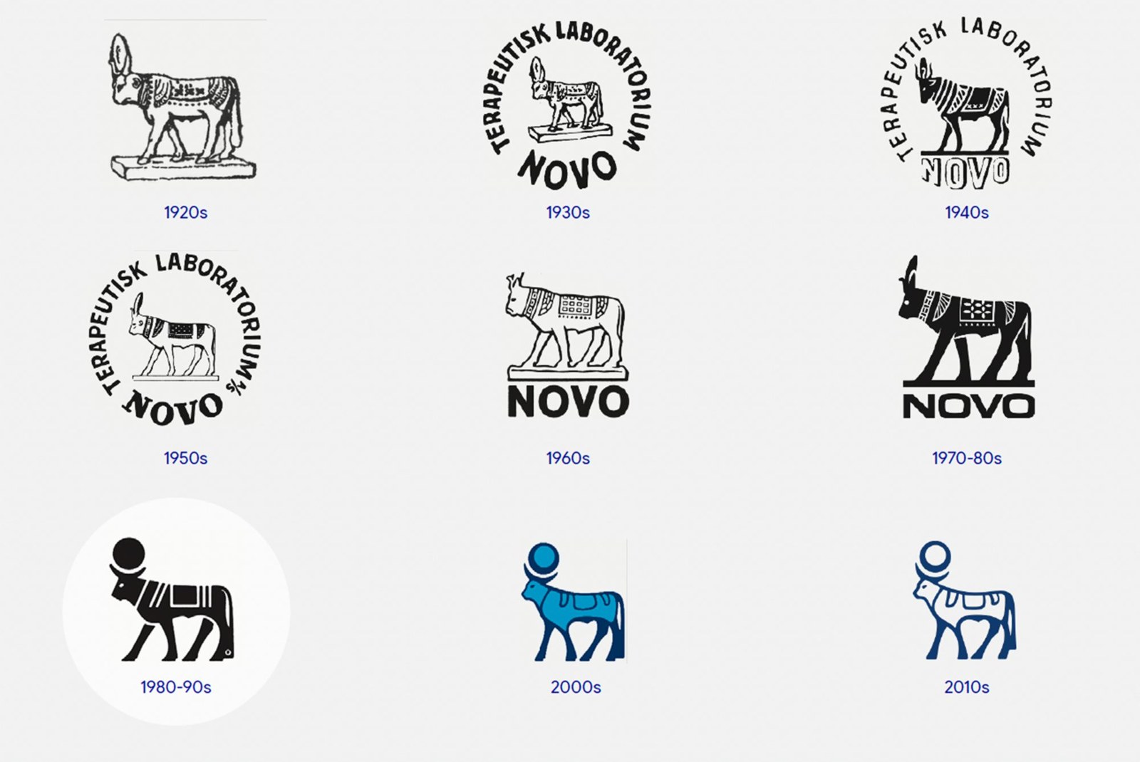
Novo’s official timeline of its Apis bull shows how the symbol has changed across decades. Source: Novo Nordisk.
The official timeline makes the inheritance visible. Novo is not claiming the new animal drawing appeared from nowhere; the form has repeatedly evolved. A heritage mark can be simplified without pretending its earlier versions never existed.
Watch the mark in the real world
The new sign shows what a logo sheet cannot: distance, architecture and uneven lighting. The bull remains separate enough to read as an emblem, while the lowercase name takes most of the horizontal space. That balance matters more than a clever detail visible only at presentation size.
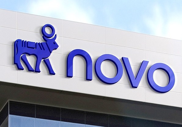
The updated bull and Novo wordmark on a building sign. Source: Novo Nordisk.
Novo also pairs a more vivid “Lasting Blue” with “Now Turquoise” and introduces a custom typeface. Those choices help the brand identity act consistently across product, workplace and public communication. The symbol alone cannot carry that workload.
What the healthcare sector can learn
Healthcare brands often need to communicate scientific credibility and human accessibility at once. A warmer palette or friendlier name can help, but it must not dilute the cues of trust people already know. Novo’s retained bull gives the update a recognizable anchor; the new tone has room to develop around it.
Mastercard’s continued use of its interlocking circles after simplifying its wordmark offers a related principle: a familiar symbol can preserve recognition while the naming system changes. The businesses are different, but the identity problem is similar.
A smaller health or service brand should test the same hierarchy before commissioning a full redesign. Ask which asset customers recall without prompting, then place a shorter name beside it on a phone screen, a sign and a one-color document. If the three versions still look related, the system has a useful foundation.
If your name is doing too much work, explore a compact, original wordmark with Sologo’s Wordmark Maker. Keep the visual cue customers already recognize, and test the new name at the size they actually see.