For a bakery, the product can be a stronger design brief than an abstract promise of “warmth.” Montreal’s Toledo has made the irregular layers of puff pastry the organizing idea for a new identity by Nouvelle idée. The result connects lettering, pattern and retail applications without drawing a literal croissant everywhere.
The third location changed the brief
The agency case study says Toledo sought the update as it opened its third location. Its familiar green remains, while flour, butter, coffee and baked bread inform a broader palette. The strategic problem was growth: make new outlets and products feel like one bakery without erasing what regulars already knew.
The oversized wordmark in the official image has enough presence to sit over a busy food photograph. Its curves feel related to the pastry idea, yet it remains straightforward to read. This is an important restraint for food brands: appetite may bring someone closer, but the name must still be legible.
A logo becomes useful when it leaves the logo file
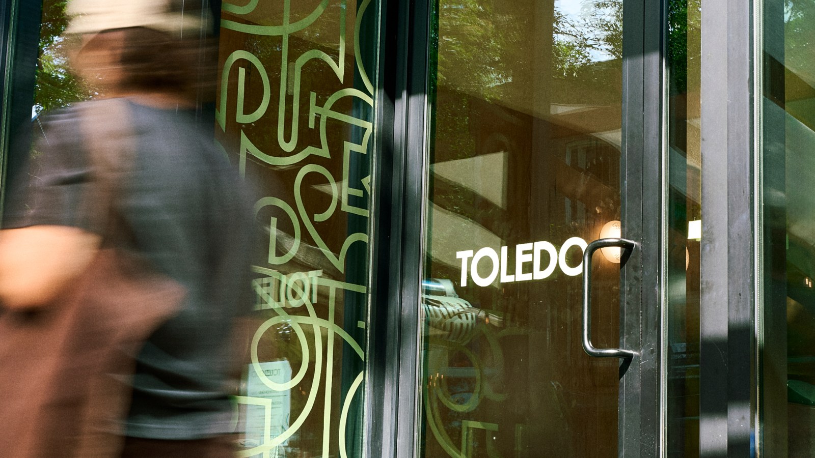
The Toledo storefront shows how the identity lives in signage and patterned glass. Design: Nouvelle idée.
At the storefront, ornamental lines occupy the glass while a simpler wordmark identifies the place. The window does not have to reproduce a complete poster. That division makes the identity flexible across architecture, menus and small labels.
The green cup and paper bag show the same principle at a different scale. A repeatable shape can become packaging texture; a concise mark can handle attribution. That is the practical value of a brand kit: decisions about which asset does which job.
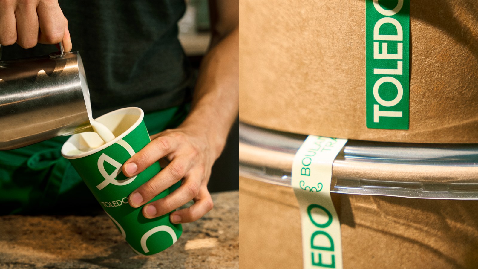
A paper bag and coffee cup carry different parts of the Toledo system. Design: Nouvelle idée.
What other small food brands can borrow
The identity’s source is unusually specific: puff pastry layers, not a generic wheat stalk. Similar thinking appears in Oatly’s typography-led packaging, where the brand’s attitude comes through in a repeatable system rather than a decorative food icon. The lesson is to find a genuine product detail that can change scale and context.
A neighborhood bakery could photograph three signature products, identify one recurring structure or texture, and test it on a cup, a sign and a social post. Keep the name legible and preserve one familiar color if regular customers already rely on it. A motif should help people find the shop, not require an explanation at the counter.
Try a readable name-led logo with Sologo’s Name to Logo Maker, then preview it on real packaging mockups. Let the product inspire the supporting pattern while the wordmark does the identifying.