A customer can recognise a cup before reading the name on it. That small interval is the useful design problem behind Tropical Smoothie Cafe’s Palm T: how can a restaurant with a long name leave a short, memorable signature?
The chain announced its JKR-designed identity on September 16, 2026; September 21 coverage in Dieline and Brand New brings it into this week’s design conversation. The update introduces the Palm T alongside a refreshed wordmark and green-and-orange palette. Our interest is the division of labour between those elements, rather than a claim that a new logo alone will drive growth.
A palm tree that can also be read as an initial
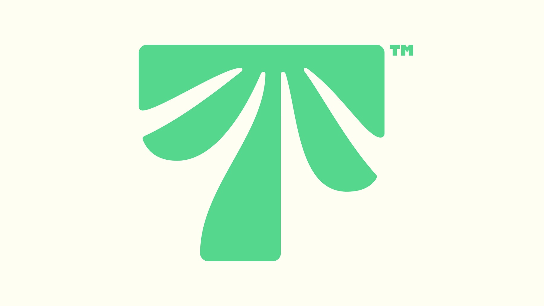
The Palm T combines the initial with a palm-canopy silhouette. Official Tropical Smoothie Cafe / JKR press image. Source
The outer silhouette gives the T a broad top and a substantial stem. Inside it, the leaf shapes suggest a canopy. That combination makes two readings available without adding a second badge or enclosing the whole name in an emblem. At a glance it offers a shape; at closer range it offers a small visual discovery.
A palm tree by itself is widely shared visual territory. Connecting it to an initial makes the idea more specific, but does not guarantee distinctiveness or legal availability. For a small cafe, the useful question is whether the symbol still feels recognisable when the name and supporting imagery disappear. A generic tropical mood is easier to achieve than a memorable silhouette.
The cup is a tougher test than a flat logo file
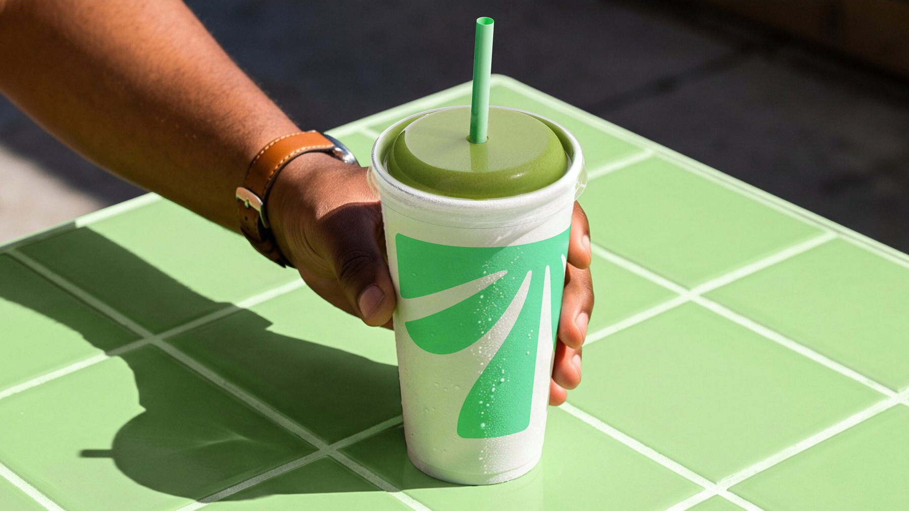
Official cup imagery shows the Palm T working across a curved, handheld surface. Image: Tropical Smoothie Cafe / JKR. Source
On a cup, fingers obscure part of the design and the curved surface hides another part. A compact mark can survive that view better than a long line of small lettering. The press image makes this application tangible; it does not prove that customers already recognise the symbol unaided. That would require observation or testing.
The wordmark still matters when someone is finding a location for the first time. Signage can give the name room, while a cup or profile image can favour the symbol. This is a practical hierarchy, not a requirement to remove the name everywhere. Test both options in an mockup before deciding which version belongs on each surface.
Recognition needs more than one repeated shape
Starbucks’ siren and McDonald’s arches offer familiar examples of symbols carrying recognition separately from a full name. They are comparisons in function, not claims of equivalent public familiarity. A newly introduced lettermark has to earn that independence through repeated, consistent use.
The broader restaurant-design lesson is to define a small set of assets with different jobs. Keep a readable name for discovery, a compact signature for constrained spaces, and a colour pair that connects them. The distinction between one mark and a coordinated brand kit becomes especially useful when a shop adds takeaway packaging or delivery channels.
For an independent smoothie shop, start with three actual views: the sign from the pavement, a cup held in one hand, and a tiny ordering icon. If an idea fails at one size, change the arrangement before adding detail. Keep the same core shape across the tests so that you are measuring the design rather than three unrelated concepts.
A distinctive initial can be a useful starting point for that exercise. Explore your own letter combinations with the Sologo Monogram Logo Maker, then judge the strongest option in the places customers will really see it.
Sources: Tropical Smoothie Cafe’s September 16 announcement and Dieline’s September 21 coverage. Visual analysis is our own; all images are official brand creative.