Brazilian bank Caixa unveiled a new visual identity on November 9, its first major logo change in almost three decades. The blue and orange X is still there. The surrounding wordmark is rounder, the colors brighter, and the system is designed to work across branches and digital services. This is a useful case in changing a large brand without making customers relearn it.
Caixa’s November 9 newsroom release says the updated X retains the qualities people already recognize: blue for solidity and security, orange for diversity and Brazilian creativity. Agência Brasil’s November 9 report places the redesign within a broader modernization of the bank and says the branch rollout will be gradual through 2030. Tátil designed the identity.
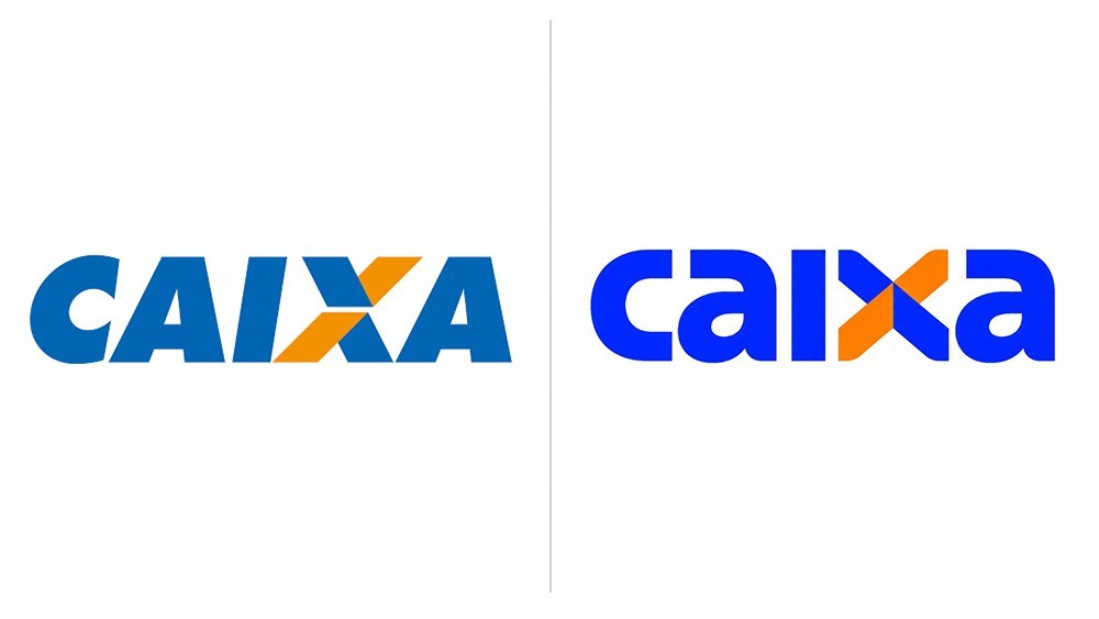
Image: Caixa old and new wordmarks, credited to Caixa
The X does the memory work
The old and new wordmarks are clearly different, but the diagonal X remains the visual anchor. Its proportions and depth have changed; its two-color idea has not. That matters for a bank whose sign appears on thousands of service points. People can register the change while still recognizing the institution at a glance.
The softer lettering also changes the tone. It moves Caixa toward a friendlier digital-service look, while the angular X keeps a sense of structure. Neither element has to carry the whole message alone. The mark supplies continuity; type and color give the bank room to sound more current.
A logo is only one part of a service change
Caixa links the new identity to a simpler, more digital experience. Agência Brasil reports that the bank is developing a consolidated app and beginning the physical rollout in a small set of branches. The identity can make that shift visible, but its promise will be judged in actual transactions, navigation, and support. A bright X cannot make a confusing flow feel easy.
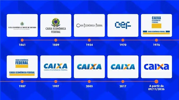
Image: Caixa historical identity timeline, Caixa disclosure via Agência Brasil
Why the history matters
The bank’s own history shows a long series of marks; the blue and orange X arrived in 1997 and survived later refinements. The new version treats that accumulated recognition as an asset. A useful comparison is Koto’s Nubank identity, which also extends a banking brand across product and communication while preserving a clear core. The banks differ in age and audience, but both need an identity that survives the move from campaign to app screen.
What smaller brands can borrow
Identify the one part of your mark that customers already notice, then test whether a new typeface or color behavior can do the needed work around it. Put the revised logo next to the old one, but also test it as an app icon, on a sign, and inside a service message. Continuity should help people find you, not prevent a useful improvement.
If your financial or service brand is evolving, start with a wordmark study, test the symbol and type in realistic mockups, then keep the choices consistent in a brand kit. Caixa’s X shows how one recognizable detail can carry a bigger transition.