Most sparkling water looks like it is trying to be invisible: white space, quiet typography, ingredient-first messaging. That approach can work — but it also creates a sameness problem. WAWA took a different route with its new logo and packaging: big, playful, collage-forward visuals that are designed to be remembered in one glance.
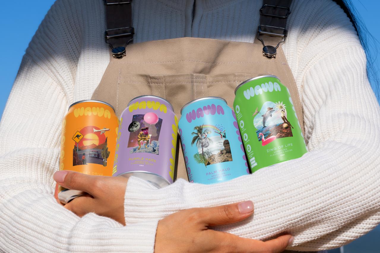
WAWA's refreshed identity leans into bold type and playful collage elements (source: Creative Boom).
What Changed in the WAWA Logo and Packaging?
This is not a “new icon” story. It is a system story. The most useful shift is how WAWA turns visual energy into repeatable rules:
- Chunkier, more elastic wordmark posture that feels bouncy and drinkable at a distance.
- A small motif library (stars, halos, simple flavor cues) that can be reused across SKUs and campaigns.
- Clear variant logic: each flavor can own a hero color, but the hierarchy and layout stay consistent.
Big type + collage shapes give the packaging instant billboard readability (source: Creative Boom).
A system that repeats makes flavor colors work harder (source: Creative Boom).
Why It Matters: Shelf Impact and Feed Impact Are the Same Game
For beverages, your brand is judged in three brutal contexts:
- 1-meter shelf test (a few seconds, crowded competition).
- thumbnail test inside delivery apps and store listings.
- scroll test in social feeds.
WAWA's approach makes one strategic bet: it sells a feeling before it sells a feature. That is a legitimate positioning lever when the product category is functionally similar.
When packaging looks like a poster, it becomes social content by default (source: Creative Boom).
Broader Industry Relevance: Maximalism Works When It Is Systematic
“Maximalist packaging” is not the lesson. The lesson is: make the system do the work. If your brand needs to scale across flavors, limited editions, collaborations, and seasonal drops, your visual identity must behave like a toolkit.
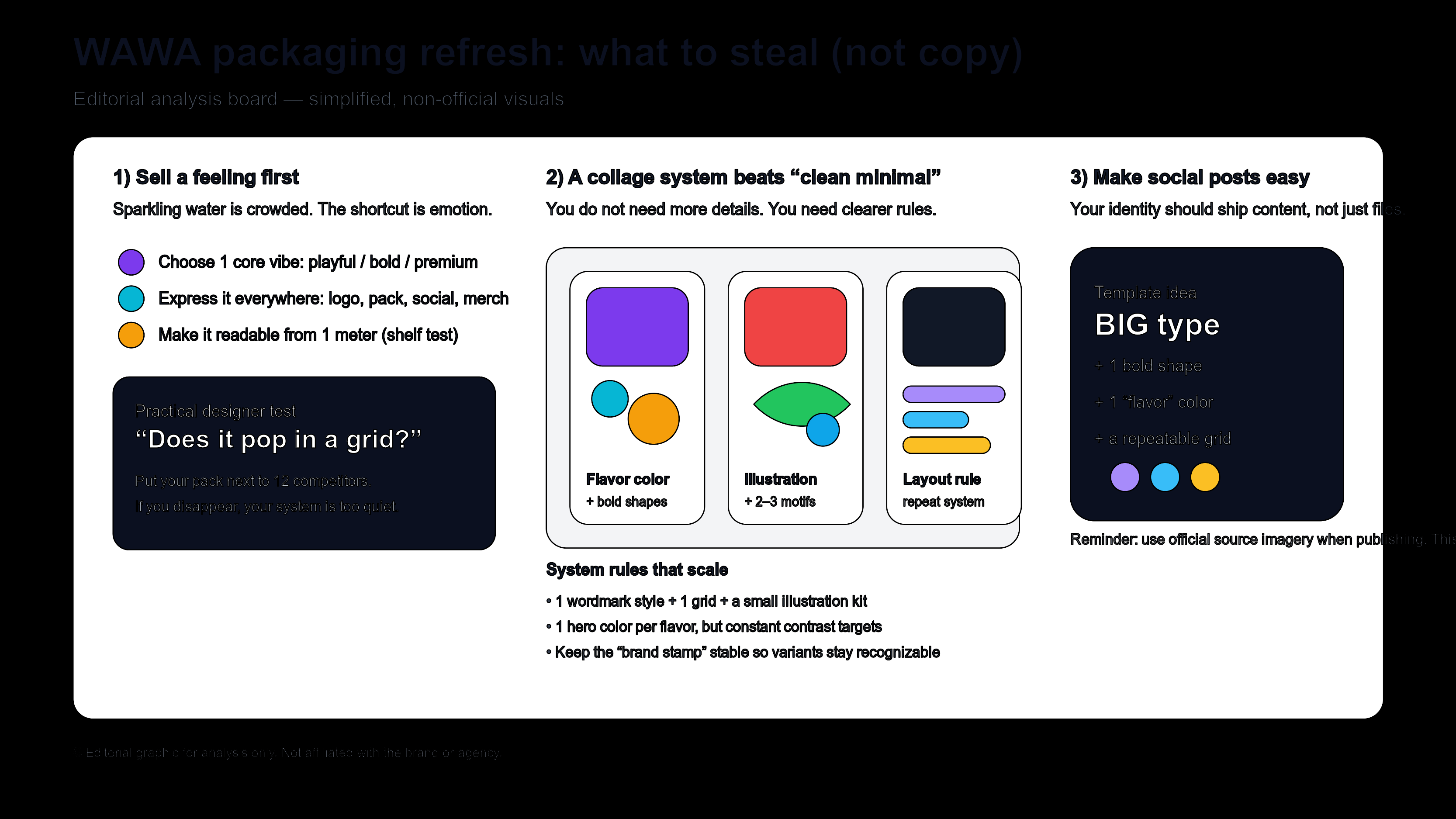
Editorial illustration (not official assets): focus on rules (grid, hierarchy, motif kit), not random decoration.
What Smaller Brands Can Learn
- Pick one vibe. “clean”, “playful”, “premium”, “wild” — you cannot be all of them at once.
- Write down your repeatable rules. One wordmark rule, one grid, one headline style, one motif kit.
- Test in context. Build a 12-brand shelf/mock grid and see what disappears.
- Turn packaging into templates. If a designer cannot ship a new SKU in one afternoon, the system is too fragile.
Build a Beverage Brand Kit (Fast)
If you want to explore a bold-but-consistent look, start with a system: logo/wordmark directions, a palette, and repeatable layout rules. Try Sologo Brand Kit Generator to define the core identity, then use AI Brand Image for campaign visuals and AI Mockup to test how the packaging would feel in real contexts.