At first glance, the new Formula 2 and Formula 3 logos look like a modest cleanup. But that undersells what is really happening. This is a good example of brand architecture getting sharper.
The June 1, 2026 FIA announcement makes the goal explicit: both championships are meant to sit more clearly inside the road-to-F1 ladder.
The official rollout frames the redesign as clearer visual hierarchy, not just cosmetic change (source: FIA).
What Changed in the F2 and F3 Logos?
The official message is straightforward:
- Both marks are simplified into single-colour designs.
- F2 keeps blue, preserving an already-established recognition cue.
- F3 moves to orange, replacing the older grey/red mix with a more energetic distinction.
- The structure aligns more closely with F1, reinforcing the championship pathway.
Why This Matters: Sports Logos Have to Work at Speed
For sports brands, the real test is not a presentation slide. It is whether the logo still works inside:
- broadcast graphics,
- timing bars,
- app thumbnails,
- social cards, and
- trackside branding.
That is why simplification matters here. The cleaner the structure, the easier it is for fans to read the ladder: F1 at the top, F2 below, F3 below that. In other words, this is less about expression and more about navigation.
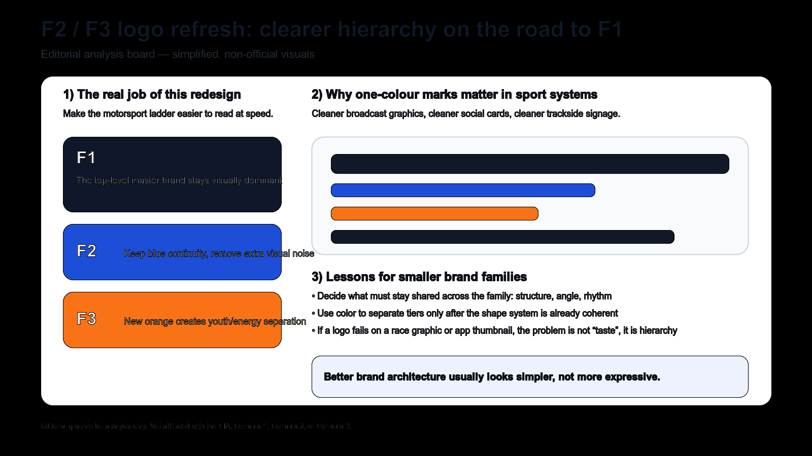
Editorial illustration (not official assets): the redesign improves hierarchy by sharing more structure and using color more deliberately.
Broader Industry Relevance: Better Sub-Brands Usually Look Simpler
A lot of sub-brand systems fail because every tier wants to look unique. That creates noise. The smarter approach is usually this:
- share the core structure,
- keep one or two differentiators,
- make the relationship legible immediately.
That is what F2 and F3 are doing here. The redesign is telling fans, sponsors, and broadcasters: these are different championships, but they belong to the same progression logic.
Related Examples: Product Suites, Event Series, and Brand Families
The lesson goes well beyond motorsport. The same logic applies when a software company has a master brand plus multiple tools, or when an event brand runs flagship, pro, and community tiers. If the naming and visual skeleton are unclear, the system becomes harder to sell and harder to understand.
What Smaller Brands Can Learn
- Define the shared skeleton first: rhythm, angle, weight, and structure should come before color.
- Use color as a tier signal, not as a substitute for architecture.
- Test in small and fast contexts: icons, cards, overlays, and list views expose system weaknesses quickly.
Design a Clear Brand Family, Not Just One Logo
If you are building a master brand with multiple tiers or sub-products, start with naming and wordmark logic before you decorate anything. Use Sologo Wordmark Maker to explore clean series directions, then define repeatable rules with the Brand Kit Generator. If you need symbol-led differentiation for sub-brands, test compact marks with the Monogram Logo Maker and review rollout contexts in AI Mockup.