KFC's latest global refresh is not just a logo story. It is a brand asset story. The useful lesson is that KFC already had one of the strongest visual assets in fast food: the bucket.
Instead of treating the bucket as packaging only, the new system makes it a larger organizing idea for restaurants, campaigns, packaging, and digital touchpoints. That is why this rebrand matters for anyone designing a restaurant logo or food brand identity.
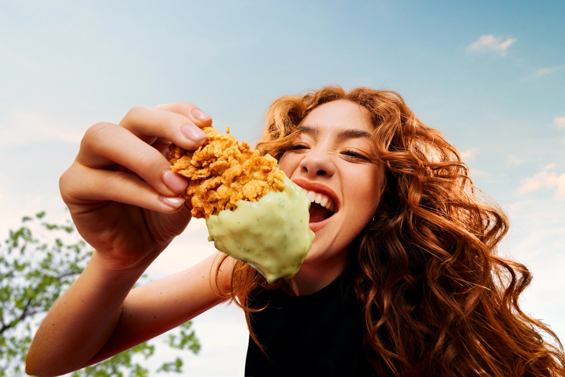
KFC's global announcement frames the refresh as a broader next chapter, including branding, restaurants, and menu innovation (source: KFC).
What Changed in KFC's Brand System?
The smartest part of the KFC refresh is not that everything looks new. It is that the most recognizable pieces still feel familiar:
- Colonel Sanders remains a central recognition cue.
- The red and white palette still carries fast-food immediacy.
- The bucket becomes a system asset, not just a container.
- The identity can stretch across packaging, interiors, campaigns, and social content.
For a brand with KFC's awareness, radical logo replacement would create unnecessary risk. The better move is to make existing memory work harder.
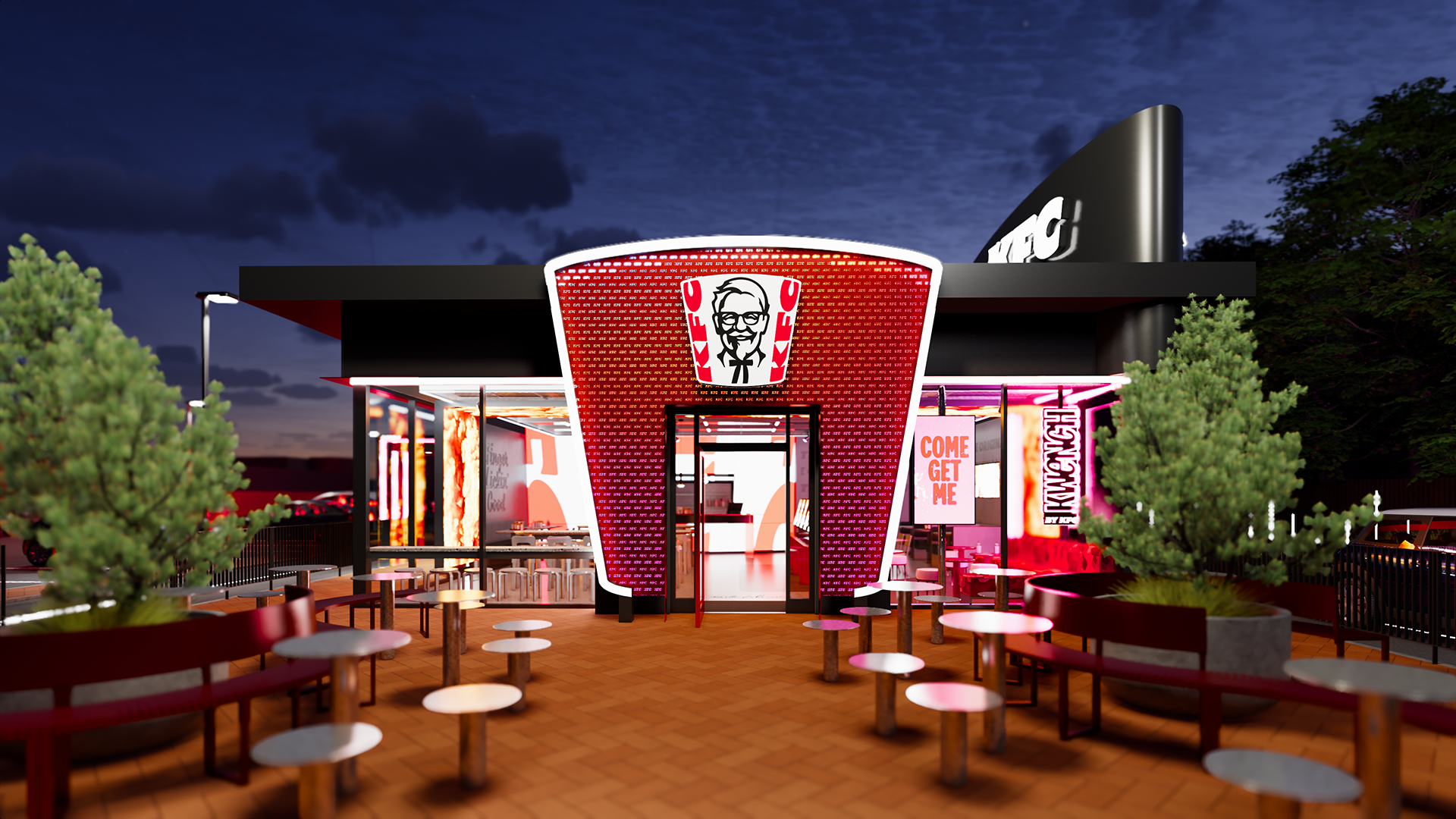
The refresh is useful because it treats identity as a repeatable system, not a single isolated logo file (source: KFC).
Why This Matters for Fast Food Logo Design
Restaurant logos live in unusually messy places. They appear on signs, wrappers, cups, delivery bags, app icons, uniforms, menus, and short-form video. A restaurant identity has to work when someone is hungry, moving, scrolling, or standing across the street.
That makes owned assets valuable. A strong shape, color, mascot, or packaging silhouette can carry recognition faster than a refined wordmark alone. KFC shows the difference between having a famous asset and building a system around it.
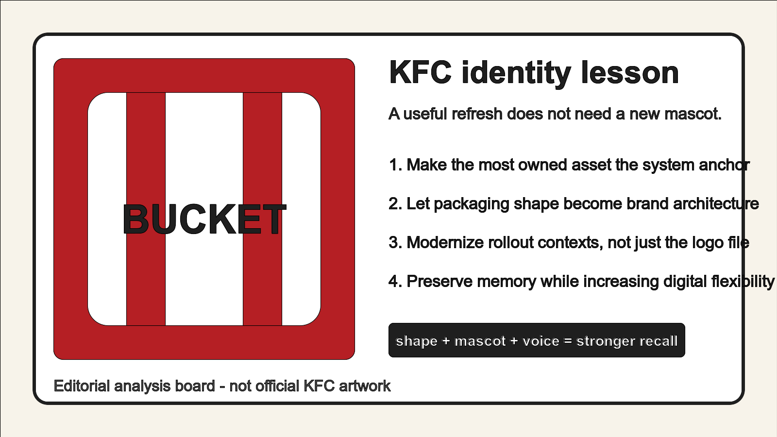
Editorial illustration, not official KFC artwork: the strongest lesson is shape plus mascot plus voice, not decorative novelty.
The Broader Restaurant Branding Trend
Many food brands are moving away from logo-only redesigns. They need identity kits that can behave well in stores, delivery channels, creator content, and loyalty apps. That pushes designers toward systems built from repeatable ingredients: type, color, mascot, shape, tone of voice, and product rituals.
KFC is an example of a large brand doing what smaller brands should also do: identify the asset customers already remember, then make that asset easier to reuse.
Related Logo Examples
McDonald's can use golden arches without spelling the name. Starbucks can crop the siren. Burger King revived a warmer, packaging-friendly visual language. These brands show that food identity is strongest when the visual system has more than one recognition route.
The practical question is simple: if your logo disappeared for a second, would customers still recognize your color, shape, package, mascot, or brand voice?
What Smaller Brands Can Learn
- Start with memory: list the assets customers already associate with your brand.
- Think beyond the logo: packaging, menu boards, delivery bags, and social templates are part of the identity.
- Choose one anchor: a shape, mascot, letterform, or color can organize the whole brand kit.
- Test small contexts: delivery app icons and receipt stickers expose weak restaurant logos quickly.
Build a Restaurant Brand Kit, Not Just a Logo
If you are designing a food brand, start with a strong logo direction and then turn it into a usable system. Explore naming-based options with Sologo Name to Logo, test typography with the Wordmark Maker, and build repeatable colors and layouts with the Brand Kit Generator. For restaurant signs, bags, cups, and packaging checks, use AI Mockup.
For this kind of identity work, the most relevant next step is the Sologo Brand Kit Generator: it helps turn a logo idea into a system that can survive real customer touchpoints.