The Mozilla Foundation identity by Pentagram is a useful reminder that not every technology brand needs a futuristic symbol. Some brands need clarity first. For a mission-led organization working around the internet, public interest, research, and advocacy, the visual system has to feel serious without becoming cold.
That is why this case is worth studying. The new identity is less about decoration and more about trust, structure, and motion.
The identity keeps the name highly visible, which matters for institutional trust and public-interest communication (source: Pentagram).
What Changed in the Mozilla Foundation Identity?
The system puts more emphasis on a clear wordmark and a flexible visual language. That matters because Mozilla Foundation is not one narrow product. It has to support research, campaigns, events, education, policy work, and public communication.
A symbol-only approach would struggle to carry all of that. A wordmark-led system gives the brand a stable anchor, while motion, layout, and contrast give it energy.
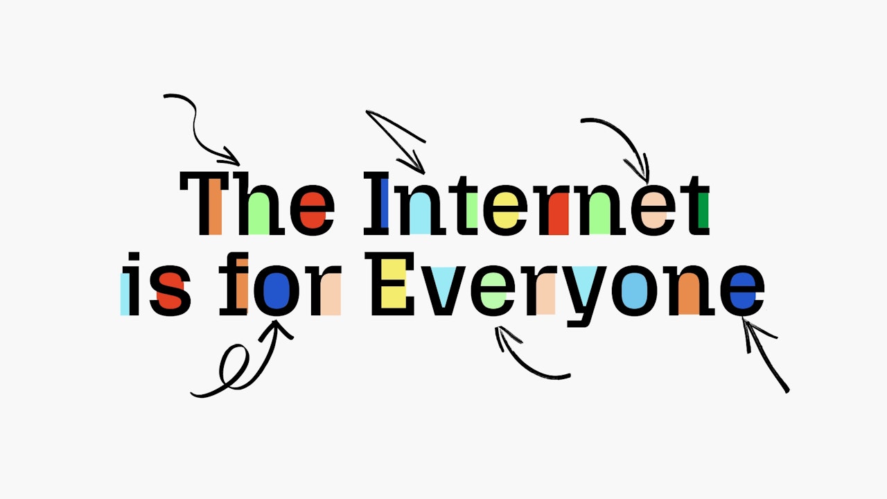
Motion and typographic behavior help the identity feel active, not merely institutional (source: Pentagram).
Why This Change Matters
Tech nonprofit branding has a hard balance to strike. Too much technology language can feel abstract or elitist. Too much nonprofit warmth can feel soft or generic. Mozilla Foundation needs to appear credible, independent, and active.
The identity works because it gives the organization a controlled voice. It can be direct in a report, energetic in a campaign, and recognizable on a digital platform without changing personality every time.
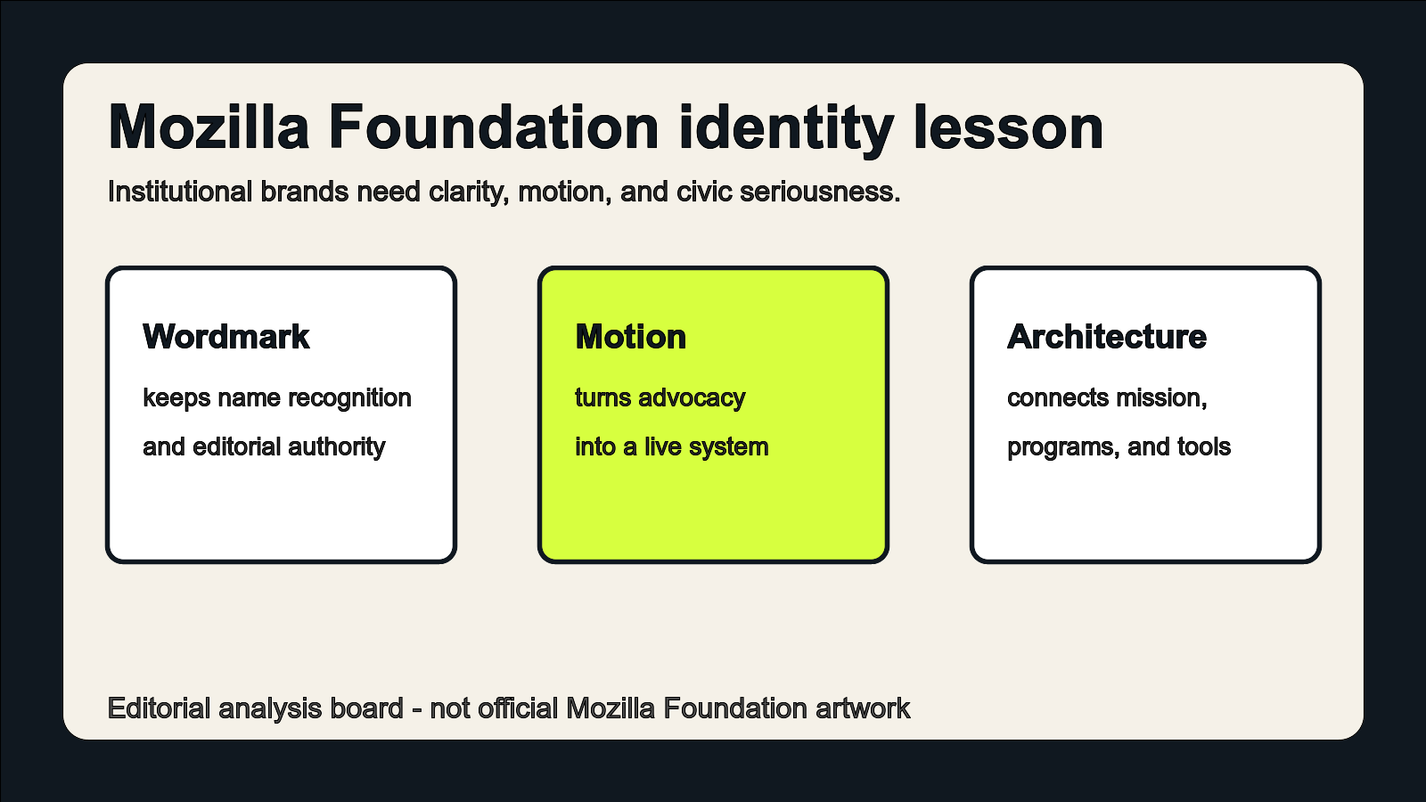
Editorial illustration, not official Mozilla Foundation artwork: the system balances wordmark clarity, motion, and brand architecture.
The Broader Tech Branding Trend
Many technology identities have converged around simplified wordmarks, geometric icons, and bright accent colors. That can be useful, but it also creates sameness. Mission-led technology brands need a stronger point of view because they are asking audiences to trust their judgment, not just use their interface.
The Mozilla Foundation case suggests a better direction: use a clear wordmark for accountability, then use system behavior to express momentum.
Related Logo Examples
Google.org, Wikimedia Foundation, and OpenAI-adjacent research communications all face a similar challenge: the identity must support public explanation, institutional credibility, and digital fluency. The strongest examples avoid both extremes. They are neither anonymous SaaS brands nor soft charity graphics.
For smaller brands, that middle ground is valuable. A civic tech project, open-source foundation, research lab, or education platform often needs a clear name mark before it needs a clever icon.
What Smaller Brands Can Learn
- Choose clarity before novelty: a readable wordmark can be more valuable than a complex symbol.
- Design for many content types: reports, campaigns, decks, social posts, and events should feel related.
- Use motion carefully: movement should support meaning, not distract from it.
- Build rules early: mission-led brands lose trust when every touchpoint looks improvised.
Start with a Clear Wordmark
If your brand depends on trust, make the name easy to read first. Try Sologo Wordmark Maker to explore clear name-led directions, then use the Brand Kit Generator to define typography, colors, and layout rules. If your organization uses initials or a compact institutional mark, the Monogram Logo Maker can help test simpler alternatives.
For a Mozilla Foundation-style lesson, the best next step is the Sologo Wordmark Maker: start with the name, then build the system around it.