The World Tennis rebrand is a useful reminder that many logo problems begin before the logo. The International Tennis Federation may have been accurate, but ITF was not an especially public-friendly name.
Storm's new identity moves the organization toward a name people can understand immediately: World Tennis. That gives the symbol less explaining to do.
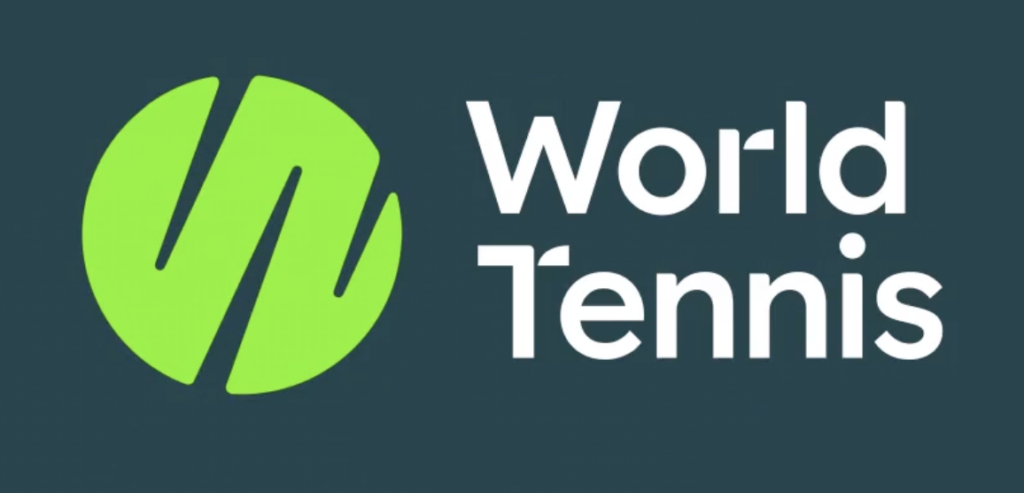
The new mark uses a tennis-ball idea inside a W-like form, giving the name a direct visual hook (source: LogoLounge).
What Changed in the World Tennis Logo?
The old identity leaned on institutional familiarity. The new one is built around access, energy, and participation. LogoLounge notes the new mark turns a fluorescent tennis ball into a stylized W, with rounded forms that echo through the wordmark.
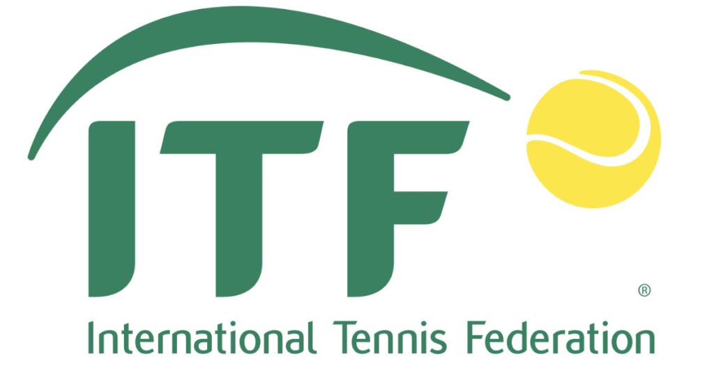
The old ITF identity looked official, but the acronym placed more burden on audience knowledge (source: LogoLounge).
Why This Change Matters
A governing body wants authority, but it also needs recognition. When casual players do not know what an acronym means, the brand becomes invisible outside specialist circles. World Tennis is more legible, more searchable, and more emotionally useful.
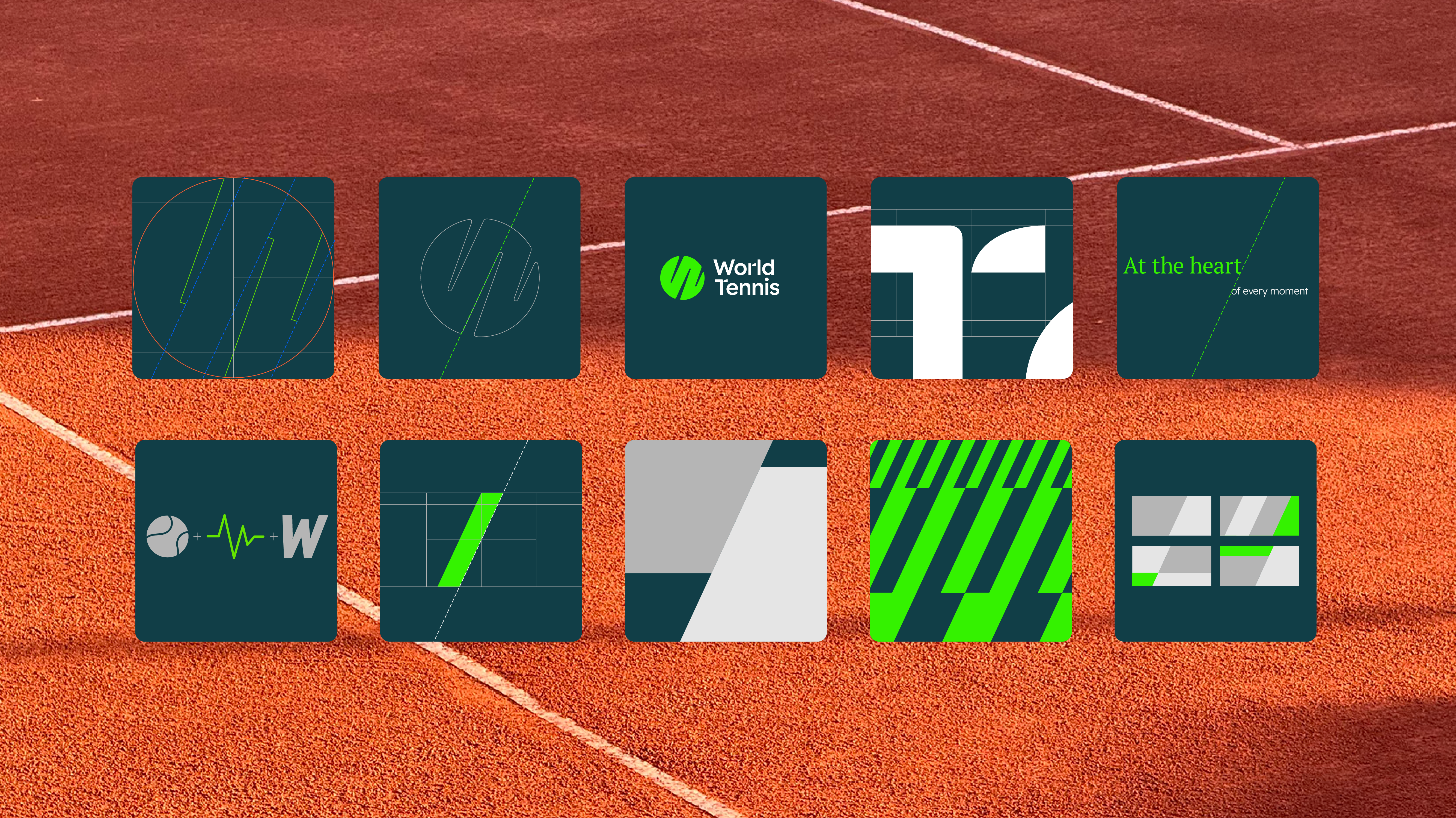
Storm positions the new system around participation and the idea of tennis for life (source: Storm).
What Smaller Brands Can Learn
- Do not hide behind acronyms unless the audience already knows them.
- Make the name carry the category. World Tennis instantly explains the field.
- Let the logo reinforce the name. The ball-like W makes the verbal shift easier to remember.
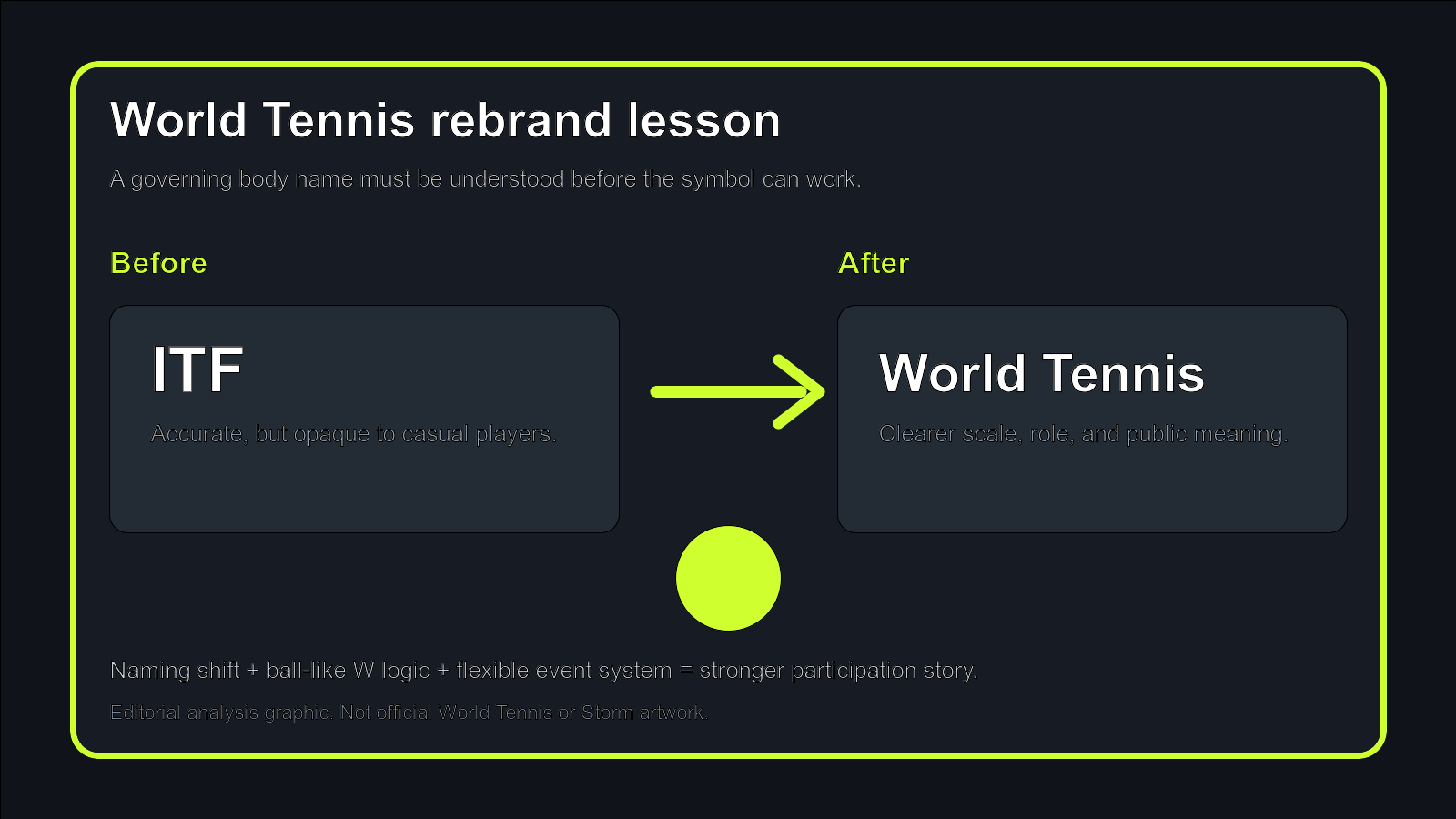
Editorial analysis board, not official artwork: naming clarity reduces the workload on the symbol.
Turn a Clear Name into a Clear Logo
If your brand name is hard to explain, explore the name and logo together. Start with Sologo's Name to Logo Maker, compare cleaner type directions in the Wordmark Maker, and build the final system with the Brand Kit Generator.