A scheduling logo can become a constraint when the product starts doing more than scheduling. Calendly’s ripple C offers a useful alternative: keep a recognizable initial, then build a visual language that can accommodate new kinds of work.
The news this week is Abduzeedo’s September 8 design review, rather than a September launch. Calendly’s August 19 product announcement introduced Callie and Notetaker as part of a broader meeting platform.
An Initial With Room Around It
Smith & Diction’s identity uses a ripple-like C inside a rounded container. At large size, the nested curves suggest expansion. At small size, the outer silhouette has to do more of the work. That difference is the real test of an app mark: an interesting construction is useful only when its smallest version survives.
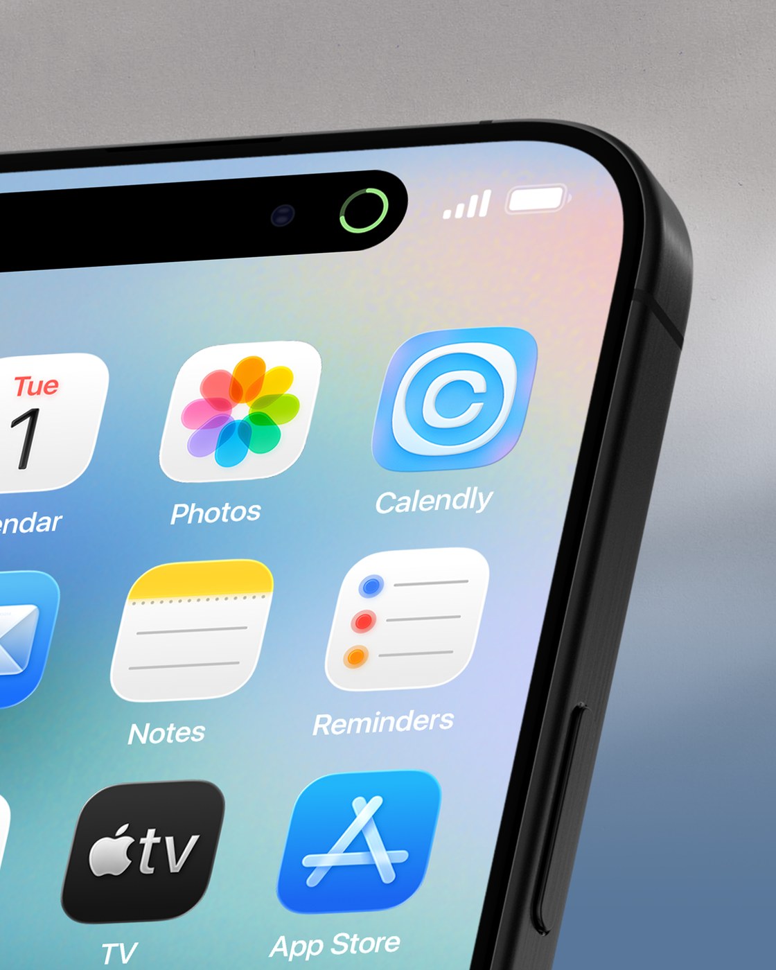
The Calendly icon on a phone home screen: the shape must stay recognizable at app size. Design: Smith & Diction / Calendly, via Abduzeedo.
The phone application is more instructive than a pristine logo sheet. Neighboring icons compete for attention, the label becomes tiny, and the mark sits inside a container it does not fully control. A successful identity needs a recognizable mass before it needs a detailed explanation.
The Same Geometry Can Explain Different Products
Google’s familiar multicolor product icons illustrate the tradeoff: family resemblance helps attribution, yet neighboring tools still need distinct silhouettes. Calendly raises the same question with a softer vocabulary. A system should make related products feel connected while letting someone find the right one without reading every label.
Connected rounded shapes extend the identity into messages and product-related graphics. This creates a practical relationship between the logo and the surrounding interface. A new feature can belong to the company without receiving an unrelated miniature brand.
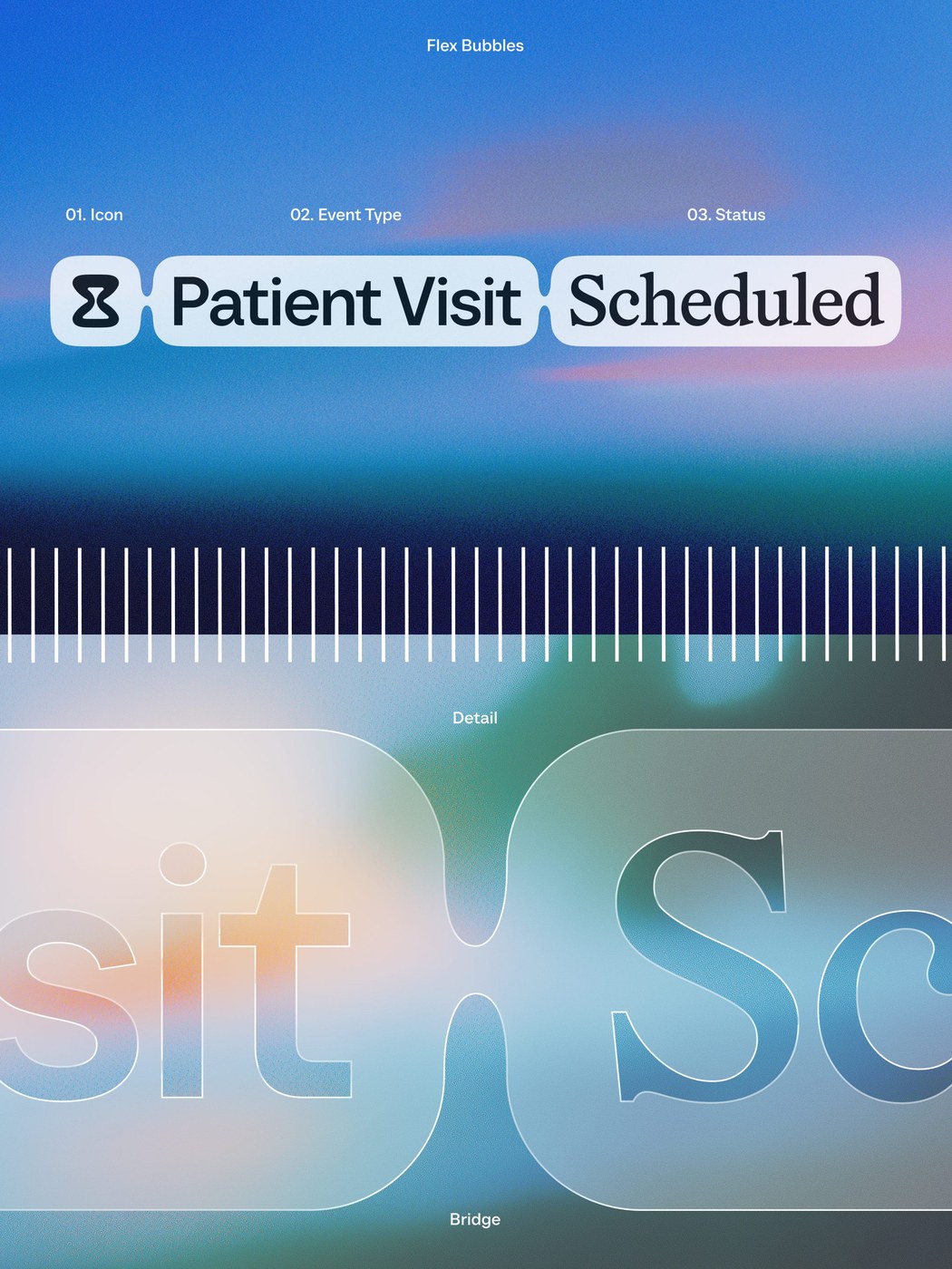
Connected, rounded forms carry variable messages in the identity system. Design: Smith & Diction / Calendly, via Abduzeedo.
That is the difference between a logo file and a working brand identity. Recognition can be distributed across shape, type and repeated behavior. But rounded forms should never make a button’s role ambiguous; usability still has to set the limits.
Make the Smallest Surface the First Decision
Choose the intended app-size silhouette before designing a launch animation. A useful rule should explain which parts may expand in a campaign and which must remain fixed for recognition. That decision belongs in the brief, not at the end of production.
For a smaller software team, begin with three actual surfaces: the browser tab, the mobile icon and a feature announcement. Test them together in color and monochrome. If the idea needs a long caption to stay coherent, simplify its visual rule before adding more variants.
Keep the Name Legible Beside the Symbol
Keep approved shapes, colors and type choices in a shared brand kit, then review how the wordmark behaves beside the icon. Explore an original wordmark with Sologo and judge it against the smallest place your customers will encounter it.