An event brand has an unusual obligation: it must be visible while helping someone else’s work get noticed. London Design Festival’s 2026 campaign makes that relationship its subject. The identity behaves like a frame, leaving space for the work it exists to present.
The Public Theater’s recurring Shakespeare in the Park campaigns offer a related model: each season needs its own expression while the presenting institution remains legible. LDF’s retained red makes the same strategic point. A memorable anchor can give the rest of the system permission to change.
A Festival Is a Host
Pentagram’s September 11 project feature presents Framing LDF, led by Domenic Lippa and his team. The familiar red stays, while the annual graphic idea changes. This is a seasonal campaign system, not evidence that the festival has abandoned its core identity.
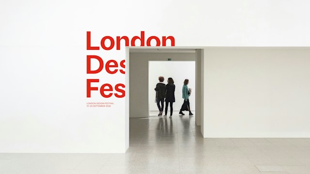
The frame concept extends into an exhibition setting, placing the festival name around an opening. Image: Pentagram / London Design Festival.
The exhibition application makes the concept physical. The opening is not just a place to insert an image: it becomes a way of relating the name to a visitor’s movement. That is a stronger starting point than choosing an arbitrary decorative motif and repeating it across merchandise.
For any organization representing many contributors, the central design problem is ownership. A highly distinctive campaign can overwhelm the content it hosts; a neutral template can disappear. A frame offers a negotiable boundary between the two.
Smaller festivals and exhibitions can test the idea without copying the lettering. Place three very different contributors’ images into the same layout, then remove the images entirely. If the brand survives both conditions and none of the contributors becomes visually subordinate, the framework is doing useful work.
The Blank Space Is Doing Work
The composition remains active even when no photograph fills it. On the T-shirt, the lettering’s placement implies an opening. This matters because an identity will eventually appear on something that cannot reproduce the full campaign: a staff badge, a small ticket or a one-color object.
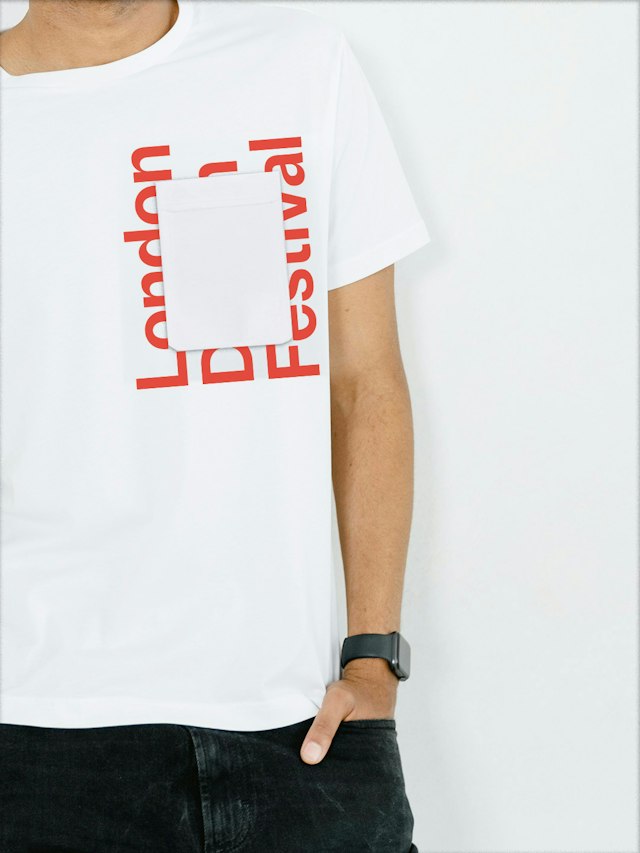
A T-shirt carries the framing gesture without a project photograph. Image: Pentagram / London Design Festival.
Think of this as a brand kit with a spatial rule. The rule tells a designer where content can breathe, where recognition should remain and what happens when imagery disappears. It is more useful than a folder full of unrelated examples.
The useful measure of this campaign is how well it hosts difference. Once the name and color are recognizable, the space around them can be generous. That generosity is part of the festival’s message, not unused advertising space.
Before committing to a campaign, check the identity on physical applications. Build your own recurring rules with Sologo’s Brand Kit Generator, starting with one stable identifier and enough space for the people your event brings together.