Fjord offers a floating sauna and cold-water plunge near Sausalito, on San Francisco Bay. Its wordmark makes the service readable in one glance: DutchScot replaced the “o” with a degree symbol. The little change suggests temperature while leaving the name intact. It is a useful answer to a common logo problem: how much explanation should a mark need?
The project drew fresh attention in LogoLounge’s October 31 coverage. DutchScot’s official case describes a communal, self-guided hot-and-cold experience rather than a spa service. The studio worked with the founders and Playtype on a bespoke face, drawing on the area’s industrial past instead of familiar wellness softness.
One character does two jobs
In the wordmark, the degree sign stands for the missing letter and signals temperature. Taken out of the name, it becomes a compact icon for other applications. This is more economical than adding a separate flame, snowflake or water drop. It also makes the identity distinctive without pretending the symbol can communicate the entire business on its own.
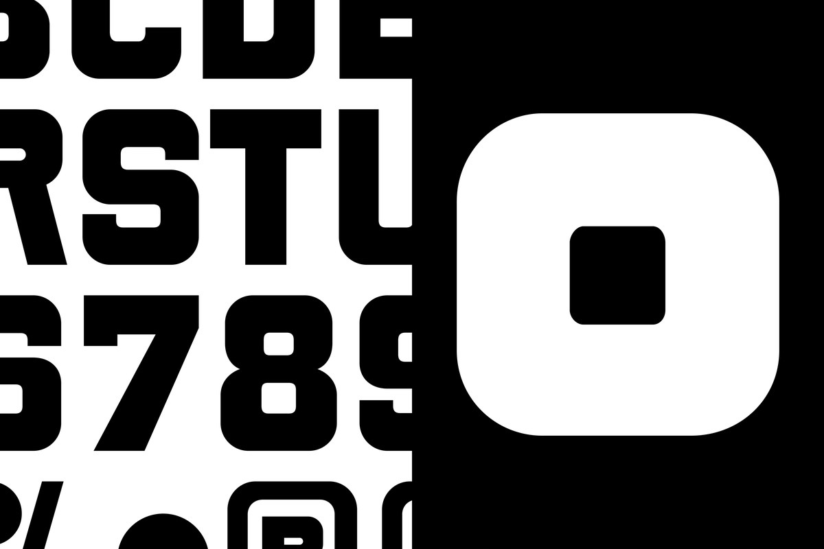
Image: DutchScot Fjord bespoke type specimen
The typeface is deliberately bold. That suits a physical sign seen against timber and changing light, but the project also needs quieter information such as booking instructions and safety details. A strong display face earns its place when it can live alongside clear supporting copy.
A wordmark built to leave the page
DutchScot extends the idea through signage, merchandise, print and a website with a temperature gauge that moves as visitors scroll. The sign photograph shows the degree mark in a real environment, where material, distance and light matter as much as a flat logo file. Photography by Alex Farnum adds a sense of the place rather than relying on an abstract promise of relaxation.
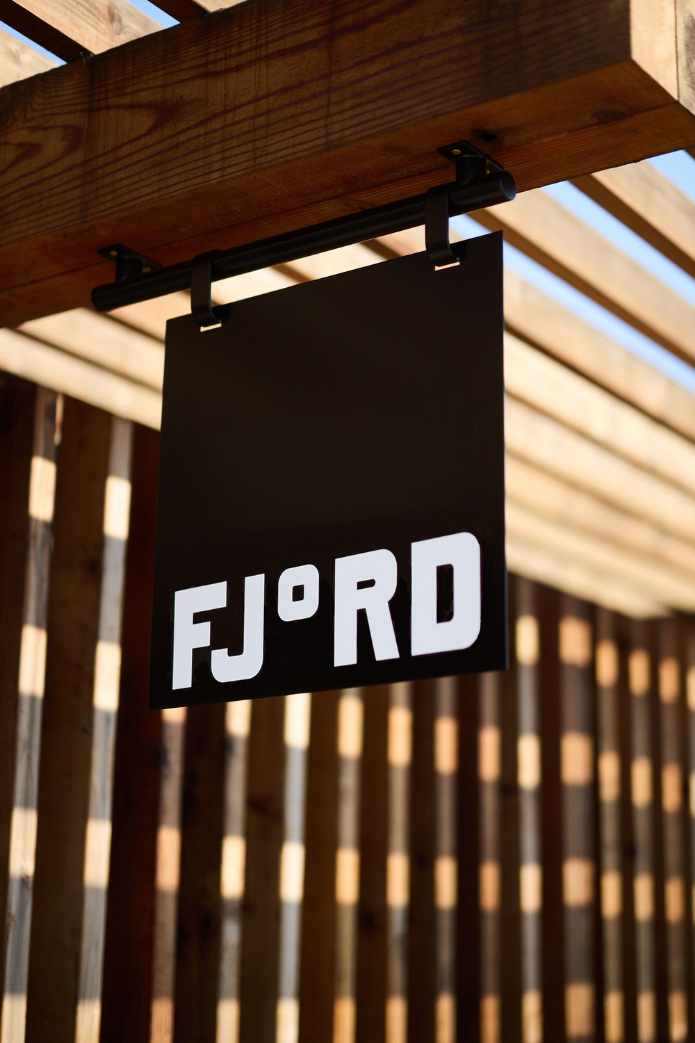
Image: DutchScot Fjord physical signage
A broader wordmark lesson
In a very different category, Barkas built Kuda’s banking identity around a custom display face that carries the “More Life” position across product and campaigns. Fjord compresses its own service idea into a single character instead. Both approaches show that typography can hold a brand proposition, but the best choice depends on where customers encounter the name: a banking app or a sign on the waterfront.
The lesson for small experience brands
Find one detail that belongs to the activity and can survive inside the name. A character substitution works only if people still read the word correctly and the idea stays legible at small sizes. Fjord’s degree mark passes that first test and gives the brand a reusable shorthand.
If you are naming a place or experience, test the name in a wordmark maker, then see it on signage and merchandise mockups. Build a brand kit so the clever character remains part of a consistent visual system.