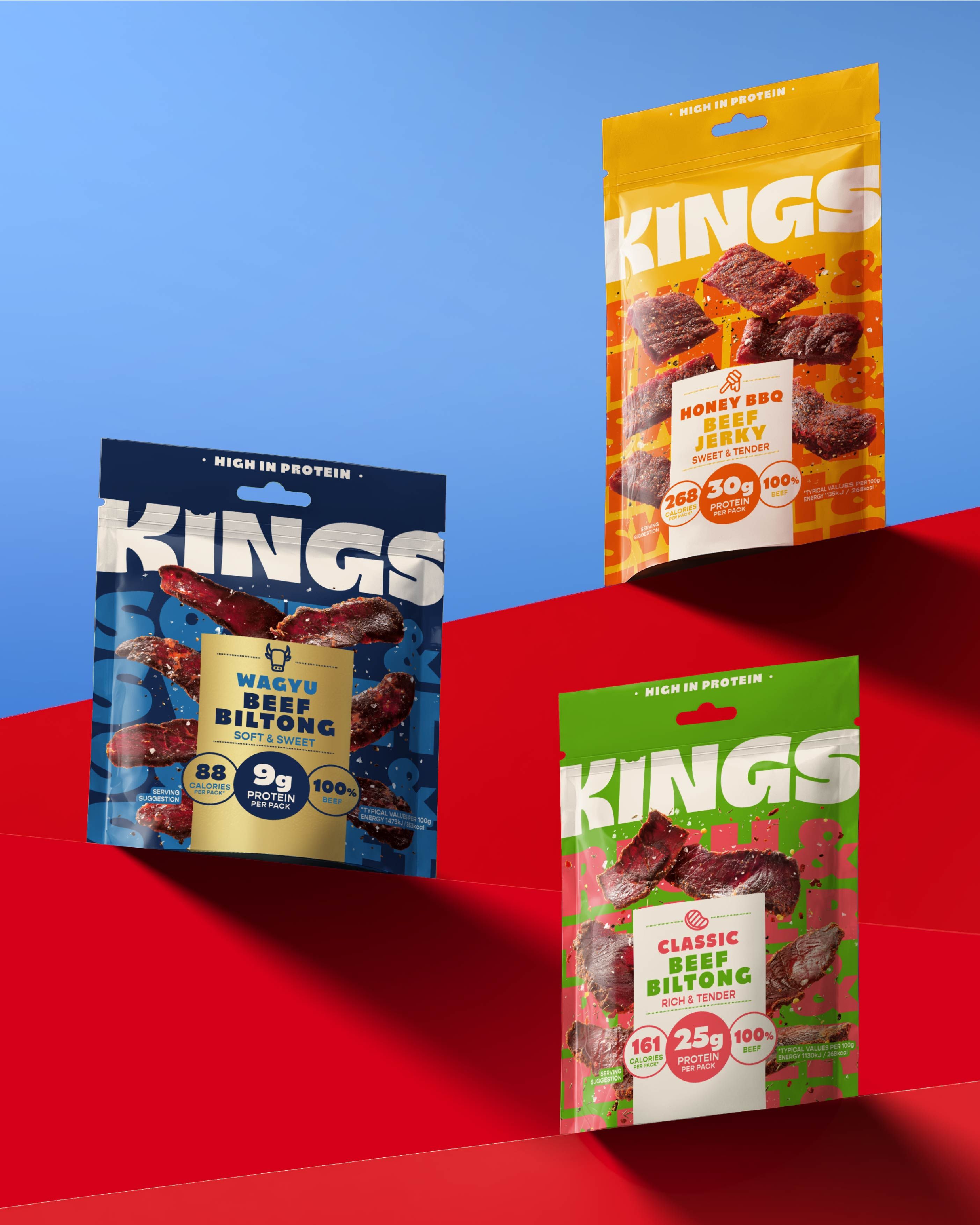
Kings sells biltong and jerky, but its new packaging is trying to win a broader snack moment. BrandOpus’s October work for the Kepak-owned UK brand moves appetite ahead of purely functional protein messaging. The logo does the first piece of work: thick letters carry an intentional bite, a product cue simple enough to register from a shelf.
BrandOpus’s announcement says the brief was to make meat snacks feel more accessible to everyday grazers. Lettering artist Rob Clarke collaborated on the logotype. Product phrases such as “Sweet & Smokey” and “Rich & Tender” become large packaging graphics, while color separates the range. The design does not hide protein claims; it gives flavor the opening line.
The bite is small; the shelf role is large
A bite mark can easily become a gimmick. Here it sits inside a heavy wordmark, so the name remains the dominant shape. At a distance, the bold KINGS lettering and color blocks provide the cue. Up close, the missing piece adds a second reading tied to eating. That order is sensible for a fast retail decision.
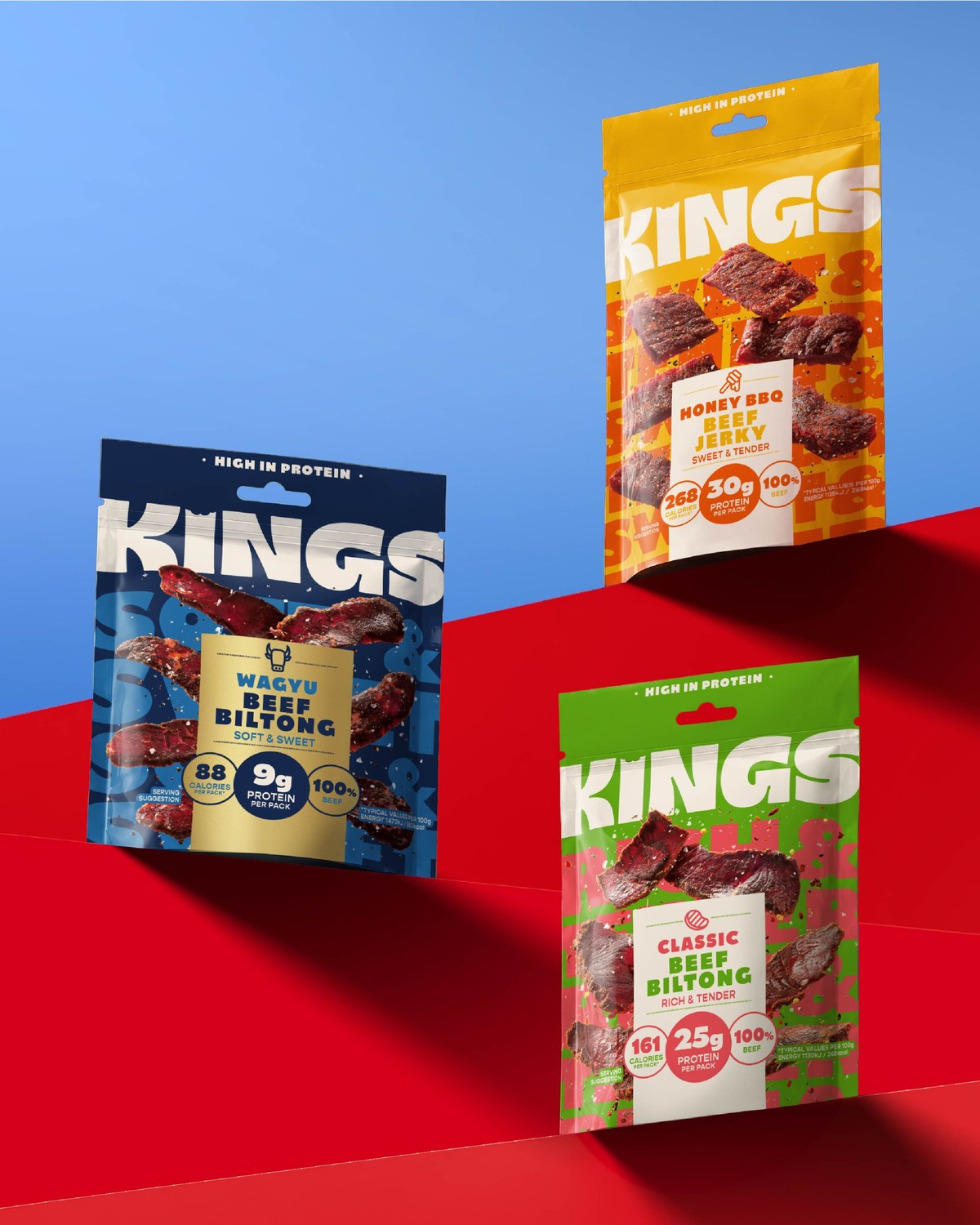
Image: BrandOpus Kings package design showing logotype and tasting notes.
The pack view also shows the value of restraint. A shopper still needs to know the product type, flavor and nutrition. BrandOpus uses a consistent tab to organize those facts across variants. The expressive tasting-note typography makes the packs lively, but the tab stops the range from turning into unrelated posters.
Flavor language becomes a visual asset
Many protein snacks compete with numbers. Kings keeps its credentials visible while using tasting notes to suggest texture and pleasure. Suspended product photography and bright color support that appetite-first pitch. Premium cuts receive deeper tones and gold accents, according to the agency, while the main range stays vivid.
This is an example of brand architecture at the scale of a supermarket shelf. A logotype must be stable enough to connect all packs; color and copy should help customers distinguish choices without relearning the brand. The packaging is now in stores, giving the design a real-life test under crowded lighting and limited attention.
What a small food brand should test
Put the name, product type and flavor on a phone-size image of the pack. Then view it beside competitors at a distance. If only the illustration survives, the hierarchy needs work. Kings suggests that a distinct letterform and one simple product cue can carry more recognition than a pile of claims.
Explore a sturdy wordmark for the master brand, then use the brand kit generator to set flavor colors and type rules. Check the result on packaging mockups before printing a range.