Axi did not need a new logo to look like a new brand. In the identity work publicized by Properly Studio in October, the online trading company kept its name mark and signature red. The larger change is a system built to travel across more than 100 markets, a 150-plus-page website and the trading interface. That is a useful correction to the reflex that every rebrand begins by replacing the symbol.
Properly Studio’s case study describes the four-month build and Axi’s brief: globally consistent, locally connected. The studio treated the logo as a fixed point, then made room for regional personas, landscapes and market-specific content. An October 15 studio announcement framed the public rollout.
A stable logo needs flexible surroundings
The Axi brand persona, red accents and market graphics can change around the same mark. Properly grouped markets into four broad regions for creative production. It says imagery was made with an AI-assisted workflow and finished by hand; these are official campaign assets, not documentary portraits of individual customers. That distinction matters when visual localization aims to feel credible.

Image: Properly Studio Axi regional campaign image.
Local relevance requires more than swapping a face or a landscape. The studio says rules for language, maps and jurisdiction-specific screens can change without breaking the layout. Its longer localization account describes Axi Sans alongside Noto Sans families for different writing systems. Typography here is infrastructure for comprehension, not a decorative extra.
The trading app is the stress test
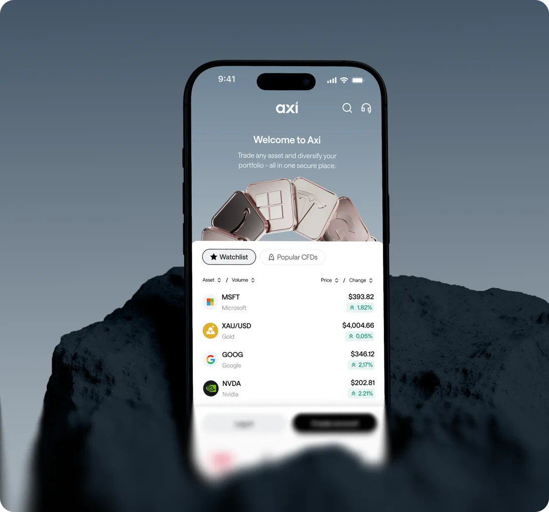
A striking campaign can bring someone to a platform. The interface has to help them navigate products and decisions. The app image shows the refreshed brand carried into a compact mobile screen: the same restrained red, clear hierarchy and recognizable name sit around dense trading information. That is where a brand system earns trust through repeated use.
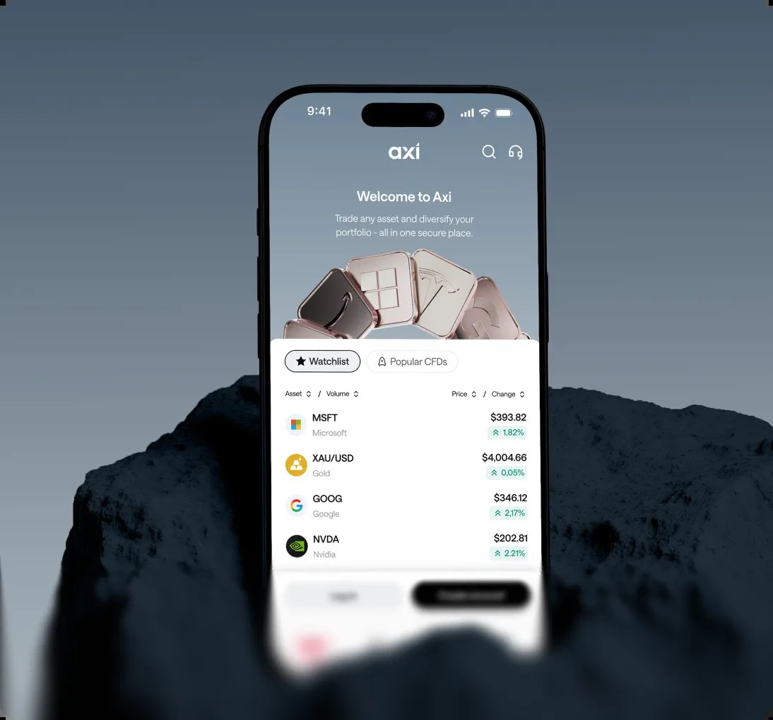
Image: Properly Studio Axi trading app design.
The agency says it delivered reusable templates and rules rather than a one-time style guide. For a company working across languages and regulated markets, that matters. Local teams need to update content without inventing a fresh visual grammar each time, while compliance text must remain correct for the audience seeing it.
What a growing business can borrow
Keep an existing mark when customers already recognize it and the real problem is inconsistency elsewhere. Define a small set of constants—logo, key color and layout rhythm—then write rules for what may vary by market or product. Test the system on a mobile screen and a real campaign before calling the identity finished.
For a smaller fintech or service brand, begin with a legible wordmark. Build a brand kit for consistent type and color, then inspect the result in realistic mockups at phone size.