An orchestra needs to be recognizable before the first note is played. Pentagram’s new identity for the St. Louis Symphony Orchestra uses a gestural ribbon that can form an SLSO monogram or an instrument illustration, paired with a custom serif wordmark. The flexible shape speaks to movement, while the typography gives the institution a steady name.
Pentagram’s official case study, published October 27, ties the work to a larger change: Powell Hall reopened in 2025 after restoration and expansion. The identity’s line, “All Together Now,” expresses the orchestra’s goal of connecting performers, audiences and the surrounding community.
Why the ribbon earns its place
A wavy line could easily become decoration. Here it has jobs: it can draw the monogram, suggest conducting patterns, and echo curves in Snøhetta’s expanded building. On a street banner, those shapes sit next to the full institutional name, so the mark can be expressive without asking a passerby to decode it alone.
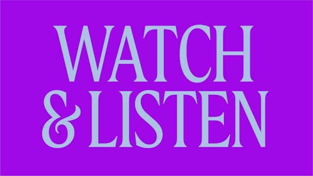
Image: Pentagram SLSO campaign typography
The purple typographic application demonstrates the system at its loudest. Large words work for a season campaign, but smaller program details need more discipline. Pentagram’s Frequency Serif, developed with Reset Type Studio, gives the orchestra a consistent typographic voice beyond the ribbon.
A venue becomes part of the brand
Pentagram shows the identity across seasonal campaigns, the website and signage around Powell Hall. A street-level poster is a harder test than an isolated logo: it must attract attention, name the organization and help people orient themselves. The visual system becomes useful when it can bridge a concert ticket, an exterior sign and an online event listing.
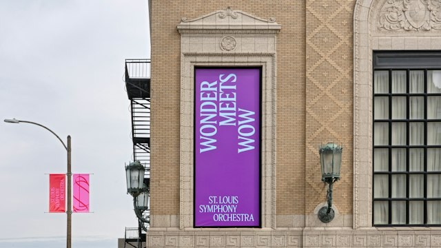
Image: Pentagram SLSO exterior poster at Powell Hall
A cultural identity has to travel
Pentagram’s MTA Arts & Design anniversary identity takes a more fixed route: a geometric 40 extends the program’s paired-circle mark across subway posters and screens. SLSO needs a living device for seasons and performances, so its ribbon has more range. Both examples show that cultural branding earns value where it reaches the public, beyond a launch image.
What cultural brands can borrow
Choose a graphic device with more than one credible use. Test it on a tiny digital listing and a physical sign, then make sure the organization’s name remains readable beside it. SLSO’s ribbon is strongest where it represents music and place together, rather than where it simply fills space.
For a performance or community project, start with a legible wordmark, experiment with a companion monogram, and check both in poster and signage mockups. The goal is a system people can recognize from street to screen.