SurveyMonkey began with a contrast problem. Its brand and product teams were checking whether existing colors met accessibility standards, then found that the answer affected typography, motion, marketing and the interface itself. The company published its account on September 14, describing a broader visual refresh launched in August.
According to SurveyMonkey’s first-hand account, the work became Project Catalyst. That timing matters: this is a September explanation of an earlier launch, not a newly unveiled logo this week.
Color cannot be tested only in a mood board
The published color examples pair brand greens with other tones under contrast checks. A color can look distinctive in a campaign image yet fail a button, label or data display. Accessibility testing turns a visual preference into a working rule.
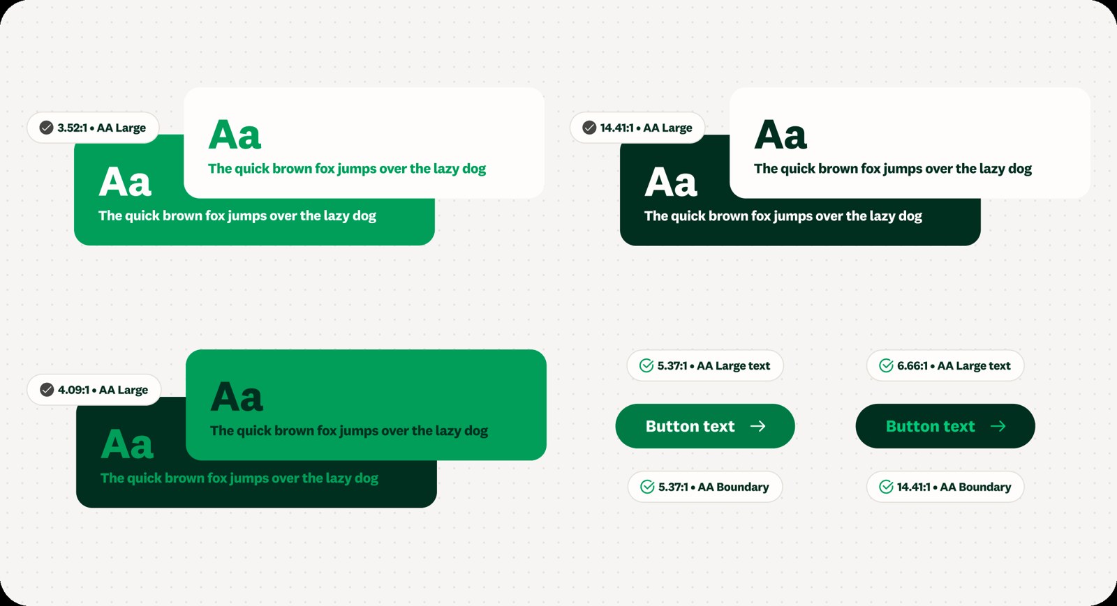
SurveyMonkey’s published examples of accessible color combinations. Source: SurveyMonkey.
The practical question is where each color is allowed to sit: background, text, accent or data state. A palette with those roles is more useful than a collection of swatches. The same principle applies to type size and motion: the identity has to support comprehension, not just recognition.
The product interface is a brand surface
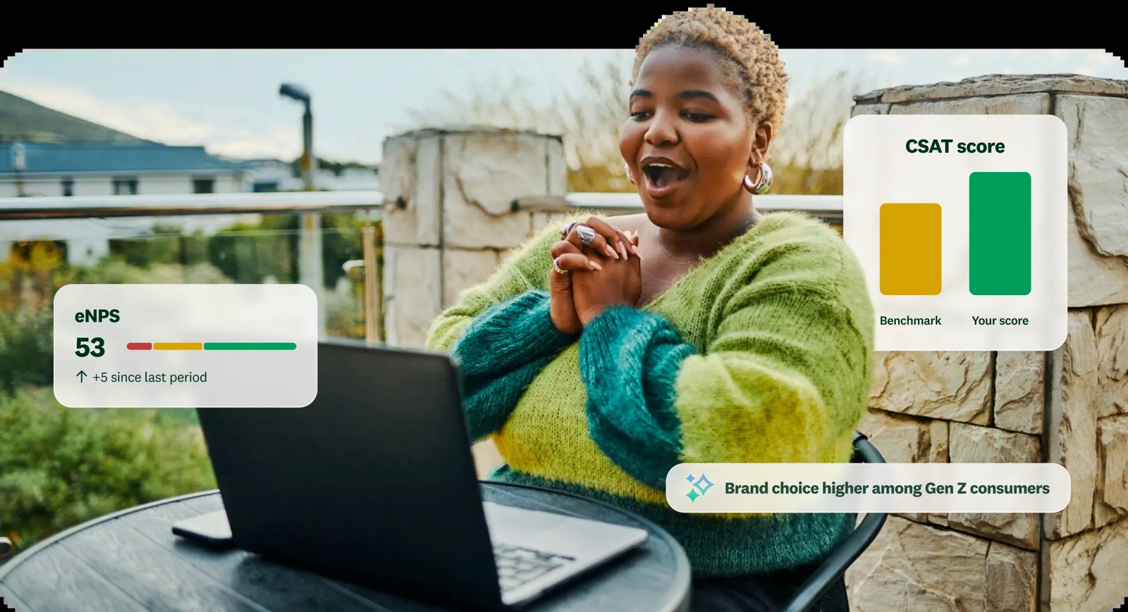
The refreshed identity inside a product context. Source: SurveyMonkey.
SurveyMonkey’s product example shows why brand and interface teams had to make decisions together. If the marketing site promises warmth while the app feels cold or hard to read, users experience two different companies. The design system is the bridge between those encounters.
This is relevant beyond survey software. A brand identity for any digital tool now lives in forms, notifications and dashboards. Shared brand-kit rules can reduce drift, but teams still need to test real screens.
The useful lesson for a small software team
The company says design decisions remained human-led while AI helped with parts of execution. That distinction is useful when scaling a system: automation can produce variations, but someone must define the contrast, hierarchy and tone those variations obey.
Mozilla’s accessible design guidance and IBM’s Carbon system illustrate the same broader practice: documented colors and components make consistency testable. A startup can begin much smaller. Audit three high-traffic screens, record failed contrast pairs, then fix the reusable tokens rather than patching every button separately.
When exploring an original mark, use Sologo’s Wordmark Maker and check it on light and dark screens. Keep the final choice in a brand kit with explicit color roles, so the identity stays readable as the product grows.