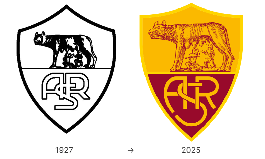
In June 2025, AS Roma, the iconic Italian football club, unveiled a bold new visual identity—by looking backward. The club has revived a familiar face: a modernized version of its crest used from 1979 to 1997. The updated new logo drops the “SPQR” inscription from the 2013 version and restores focus to the legendary she-wolf and twins, the heart of Roman mythology.
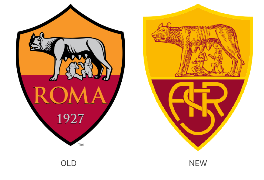
Compared to the recent crest, the 2025 new club crest uses sharper outlines, simplified typography, and a better balance of proportion between the wolf and the twins. The result is cleaner, more iconic, and optimized for today’s fast-moving digital environments.
A Return to Roman Roots
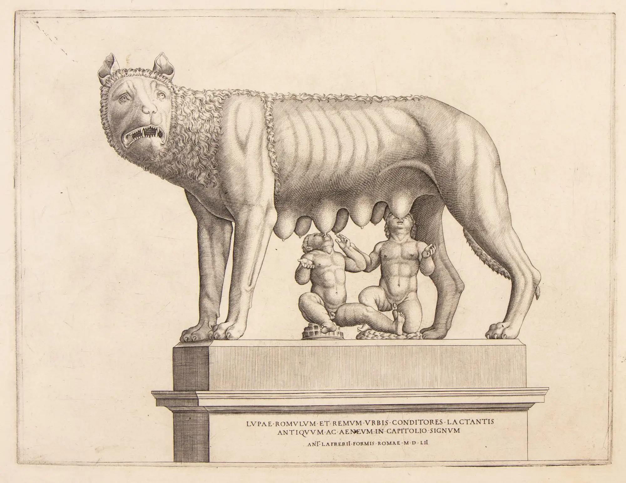
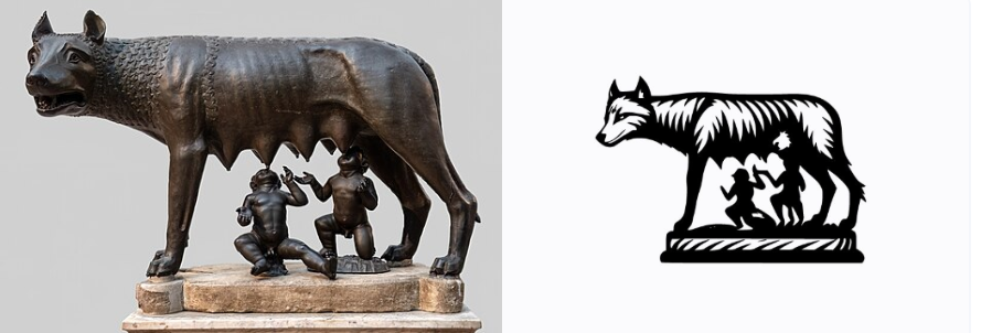
This redesign is more than cosmetic. AS Roma is reaffirming its identity—not just as a football team, but as a symbol of the city itself. The she-wolf (Lupa Capitolina) feeding Romulus and Remus is one of Rome’s oldest legends, and one that has long been central to the club’s visual heritage.
By restoring this imagery, the club strengthens its emotional ties with supporters and underscores its place in Roman culture. It’s a move that speaks to pride, legacy, and authenticity—all core elements of strong branding.
Tradition Meets Modern Utility
Though the logo draws heavily from the past, its structure has been subtly reworked for modern use. The new design features smoother geometry, a more neutral color palette, and scalable elements that work effortlessly across print, web, broadcast, and mobile.
This makes the crest more flexible for the club’s growing digital presence—whether it’s jersey printing, app icons, or social media graphics. It reflects a broader trend in sports branding: simplifying for versatility, while preserving identity.
Conclusion: A Smart Revival
AS Roma’s 2025 new logo strikes a thoughtful balance between legacy and modernity. On one hand, it reconnects the club with its historic identity—restoring a crest that has deep emotional meaning for its supporters.On the other, it refines that image for today's aesthetic and functional demands.
It’s a clear example of how heritage can be reimagined, not replaced. For clubs and brands alike, that’s a powerful message.
From Icon to Logo — Try It Yourself
AS Roma’s rebrand proves the power of returning to meaningful visuals. By transforming a historic symbol into a modern, versatile logo, the club created something both timeless and relevant.
You can do the same!
Whether it’s a sketch from the past, a family symbol, or something that tells your story—turn it into a custom logo with Sologo.ai’s image-to-logo generator. Give your brand its own identity rooted in meaning. Start designing now!