Peacock has updated its streaming logo for 2026. The change is not loud: the wordmark is cleaner, the app icon feels flatter, and the familiar color-dot idea has been simplified.
That small move is worth studying because Peacock is a digital-first streaming brand. Its logo has to work in app stores, smart TV menus, mobile home screens, search rows, thumbnails, and social profiles. In those places, clarity matters more than decoration.
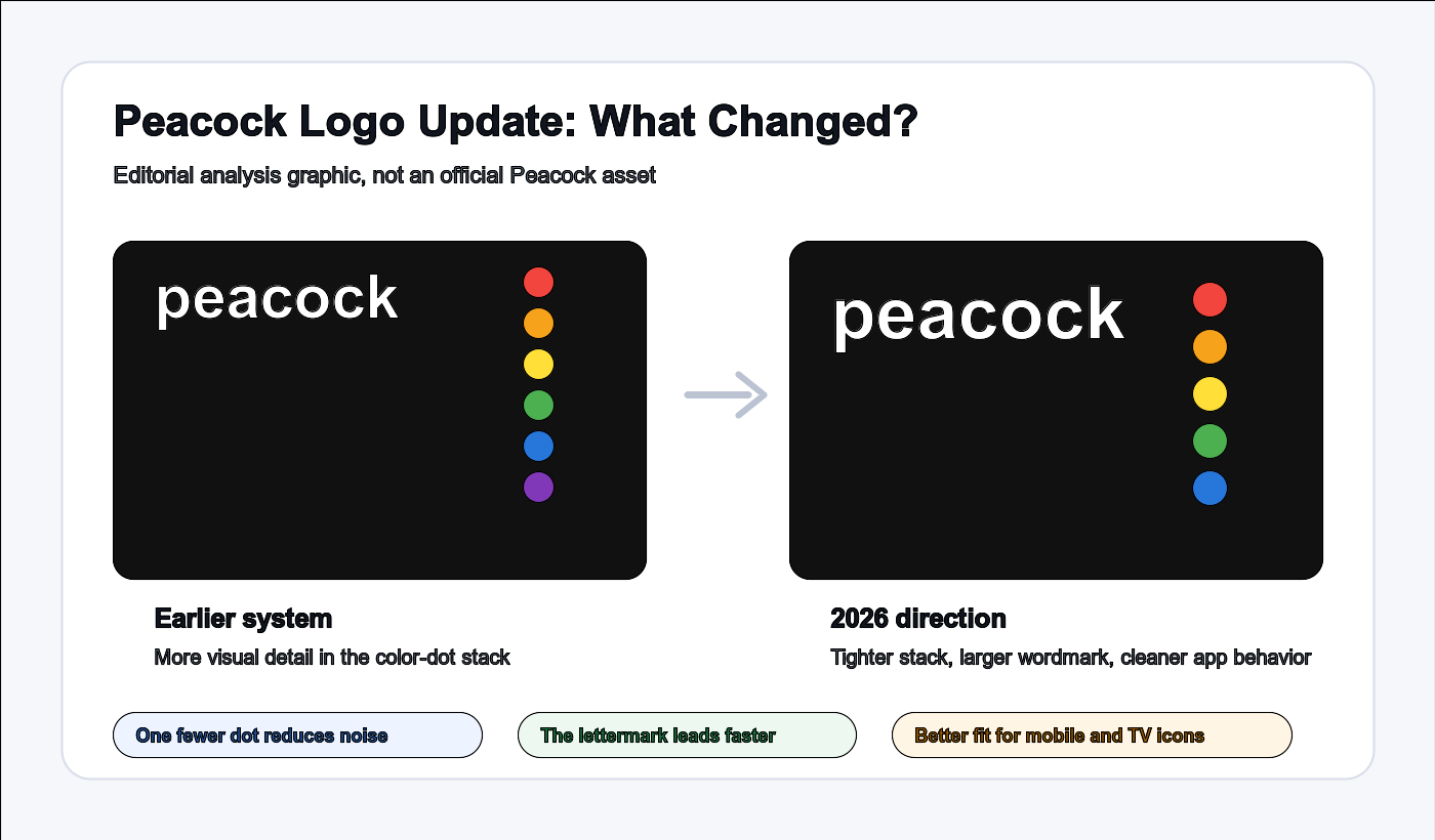
Editorial analysis graphic: the 2026 direction is about less noise, a stronger wordmark, and better small-size behavior.
What Changed in Peacock Logo?
The new Peacock logo keeps the same basic brand language: a friendly lowercase wordmark and a set of colored dots that connect the streaming service back to NBC visual heritage.
The important changes are practical:
- The color-dot stack is tighter and less noisy.
- The lowercase p becomes easier to recognize.
- The app icon looks flatter and cleaner.
- The whole mark behaves better inside square digital surfaces.
Why One Less Dot Matters
For a streaming service, a logo is not only a brand signature. It is also a product-interface element. Users may see it at very small sizes dozens of times before they ever see a full brand presentation.
That changes the design problem. A detail that looks meaningful at large size can become visual noise at app-icon size. By simplifying the color-dot stack, Peacock gives the letterform more room to lead.
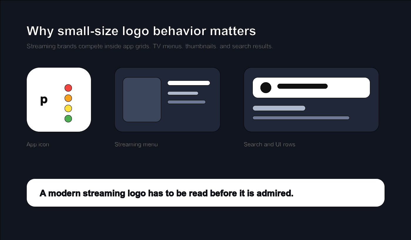
A streaming logo has to survive the app grid before it can win on a billboard.
The Bigger Streaming Logo Trend
Streaming brands live in crowded interfaces. Disney+, Tubi, Max, Netflix, Hulu, Prime Video, and Peacock are often seen as small tiles in the same visual field. That makes logo behavior more important than logo ornament.
A strong streaming logo has to do three jobs at once:
- Stay recognizable at very small sizes.
- Work as both a wordmark and an app icon.
- Carry brand memory without becoming visually heavy.
Peacock update fits that pattern. It is less about creating a new story and more about making an existing story easier to use.
What Smaller Brands Can Learn
If you are designing a logo for a startup, app, creator brand, studio, or online store, Peacock offers a useful lesson: you may not need a total rebrand. You may need a focused refinement.
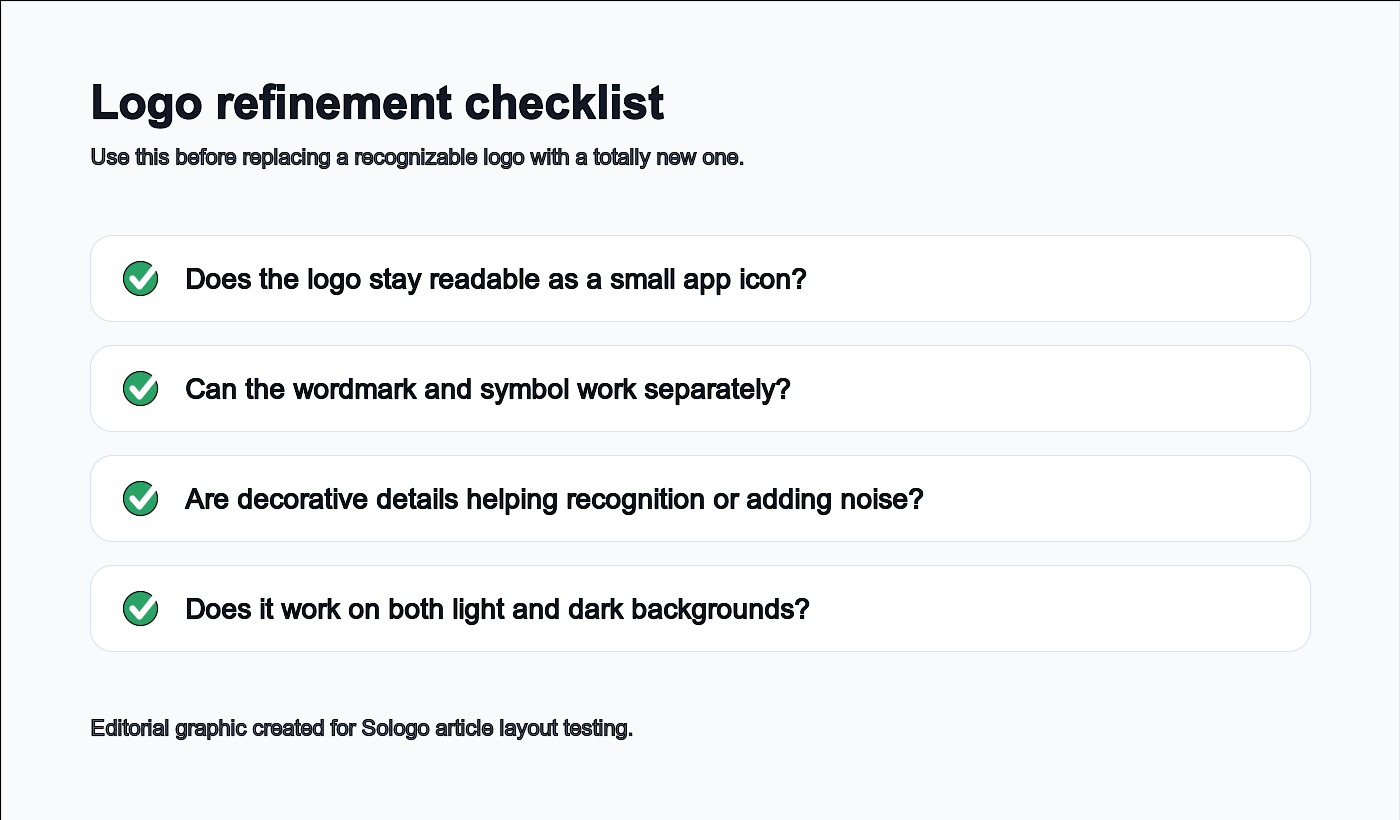
Before replacing a recognizable logo, check whether the current system can be made clearer and more useful.
Ask these questions before changing everything:
- Does the logo still read clearly as a small app icon?
- Can the wordmark and symbol work separately?
- Are decorative details helping recognition or slowing it down?
- Does the logo work on both light and dark backgrounds?
- Can it scale from social avatar to website header to packaging?
Design Your Own Screen-Ready Logo
Peacock update is a good example of protecting recognition while improving usability. If you are building a digital-first brand, start with the same question: where will people actually see your logo most often?
Try Sologo Wordmark Maker to explore clean, readable logo directions for your brand name. If you need a full identity system, use the Brand Kit Generator. For app or product visuals, test your logo with the AI Mockup Generator before you commit.