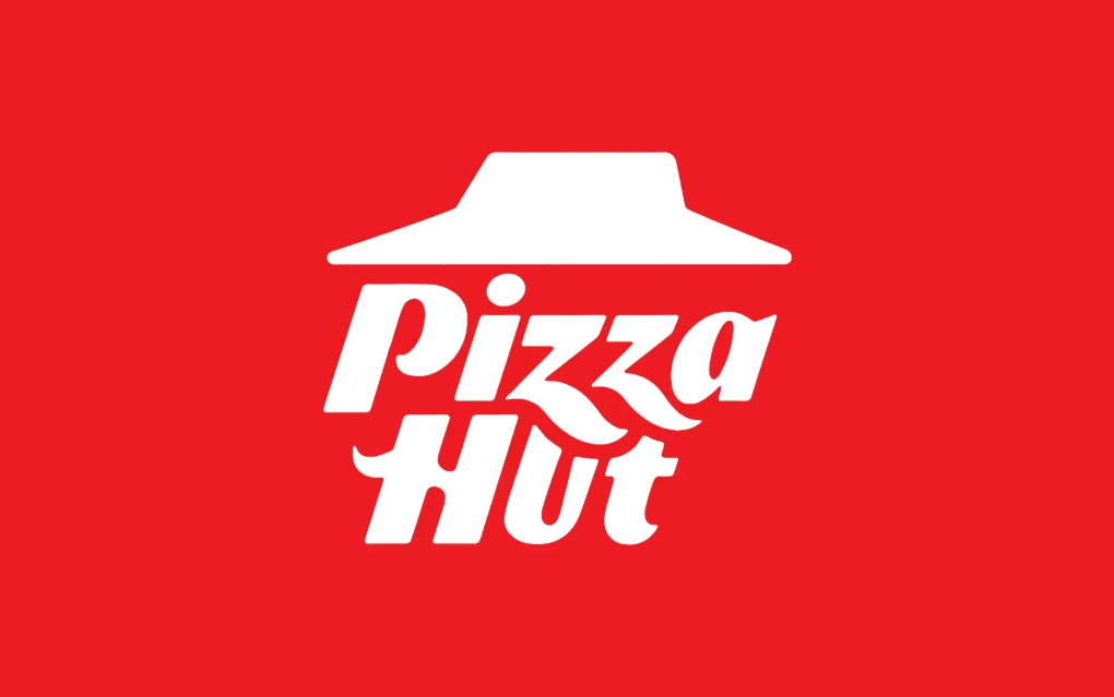
Pizza Hut has unveiled a new logo design in the UK and Canada, featuring a striking red roof and slanted typography. This redesign aims to refresh the brand's image while maintaining its iconic elements.
What’s Changed in Pizza Hut’s Logo?
Pizza Hut's latest logo introduces a modern twist to its classic design. The new logo features a vibrant red roof, symbolizing the brand's signature element, while the typography has been tilted to add a dynamic feel. This change marks a departure from the previous version, which had a more straightforward, horizontal text layout. The new design emphasizes simplicity and modernity, aligning with current branding trends.
- Color: The vibrant red color of the roof is retained, reinforcing the brand's identity and visibility across various platforms.
- Typography: The new italicized font introduces a sense of dynamism and freshness, reflecting the brand's innovative spirit.
- Layout: The layout remains simple yet impactful, ensuring that the logo is easily recognizable and memorable.
The Evolution of Pizza Hut’s Logo
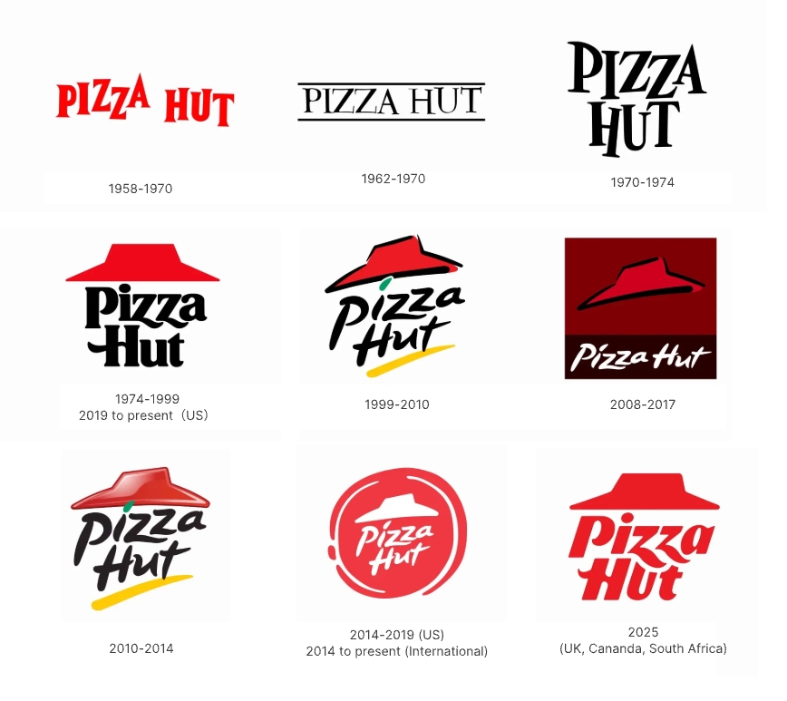
Over the years, Pizza Hut's logo has undergone several transformations. The initial logo from 1958 was simplistic, featuring a basic text design. In 1974, the iconic red roof was introduced, becoming a staple of the brand's identity.
The logo saw another major update in 2014, with a sleeker design and a more prominent red roof. The latest redesign in 2023 continues this evolution, focusing on a minimalist aesthetic while retaining the brand’s core elements.
Why This New Logo Works: Design Strengths and Strategic Thinking
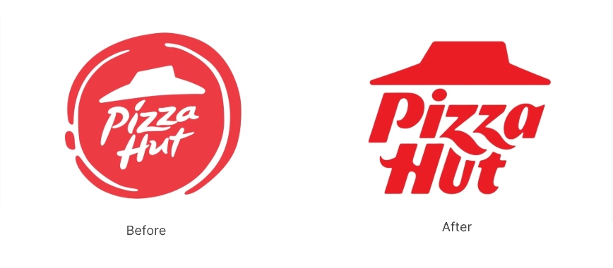
The new Pizza Hut logo succeeds in blending tradition with modernity. The bold red roof maintains brand recognition, while the slanted typography introduces a fresh, energetic vibe.
This redesign likely reflects a strategic move to appeal to younger audiences and adapt to contemporary design preferences. By simplifying the logo, Pizza Hut enhances its visual appeal and ensures versatility across digital and print media.
Other Notable Brands Using Similar Logo Approaches
- Coca-Cola Coca-Cola's logo is renowned for its flowing script and bold red color, maintaining brand consistency while evolving over time to remain relevant.
- Nike Nike's swoosh logo is a prime example of minimalist design that conveys motion and energy, aligning with the brand's athletic identity.
- Apple Apple's logo, a simple apple silhouette, has become synonymous with innovation and sleek design, reflecting the brand's commitment to simplicity and elegance.
Conclusion
Pizza Hut's new logo is a testament to the power of strategic branding and design evolution. By balancing iconic elements with modern trends, the brand successfully refreshes its image while maintaining its identity. This redesign not only enhances visual appeal but also positions Pizza Hut to engage with a broader audience in today's competitive market.
If this inspires you to think about your own brand’s future, why not start creating today? With SologoAI, you can generate a unique, professional logo in minutes—no design skills required. Whether you’re refreshing an established brand or building something new, SologoAI helps you bring your vision to life effortlessly.
If this inspires you to think about your own brand’s future, why not start creating today? With SologoAI, you can generate a unique, professional logo in minutes—no design skills required. Whether you’re refreshing an established brand or building something new, SologoAI helps you bring your vision to life effortlessly.