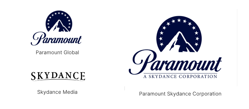
In a significant move that has caught the attention of the entertainment industry, Paramount Global and Sky Dance Media have merged, unveiling a new company logo that retains the iconic 'Stars Surrounding Mountain' design. This merger signals a fresh era for both companies, blending their strengths while maintaining a nod to their rich histories.
The New Logo Design
The newly released logo showcases a refined take on the classic mountain surrounded by stars. The design features a sleeker mountain silhouette, with stars that are more pronounced and evenly spaced, offering a modern yet timeless look. The color palette has been updated to incorporate deeper blues and whites, enhancing the logo's visual appeal. The typography remains bold, ensuring the brand name stands out prominently.
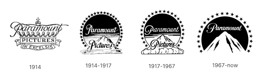
The Evolution of Paramount’ s Logo
Paramount Pictures' logo has undergone several changes over the decades. Originally introduced in 1914, the design has seen variations in the number of stars and the mountain's depiction. Key milestones include the 1968 version with 22 stars, the 1986 update with a more realistic mountain, and the 2012 redesign that simplified the stars and mountain for digital media.
Conclusion
The merger of Paramount Global and Sky Dance Media and their new logo design marks a pivotal moment in entertainment branding. By retaining the iconic 'Stars Surrounding Mountain' design, the companies showcase a commitment to their legacy while embracing modern trends. This move highlights the importance of balancing tradition with innovation in the branding world.