Pentagram's new identity for Rugiet tackles a difficult healthcare branding problem: how can a men's health platform speak directly about sensitive needs without feeling cold, embarrassing, or aggressively masculine?
The answer is not a medical symbol. It is a confident wordmark, a custom typeface, warm color, and a system that treats clarity as a form of respect.
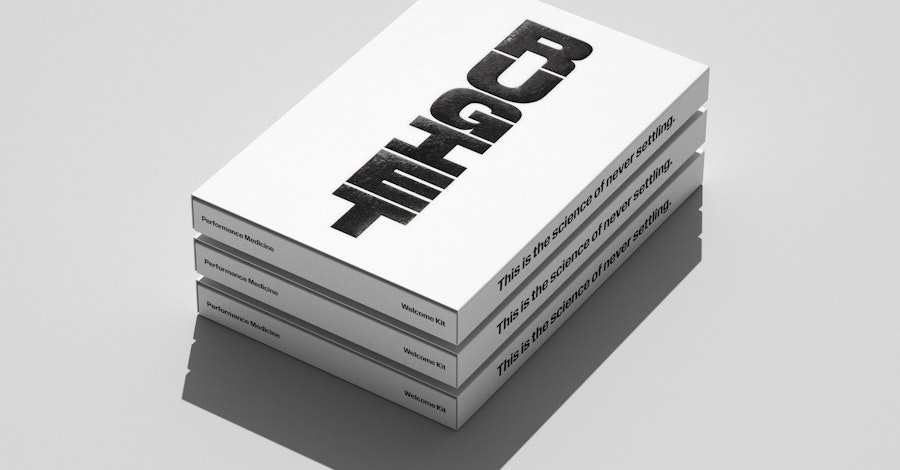
The identity uses bold type and warm color instead of conventional clinical cues (source: Pentagram).
What Changed in Rugiet's Identity?
Pentagram developed the strategy, visual identity, and a custom typeface as one system. That matters because the brand communicates mainly through words: product names, instructions, discreet packaging, and digital care. Typography is not decoration here; it is the interface.
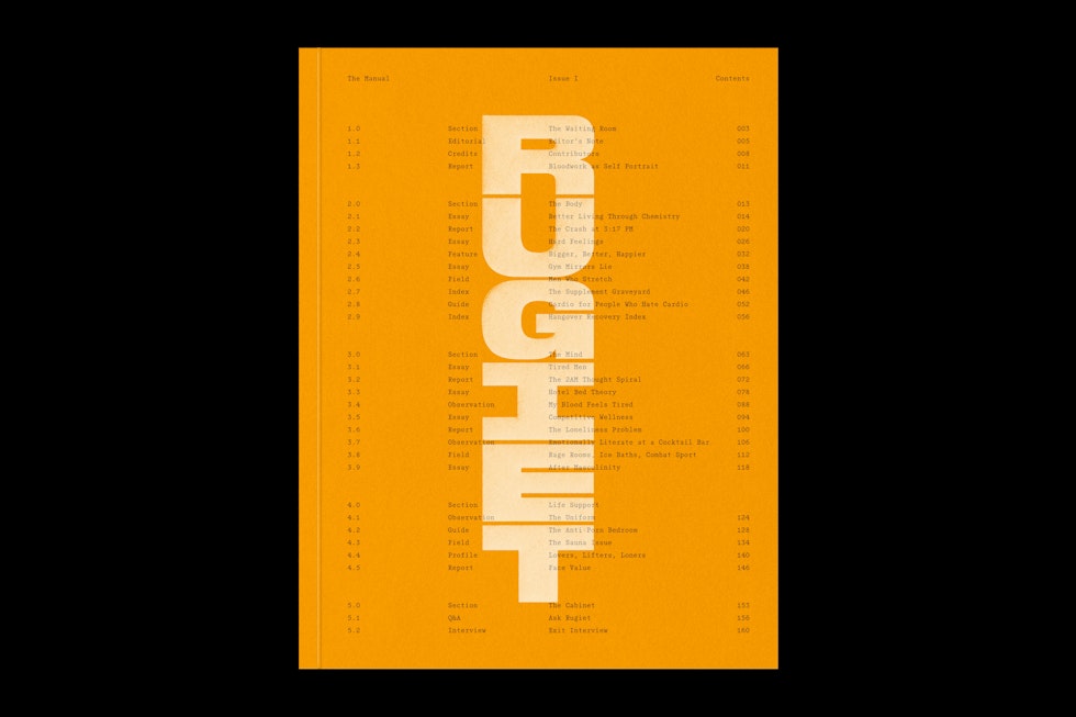
A custom type system keeps product, editorial, and service messages in one recognizable voice (source: Pentagram).
Why the Wordmark Matters
Many telehealth brands reach for the same shorthand: blue gradients, crosses, shields, and soft geometric icons. Rugiet makes the name itself the most ownable asset. A distinctive wordmark can build recognition while keeping the service discreet.
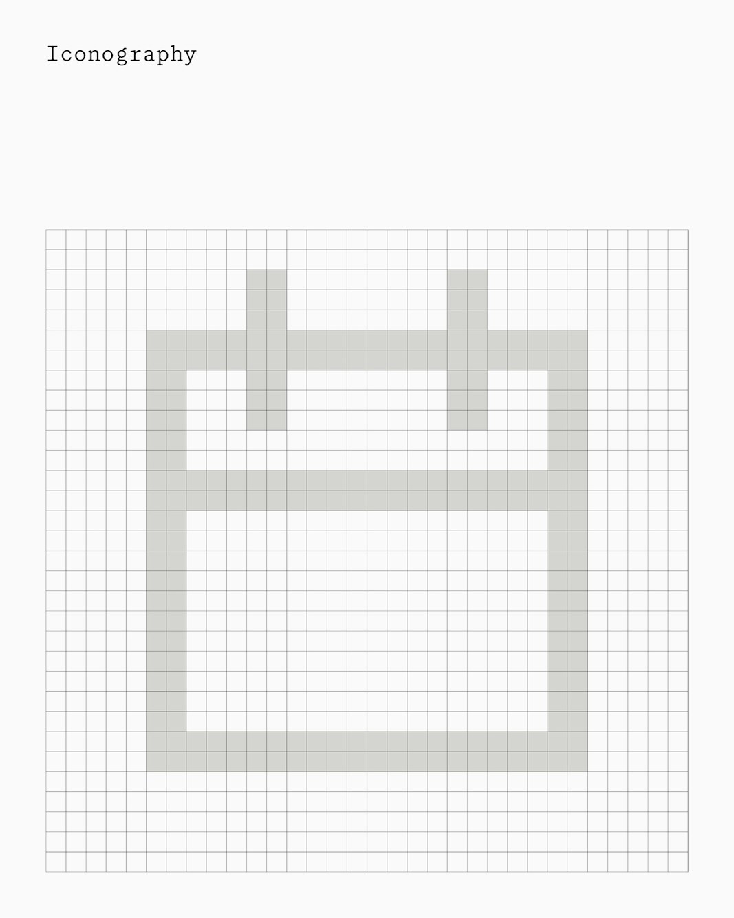
Supporting icons extend the same direct, graphic voice across the experience (source: Pentagram).
What Smaller Healthcare Brands Can Learn
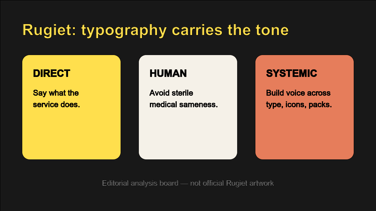
Editorial analysis board, not official artwork: direct, human, and systemic are stronger goals than simply looking medical.
- Choose a tone before a symbol. Decide how the brand should speak in vulnerable moments.
- Make typography do real work. A word-led brand needs strong hierarchy across every touchpoint.
- Avoid category camouflage. Trust does not require looking identical to every competitor.
- Test privacy contexts. Use an AI Mockup to review packaging, mobile screens, and delivery materials.
Create a More Ownable Healthcare Wordmark
Turn a clear brand name into a distinctive typographic identity with Sologo's Wordmark Maker, then organize its colors and applications with the Brand Kit Generator.