Cracker Barrel recently unveiled a new logo in 2025, but instead of being celebrated, the redesign quickly faced intense backlash. Many loyal customers criticized the departure from the brand’s nostalgic look, forcing the company to roll back the change. This incident highlights the delicate balance between modernization and heritage in branding.
Cracker Barrel's New Logo: A Short-Lived Experiment
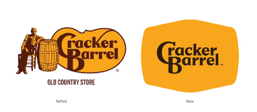
The 2025 mark did not preserve the brand’s signature imagery — it’s essentially a bare wordmark on a flat background, with no barrel, rocking chair, or illustrative detail. By removing these tactile, heritage-rich symbols and presenting only the name in a simplified treatment, the redesign aimed for a modern, streamlined look. Instead, many customers felt the brand’s personality had been erased, not refreshed, which helped trigger the swift backlash and eventual rollback.
Audience Reactions and Backlash
Almost immediately, the redesign sparked criticism. Long-time patrons argued that the updated logo stripped away the brand’s personality and authenticity. What was meant to signal a modern refresh instead became a reminder of how deeply customers value tradition and emotional connection in visual identity.
When Minimalism Meets Nostalgia: Why the Redesign Didn’t Work
A logo carries memory as much as form. In this case, the complete removal of Cracker Barrel’s iconic elements eliminated the visual cues that long-time patrons associate with the brand’s rustic identity. While a wordmark-only approach improves scalability and clarity, it also removed emotional anchors. The result was a perception of loss rather than progress — a misalignment between the company’s intent and customer sentiment that led to rapid rejection.
Lessons for Designers and Marketers
- Respecting Brand Heritage Brands like Cracker Barrel are built on history and storytelling. A redesign that overlooks emotional resonance risks alienating loyal customers.
- Balancing Modern Trends with Tradition Minimalism can be powerful, as seen with Apple, Starbucks, and Nike. However, these brands introduced changes gradually and aligned them with evolving consumer expectations — something Cracker Barrel’s abrupt redesign lacked.
- Listening to Customer Feedback The swift reversal of the logo underscores the importance of testing and incorporating audience feedback before making permanent branding shifts.
Conclusion
Cracker Barrel’s failed 2025 logo redesign serves as a cautionary tale for brands navigating modernization. It shows that while design trends like simplification and minimalism can be valuable, heritage-heavy brands must tread carefully. For designers and marketers, the case reinforces a key truth: successful branding isn’t just about aesthetics — it’s about honoring the relationship between a brand and its audience.