Bethesda Softworks has marked its 40th anniversary with a logo inspired by its own roots. The angular wordmark brings back the publisher name and the industrial, science-fiction character associated with its 1990s identity. It is a timely reminder that a gaming logo does not need to become neutral to become modern.
One caveat matters: Bethesda has presented this as an anniversary mark. Public reporting has not confirmed that it will permanently replace the 2010 corporate identity.
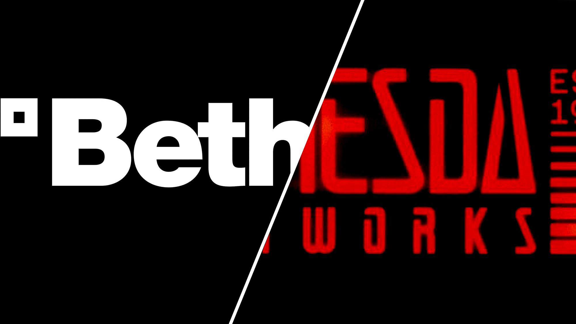
Bethesda's anniversary mark reconnects the publisher with an angular historical wordmark. Image: Bethesda, via Creative Bloq.
What Changed in Bethesda's Gaming Logo?
The 2010 identity used a clean sans-serif wordmark and a square symbol. It was legible and adaptable, but it also looked close to the visual language of many technology companies. The anniversary design changes the signal: extended strokes, sharp joins, and wide letterforms suggest game worlds, machines, and retro futurism before a viewer reads the name.
The return of “Softworks” is equally important. It helps distinguish the publisher from Bethesda Game Studios while restoring a name with historical texture. This is not just a font swap. It is a category and lineage decision.
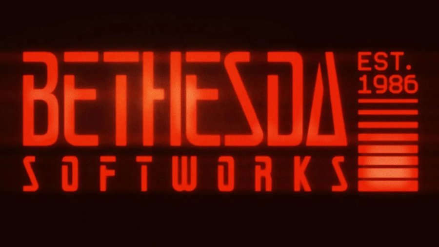
The 40th-anniversary wordmark favors recognizable character over corporate neutrality. Image: Bethesda, via Creative Bloq.
Why the Retro Wordmark Works
Nostalgia is useful only when it carries meaning. Bethesda's angular forms recall a period when software identities often looked engineered rather than optimized. That visual memory fits a company known for building large fictional worlds and publishing games such as The Elder Scrolls and Fallout.
The design also benefits from selective revival. Bethesda did not return to every old asset. Its hand-drawn 1986 mark is historically interesting, but the later angular wordmark offers a clearer bridge between heritage and present-day media.
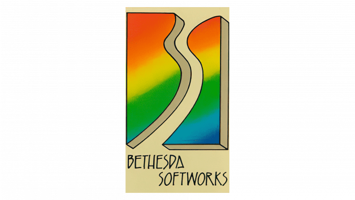
Bethesda's early hand-drawn mark is memorable, but less suited to a scalable publisher identity. Image: Bethesda, via Creative Bloq.
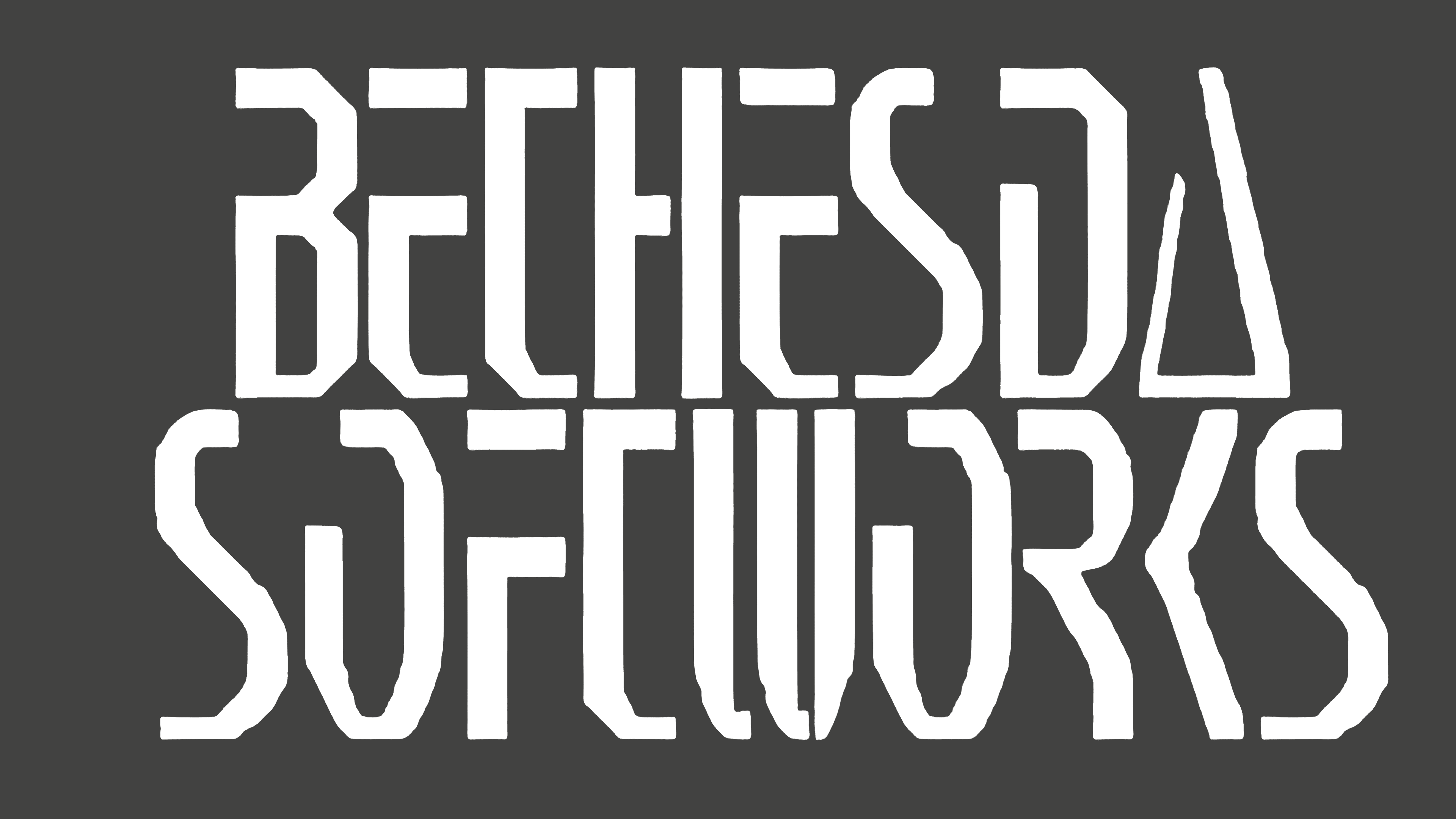
The pre-2000 wordmark provides the clearest structural reference for the anniversary design. Image: Bethesda, via Creative Bloq.
The Broader Gaming Logo Trend
Gaming brands face a tension that ordinary software brands often avoid. They need to work in store listings, social avatars, trailers, events, merchandise, and splash screens, but they also need to promise imagination. A generic geometric mark may scale perfectly while saying almost nothing about play.
Bethesda's move sits within a wider return to expressive brand assets: archival typography, legacy symbols, tactile textures, and motion systems that feel owned rather than merely usable. The practical goal is not to copy the past. It is to recover a visual idea competitors cannot easily claim.
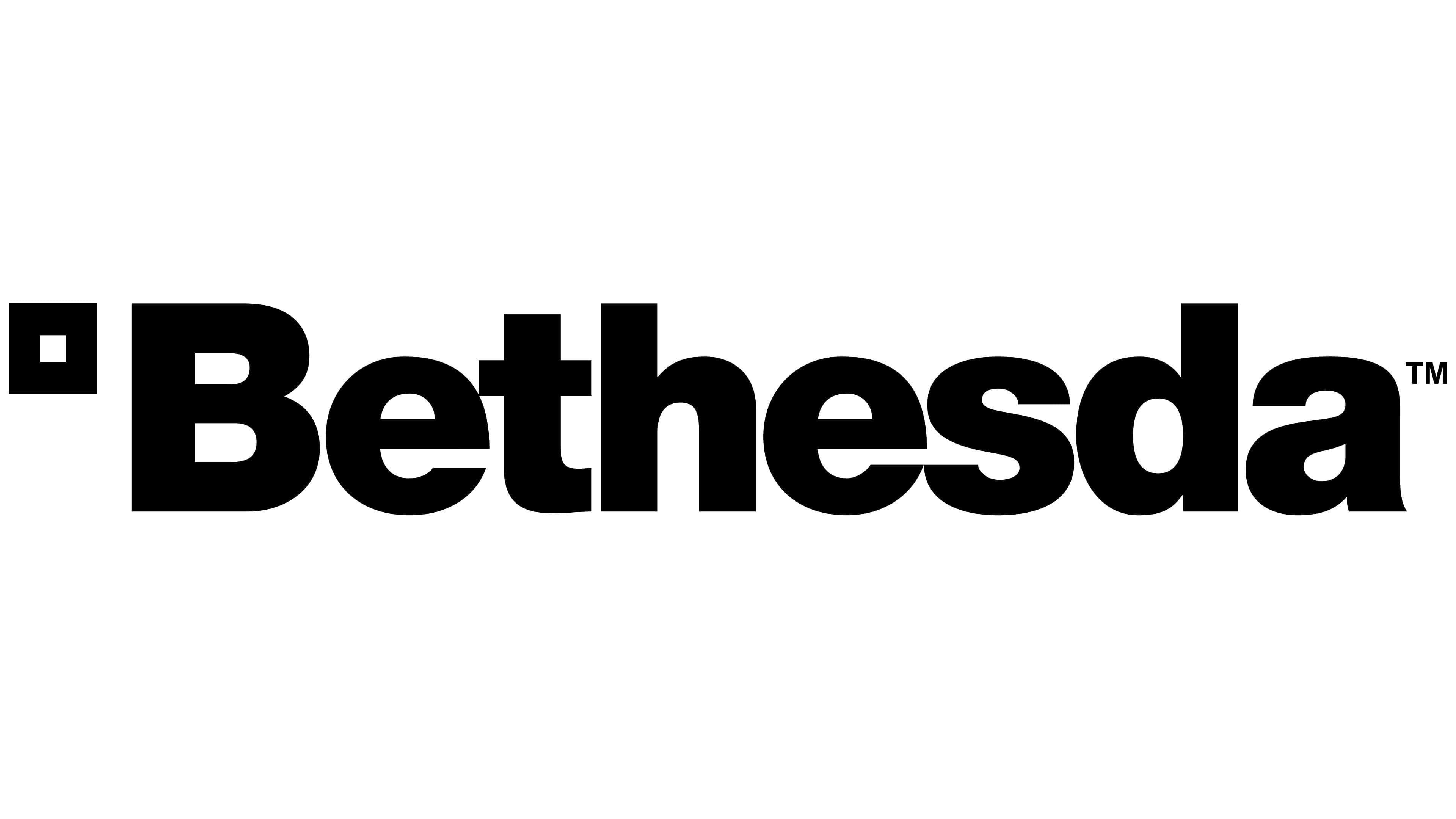
The 2010 identity is efficient, but its neutrality makes the anniversary contrast especially strong. Image: Bethesda, via Creative Bloq.
What Smaller Brands Can Learn
- Audit archives for a usable principle. Look for a distinctive proportion, letter construction, or symbol—not an old logo to copy whole.
- Let category character survive simplification. A logo should remain clear without becoming interchangeable.
- Separate campaign marks from permanent systems. Anniversary energy can be valuable even when the core identity stays stable.
- Test the wordmark in context. Use an AI Mockup to evaluate a mark on screens, merchandise, and event graphics.
Build a Distinctive Wordmark
Start with a name and a clear category signal in Sologo's Name to Logo Maker. Then explore letterform-led directions with the Wordmark Maker and carry the strongest system into a consistent Brand Kit.