Removing the flames from the Tennessee Titans’ mark changes a familiar outline. Keeping the light blue changes how that decision reads. The 2026 identity asks color, a T and the state’s three-star motif to carry continuity while a prominent piece of the old symbol disappears.
This week’s hook is the September 9 Tennessean interview syndicated by Yahoo, ahead of the September 13 regular-season debut. The team first unveiled the redesign on March 12; the images here document that earlier reveal, not the September game.
Recognition Lives in More Than the Outline
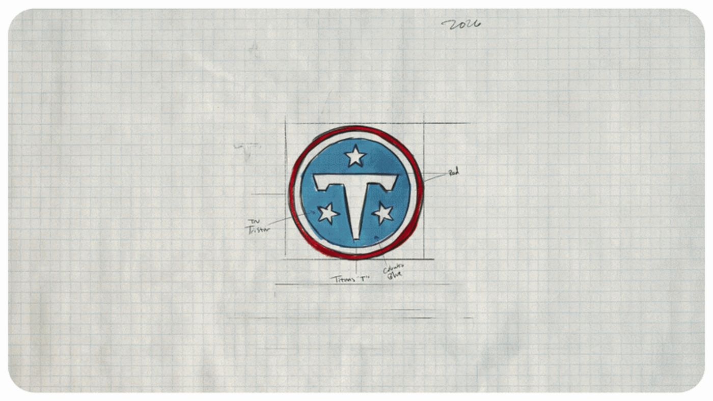
A still from the team’s official logo construction animation. Image: Tennessee Titans.
The official construction shows a compact circular mark with the T and stars contained inside. Its boundaries are more self-contained than the old flaming shape. That is useful on a helmet or stitched patch, but it also removes a silhouette fans could identify before seeing the detail.
Color therefore has a larger role. A team’s identity is encountered as a field of shirts, seats and moving bodies as much as a close-up crest. Redesign decisions should be evaluated at those distances. A cleaner symbol can be a gain on one surface and a loss on another.
Local Detail Needs a Hierarchy
The team describes a six-string stripe connecting the uniforms to Nashville. This is a different kind of identifier from the primary badge: it can reward a close look without needing to explain the team from across the stadium.
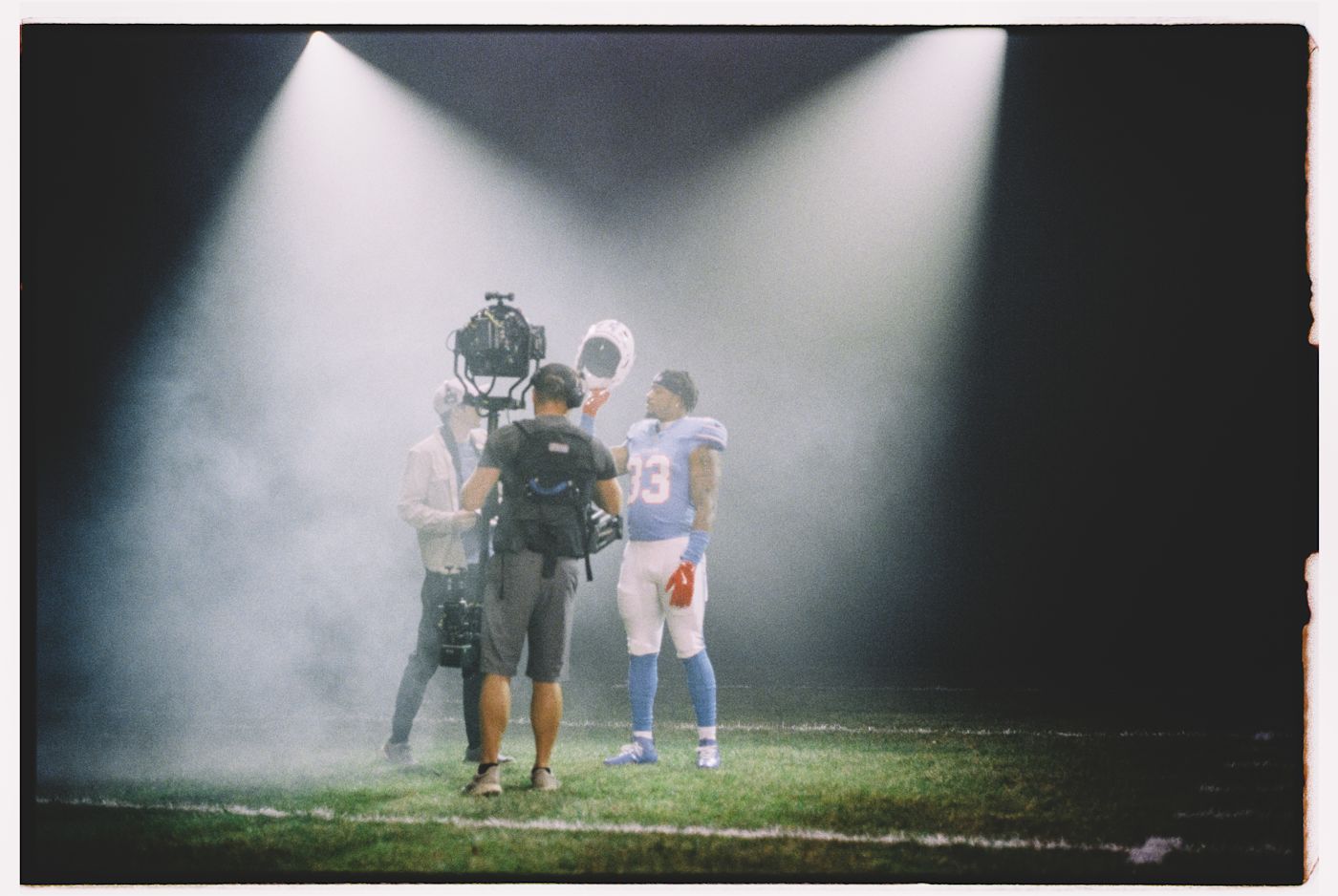
Behind the scenes at the March 9 uniform reveal shoot in Nashville. Photo: Maggie Roberts / Tennessee Titans.
That division of labor is useful in sports logo design. Let one or two elements do the immediate identification. Put supporting stories where people have time to notice them. Trying to make every local reference equally prominent can turn a badge into an inventory.
Heritage Is a Selection, Not a Checklist
The Yankees’ pinstripes and the Raiders’ silver-and-black palette illustrate how identity can persist beyond one isolated logo file. They are useful comparisons, not evidence that every team should simplify. The relevant question is which assets people already use to recognize and express belonging.
A small club can run a modest version of that test: show its mark on a sleeve, as a social avatar and across a row of shirts. Ask supporters what they noticed first, before asking whether they like the redesign. Recognition and preference answer different questions.
Use real-world logo mockups to compare the distances at which your own club will be seen. Then create an original sports mark with Sologo around the colors and local cues your community can actually recognize.